New Round Slider Element

We are pleased to introduce our new Round Slider. It features outstanding responsiveness and can seamlessly fit into any environment. It can be adapted both in height and width simultaneously. All content within the slider also automatically adjusts to the element’s size by default, which is highly convenient.
Taking into account your feedback and our previous experience with the earlier version of the slider (Circle Slider One), the internal content is now presented as a standard text field. This allows you to freely arrange the necessary content across any number of lines and format it exactly as you wish.

A rich set of options allows you to style your slider and achieve completely different results that seamlessly fit into your design concept.

A universal approach to defining the list of element options.
Due to the growing number of elements and their settings, it became necessary to standardize all properties in a consistent style across all elements. We carried out extensive work to group the properties in a clear and convenient way. For now, these properties will only be available in this form for the new elements introduced with this update. In the near future, we will gradually update the properties of all existing elements to bring them into full consistency.

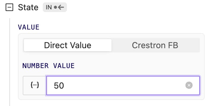
Element state management.
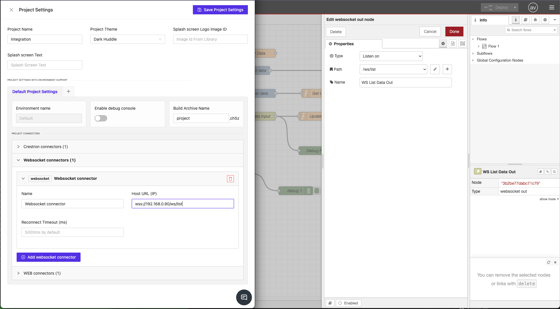
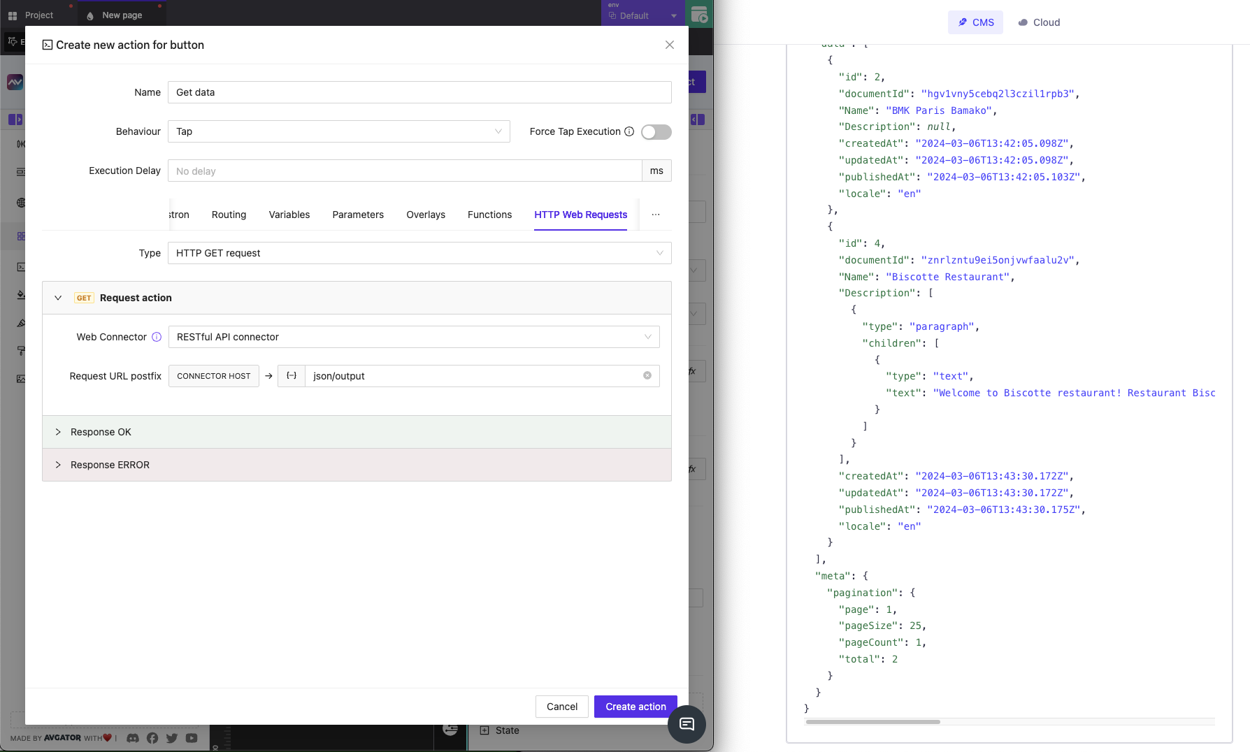
For new elements, we’ve made element state storage and usage universal. It can be stored and retrieved from any dynamic source: data sources, parameters, global variables, data received via WebSocket or HTTP requests. The Crestron option remains available. In the future, we’ll upgrade all elements so they can store, retrieve, and send state through any channels, not just Crestron.
New Color Picker Element
It’s time to introduce the new ColorPicker element. It allows you to add any RGB color range.It can store its state with any dynamic data; similar to RoundSlider, it is fully responsive and can adapt to any parent width and height.

Auth improved
We’ve improved the authorization system. Now you can log in not only using the Email and Password combination, but also via the Google platform. In the near future, we’ll add several more convenient authentication methods.

Bug fixes and improvements
- Parameter handling has become much more stable. We fixed issues with boolean parameters, as well as some update and dynamic calculation errors.
- When creating a data source, errors could occur during test data retrieval, test function applications, etc. All these issues have been fixed.
- Color selection in some element layers could be slow. We’ve improved its performance in the following object and will continue working to make this process even more convenient and faster.
- And various other minor fixes and improvements.