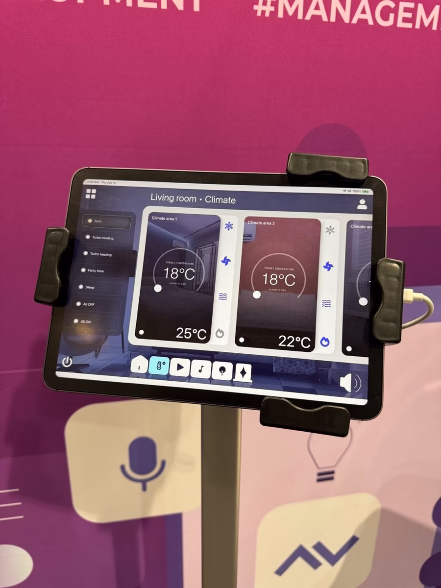
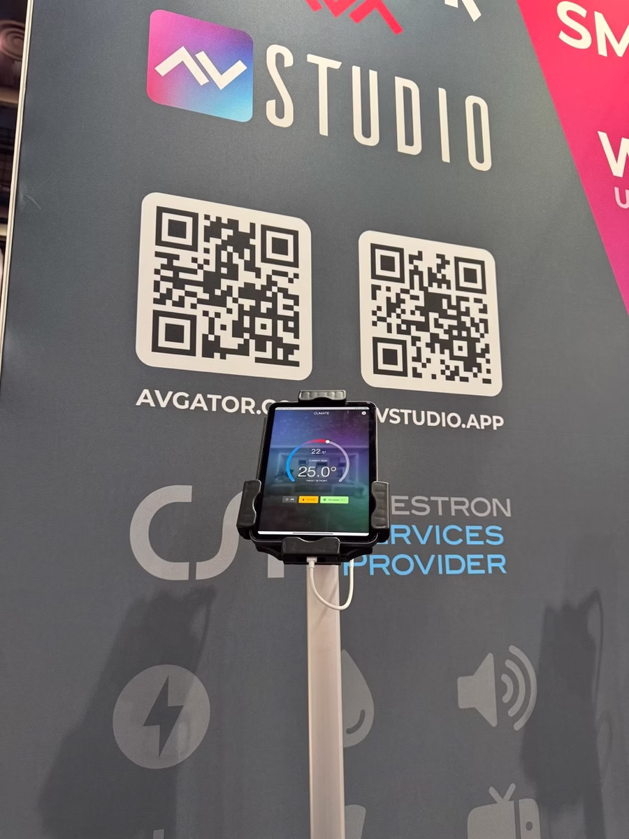
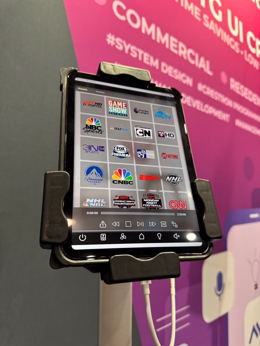
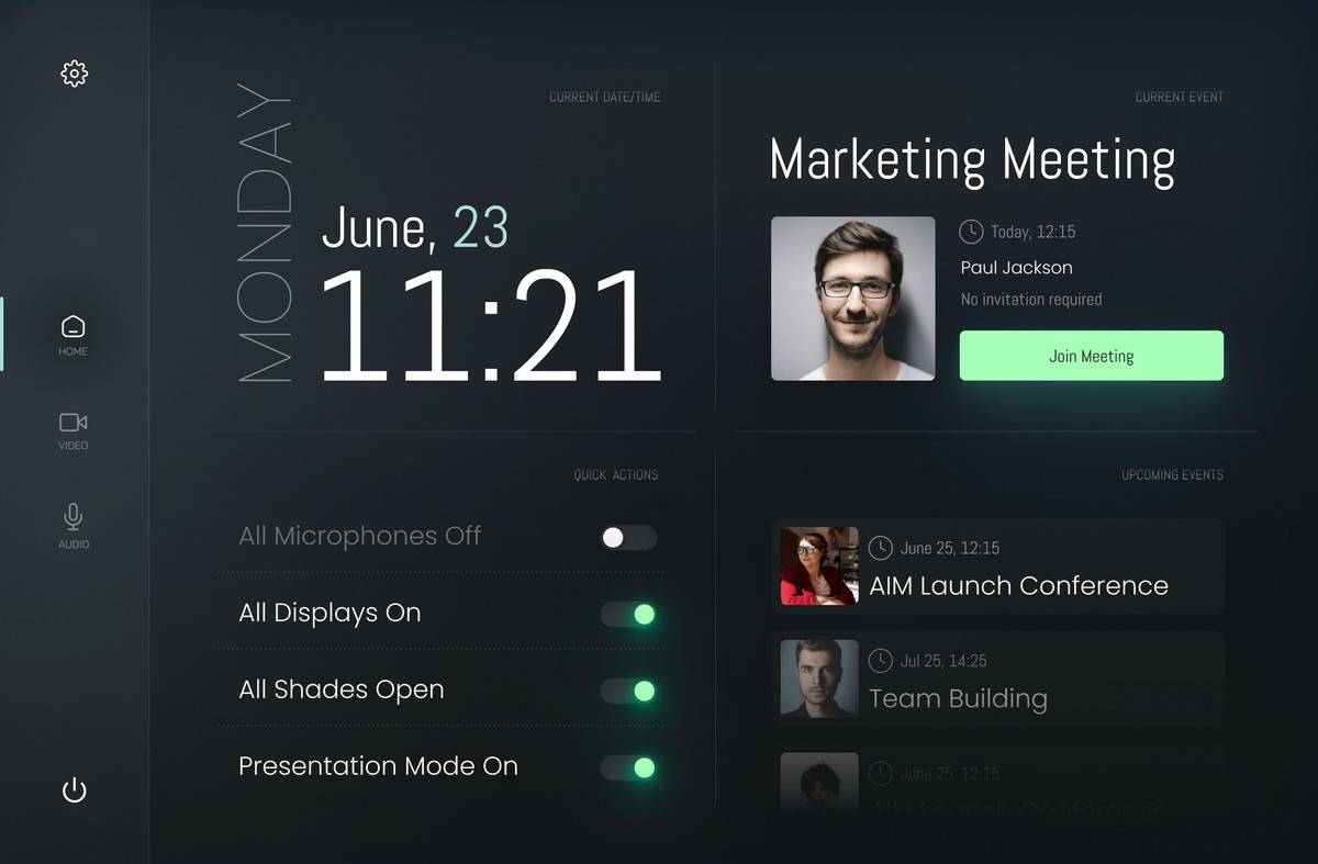
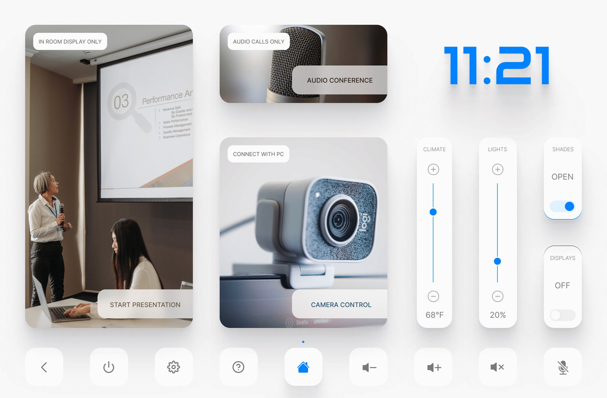
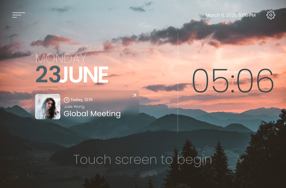
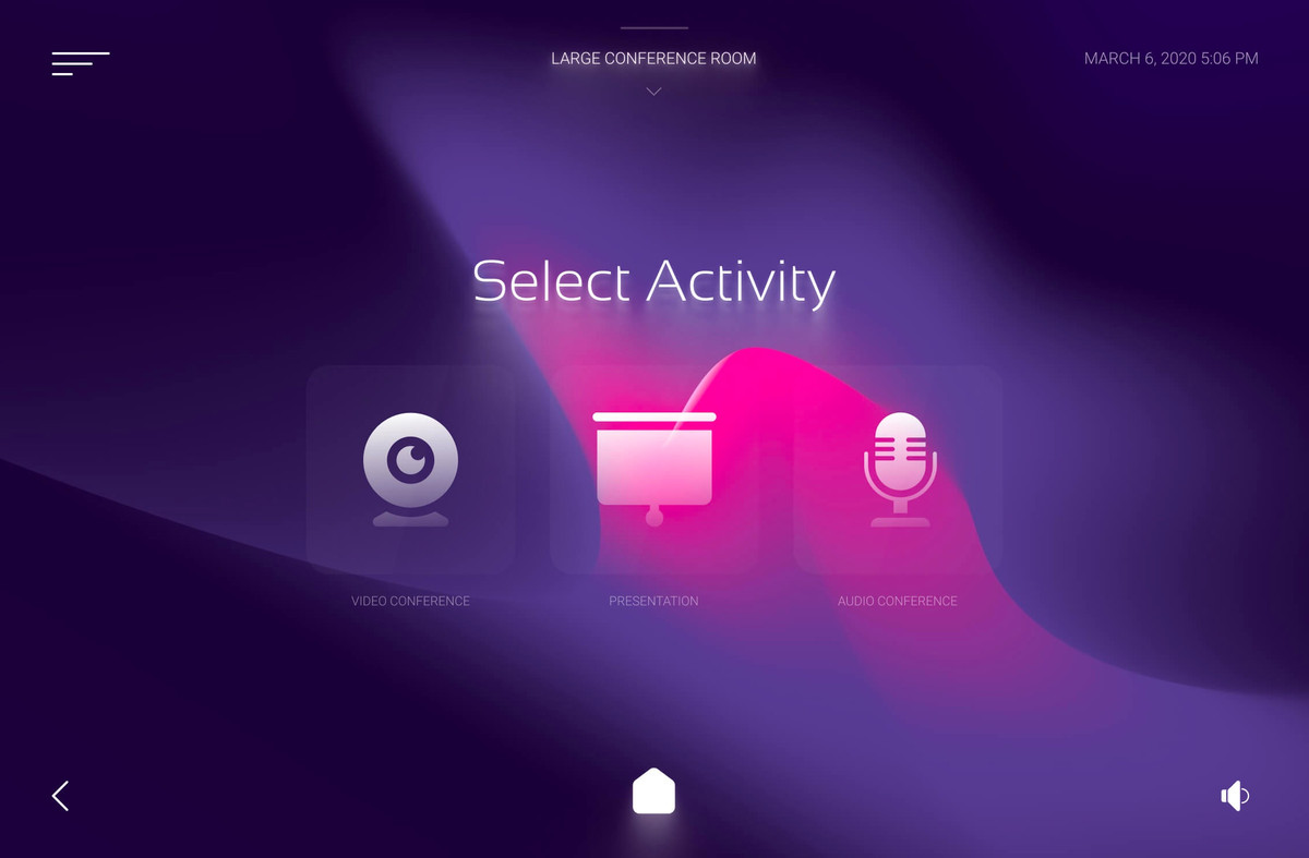
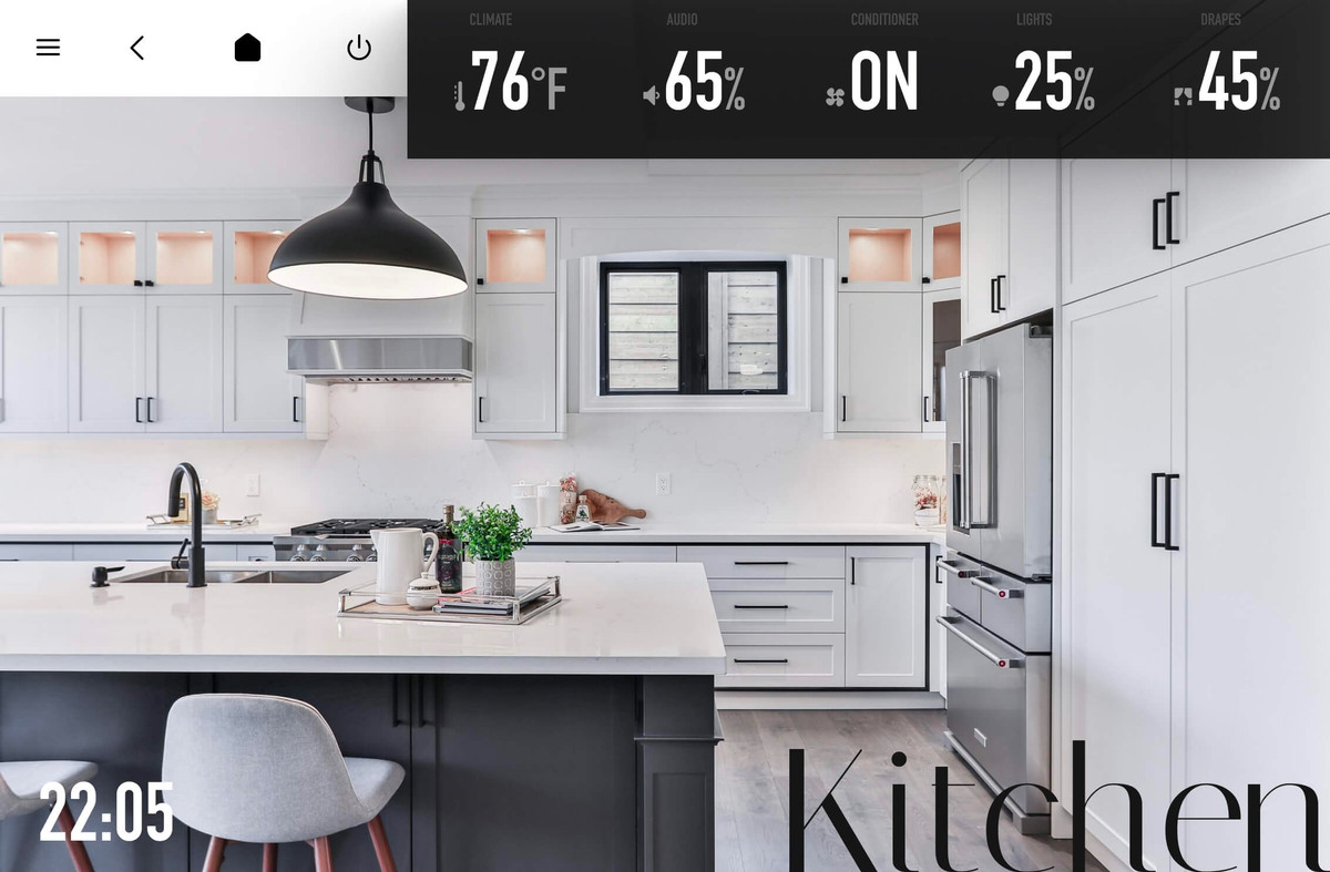
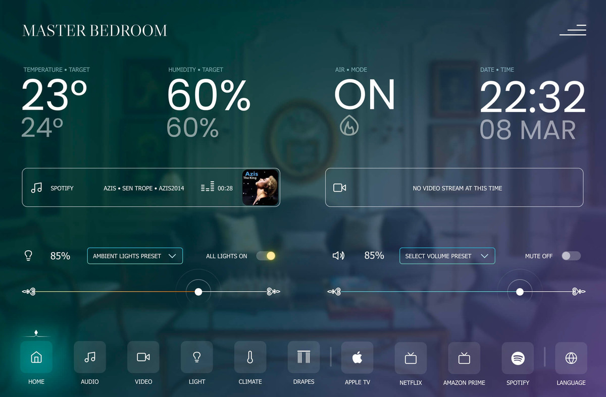
We’re excited to share some of our latest touch panel designs from AVgator® Studio. Check out the photos below!
Are you curious about how you can create similar touch panels for your projects? Visit us at Central Hall, Booth 10130 today, and let us show you how AVgator® Studio can transform your AV interfaces with ease and efficiency.
We’d love to hear your thoughts and questions—drop by for a demo or comment below if you’d like to learn more!
Join Us for a Sneak Peek of Our Latest Innovations!
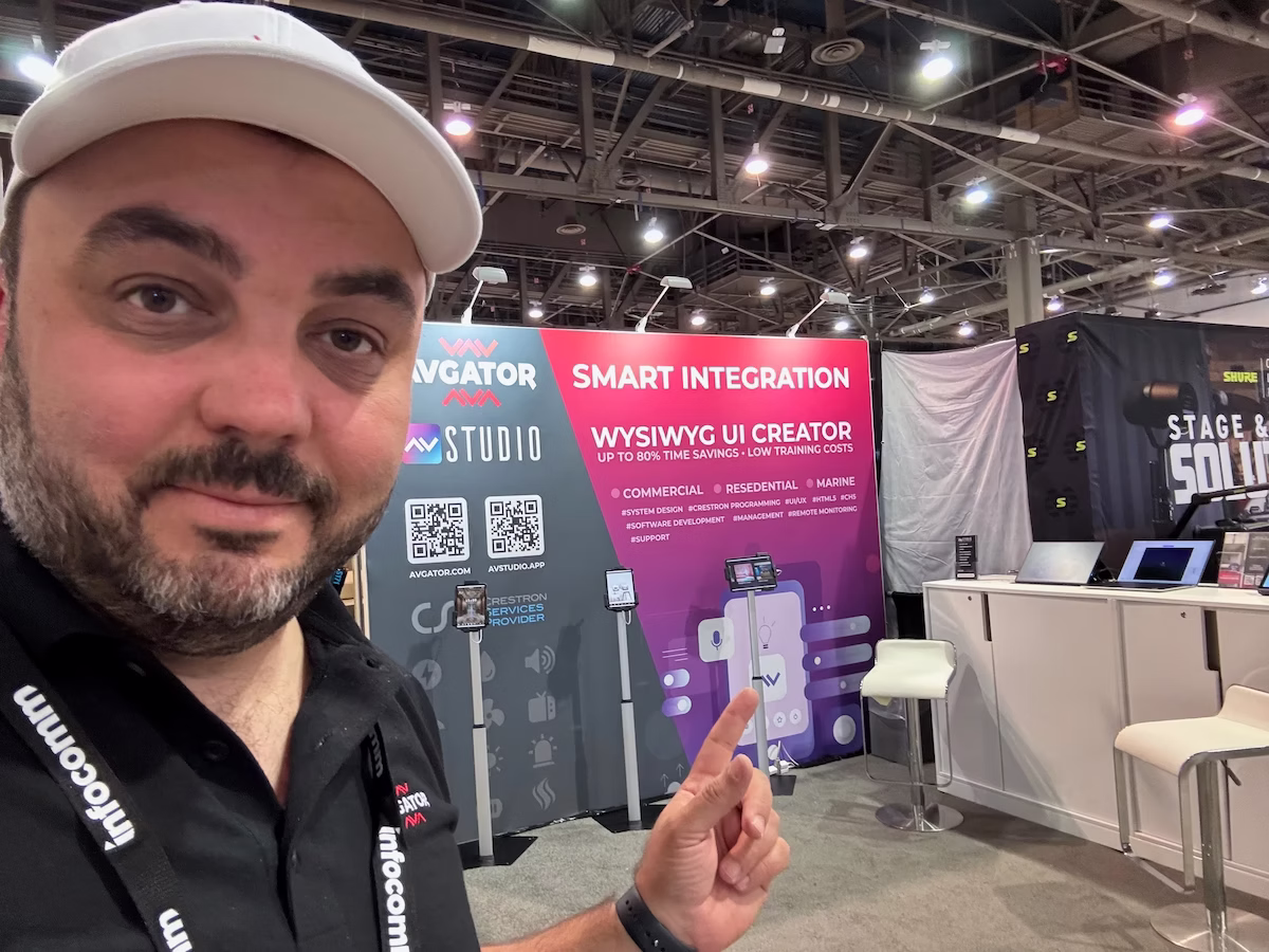
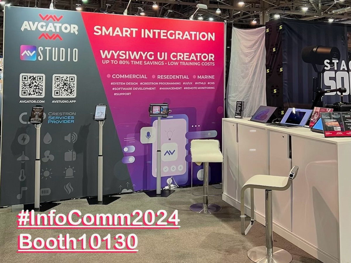
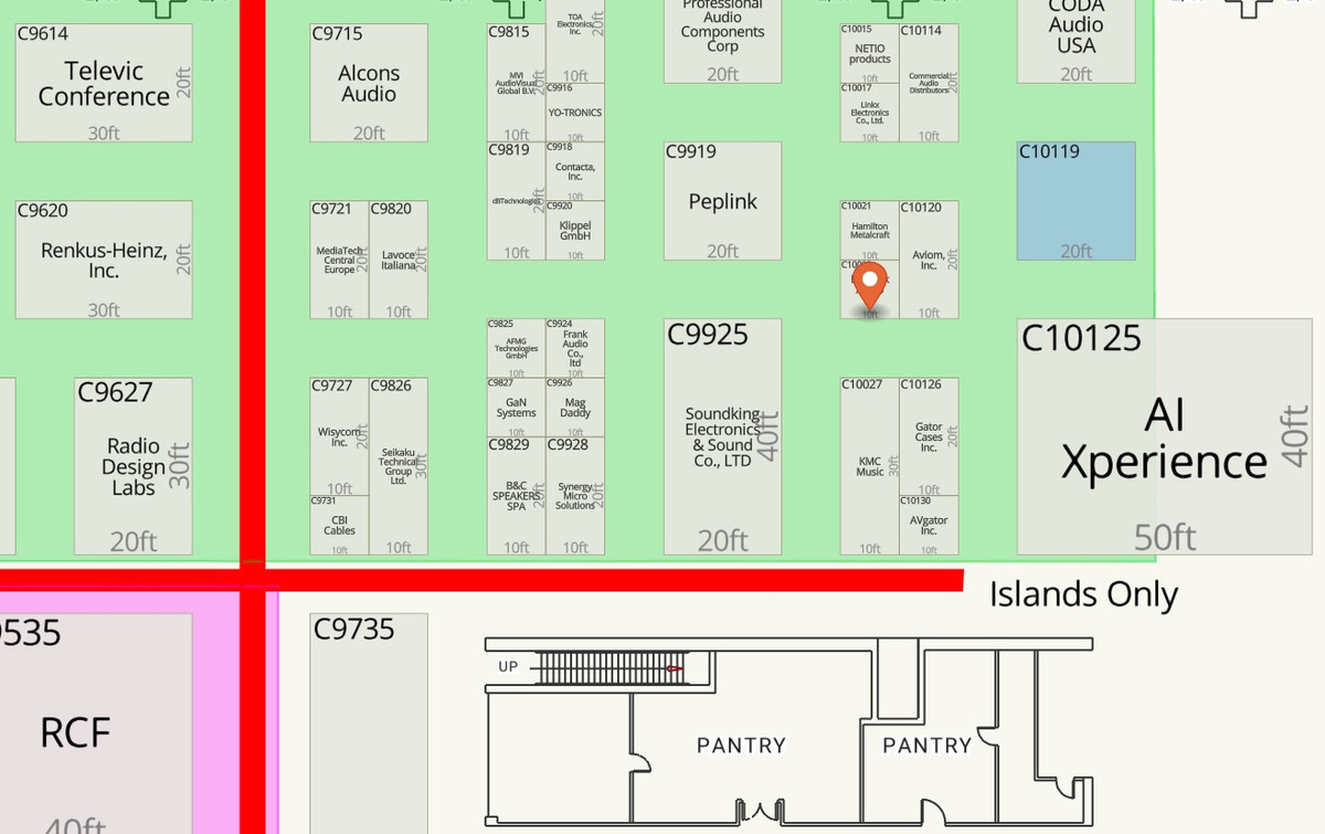
As InfoComm 2024 kicks off in Las Vegas, we at AVgator® Inc. are thrilled to announce that we are fully prepared to showcase our latest advancements. We invite all our current and future customers to visit us at Central Hall, Booth 10130, to discover what we’ve been working on.
This year, we have a special surprise in store, featuring cutting-edge developments in AVgator® Studio that will revolutionize how you approach AV technology. Our team is eager to demonstrate these new capabilities and discuss how they can benefit your projects.
What to Expect at Our Booth:
• Exclusive Preview of AVgator® Studio’s New Features: See firsthand the enhancements designed to streamline your workflow and elevate your AV solutions.
• Interactive Demonstrations: Engage with our live demos and get a feel for the intuitive, powerful tools we’ve developed.
• Meet the Experts: Our team of specialists will be on hand to answer your questions and provide insights into how AVgator® Studio can meet your specific needs.
Don’t miss this opportunity to connect with us and explore the future of AV technology. We look forward to seeing you and sharing our exciting new offerings!
Event Details:
• Location: Central Hall, Booth 10130
• Dates: June 12-14, 2024
Stay tuned for more updates from InfoComm 2024. Follow us on LinkedIn for live insights and highlights throughout the event.
🚀 Excited to be heading to InfoComm 2024 in Las Vegas! Representing AVgator® Inc., I can’t wait to showcase our groundbreaking solutions, including AVgator® Studio. Looking forward to connecting with industry leaders and exploring new possibilities in AV technology. Let’s revolutionize the future of AV together!
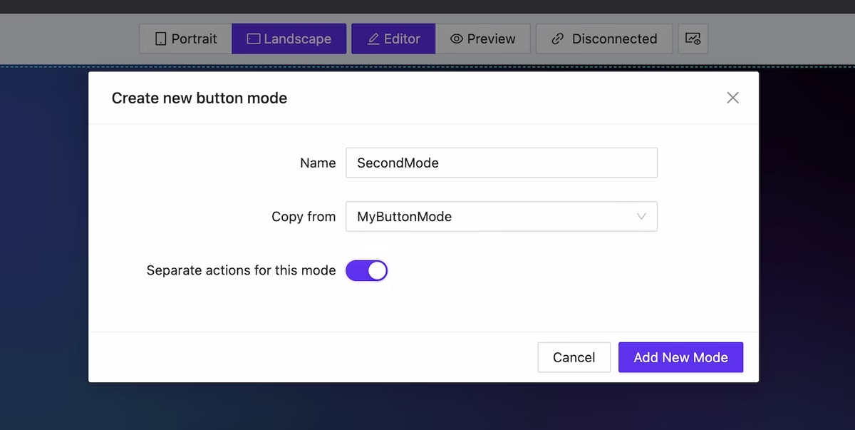
We have added the capability to create mods for elements (all of them!). This allows for significant alteration of both the appearance and actions of the element depending on dynamic data. This functionality extends to page lists as well: you can easily modify the structure of the list with just a few clicks.
Mode creation dialog
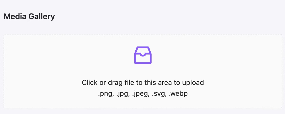
Media upload: support for .svg (color inheritance included) and .webp
NEW
We have implemented the ability to upload images in the webp format. Additionally, you now have the unique opportunity to upload images in the .svg format. It is important to understand that an SVG image containing ‘currentColor’ as a color indication will adopt the element’s color settings—this is particularly convenient for creating unique icons.
Use any .svg image as icon. Animated .svg also supported.
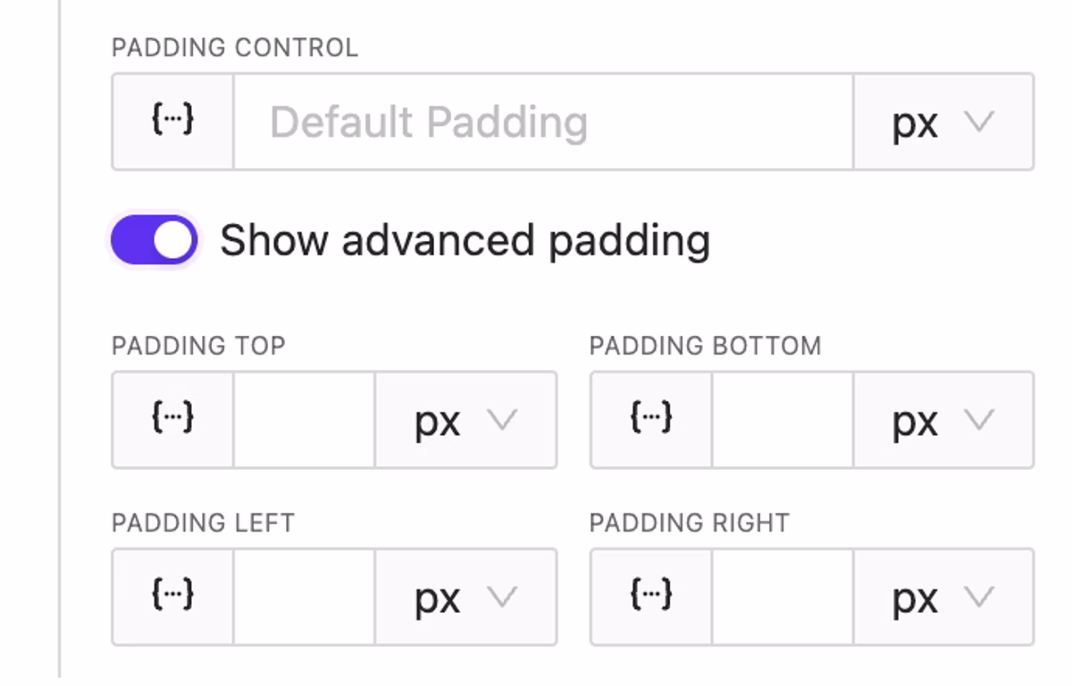
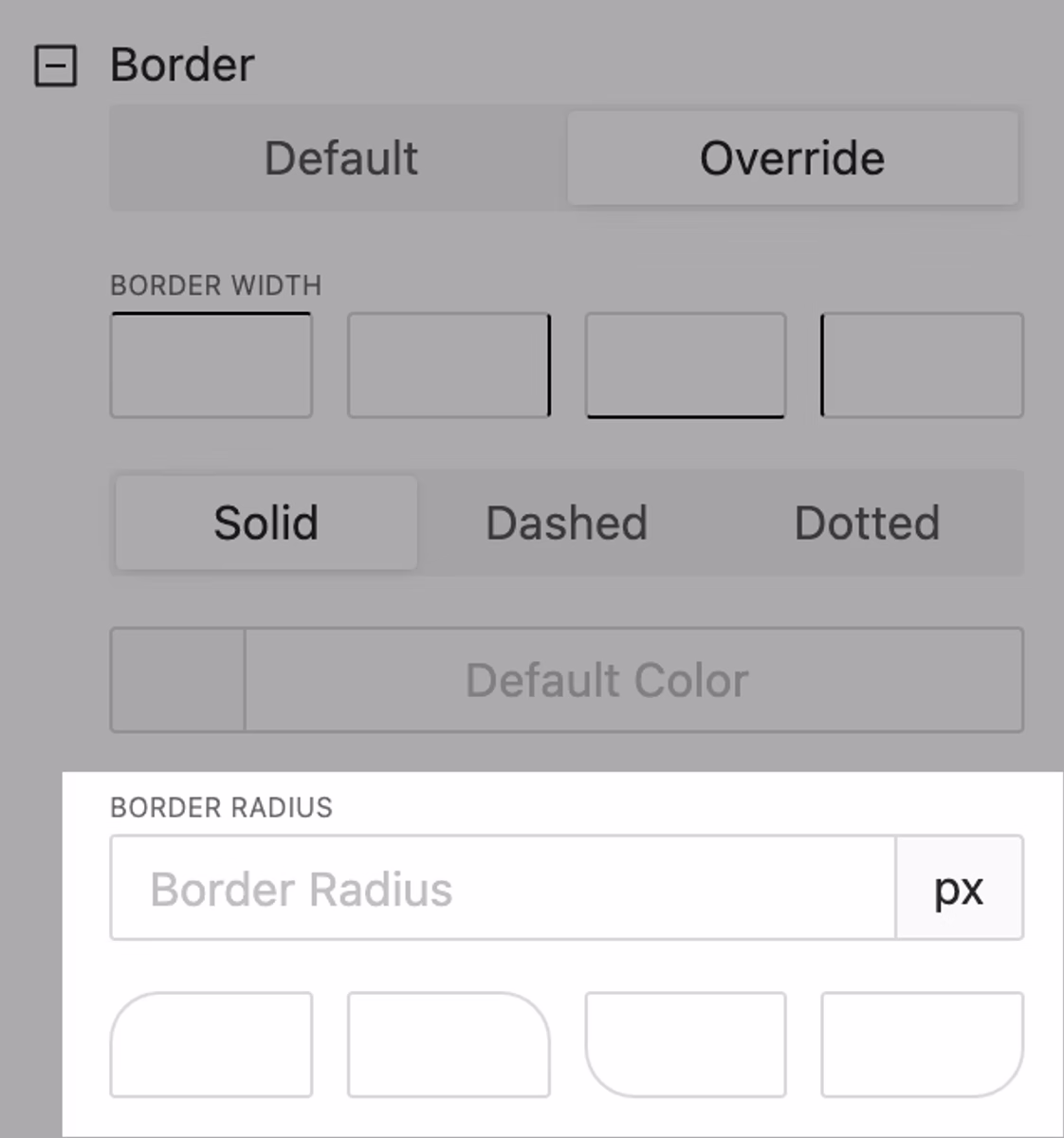
Granural Padding & Border Radius Control
NEW
It has become convenient to set different value for different sides. Feel free to utilize this feature!
Advanced border radius control
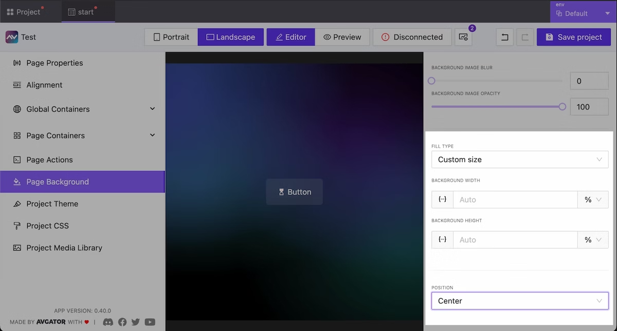
Extended Background Size & Position
NEW
Now you have more control over the background at the page, project, and other supported element. You can now specify sizes and positions as well.
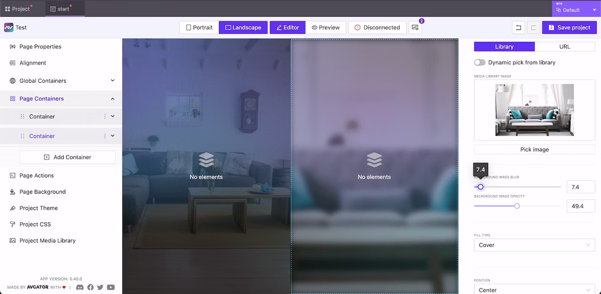
Background Image for Containers
NEW
The ability to specify a background for the container is now available. Control for position, opacity, size, blur included!
Containers with custom background Images
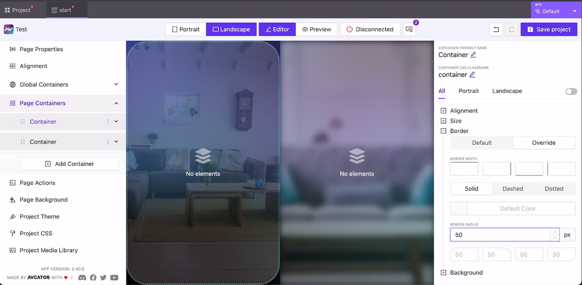
Border Radius for Containers
NEW
Utilize border radius directives for the container to enhance the appearance of your project.
Container border radius
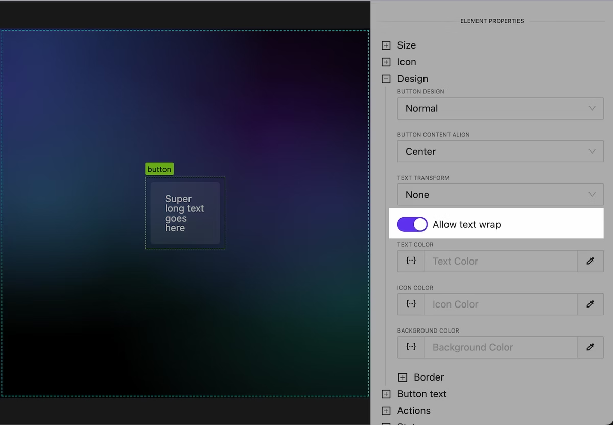
Text Wrap Behavior for Button & Text Elements
NEW
Working with long text has become more convenient. Later we will add convenient tools for automatic truncation of long text.
Control over text wrap
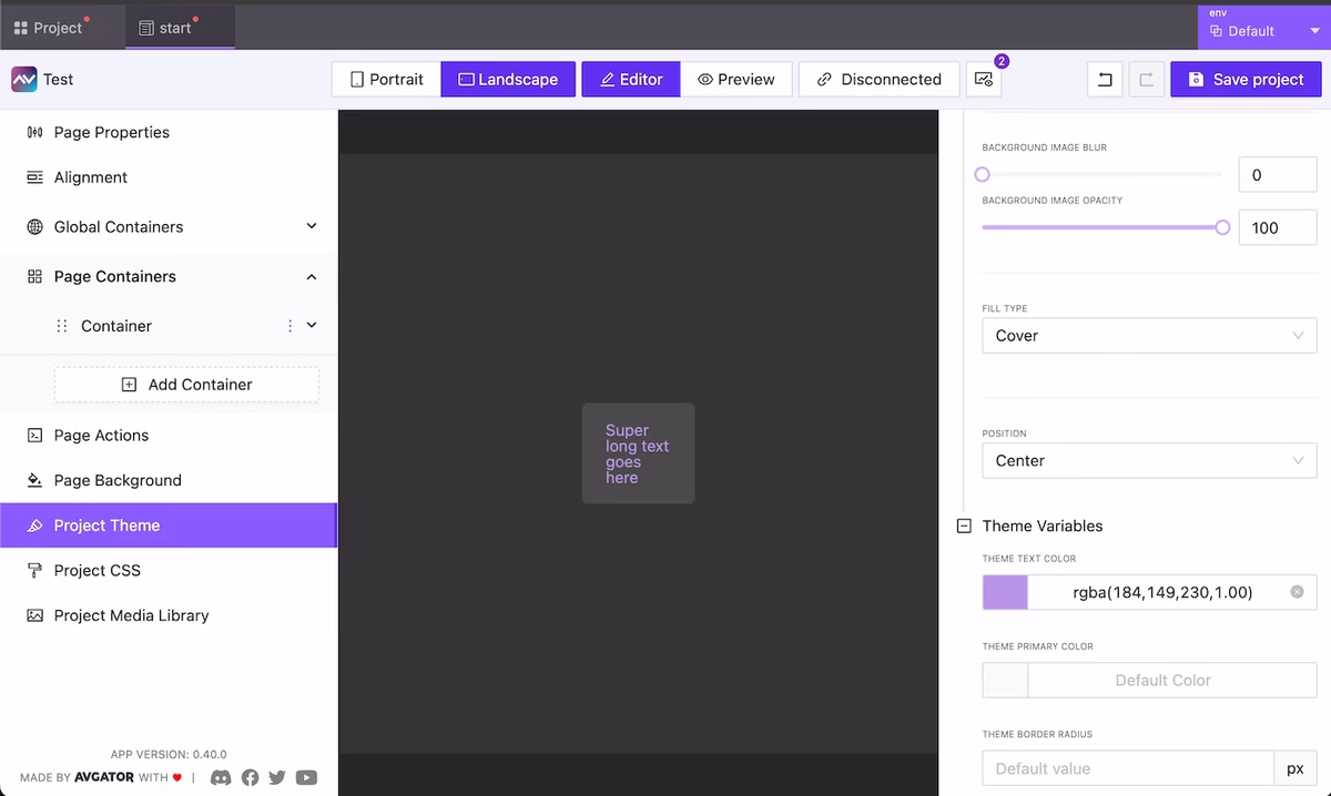
Global Override Theme Design Settings
NEW
We have moved global project background settings into a separate category in the menu. Additionally, in this menu item you now have the option to specify custom settings for the main colors used. In the future we plan to significantly extend control over the appearance at a global level and allow users to create and share their own design/color themes.
Override global theme color/background settings
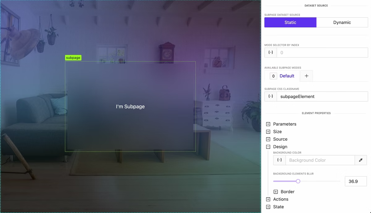
Blur Content behind Subpage or Container
NEW
At the container and subPage level, it is now possible to control the degree of blurring of elements/content beneath them. This is very convenient for highlighting, creating visually appealing effects and improving the readability of your interface.
Background blur effect
Containers are sortable again!
NEW
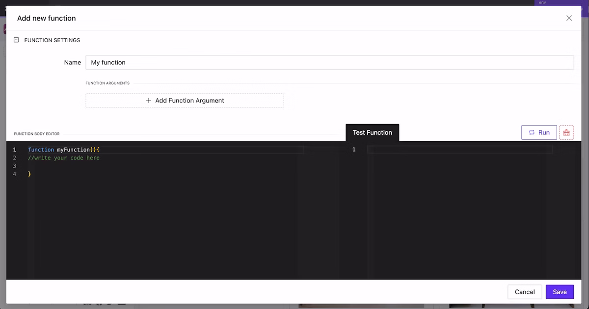
New Function Creation Modal
NEW
A new editor has been designed for creating functions. Writing and testing functions has become much more convenient. Additionally, integrated documentation with all available global data and variables for use will be added to this modal soon.
New Function Creation Modal
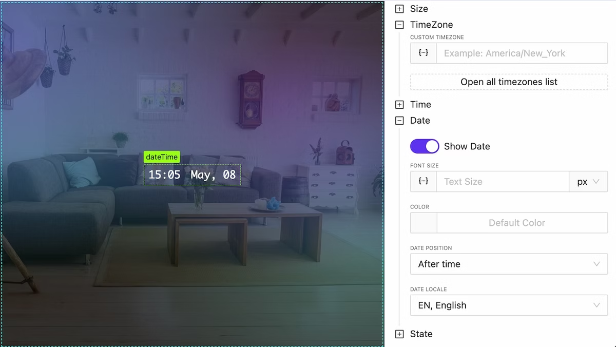
New DateTime Widget
NEW
We have added a DateTime widget for convenient and fast visualization of the current time and date with detailed formatting options and the ability to specify time zones.
DateTime widget
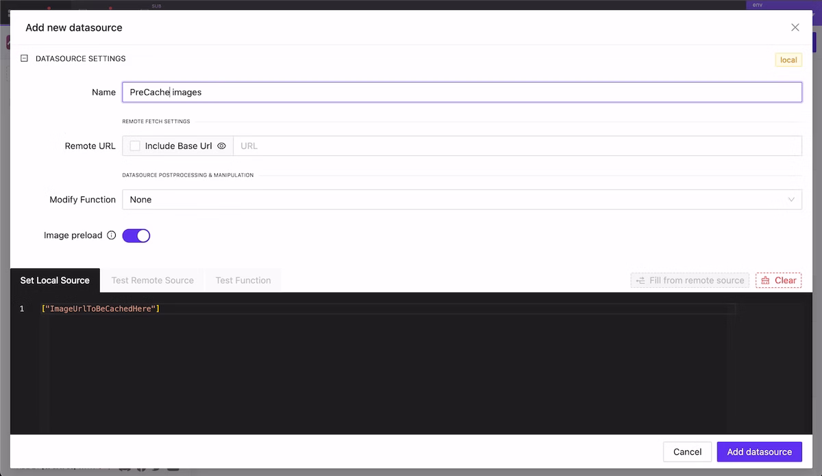
Precache External Images
NEW
If your project extensively uses images from external sources you can now cache them in advance so that users will see them instantly when using your GUI.
Add datasource with urls array should be precached
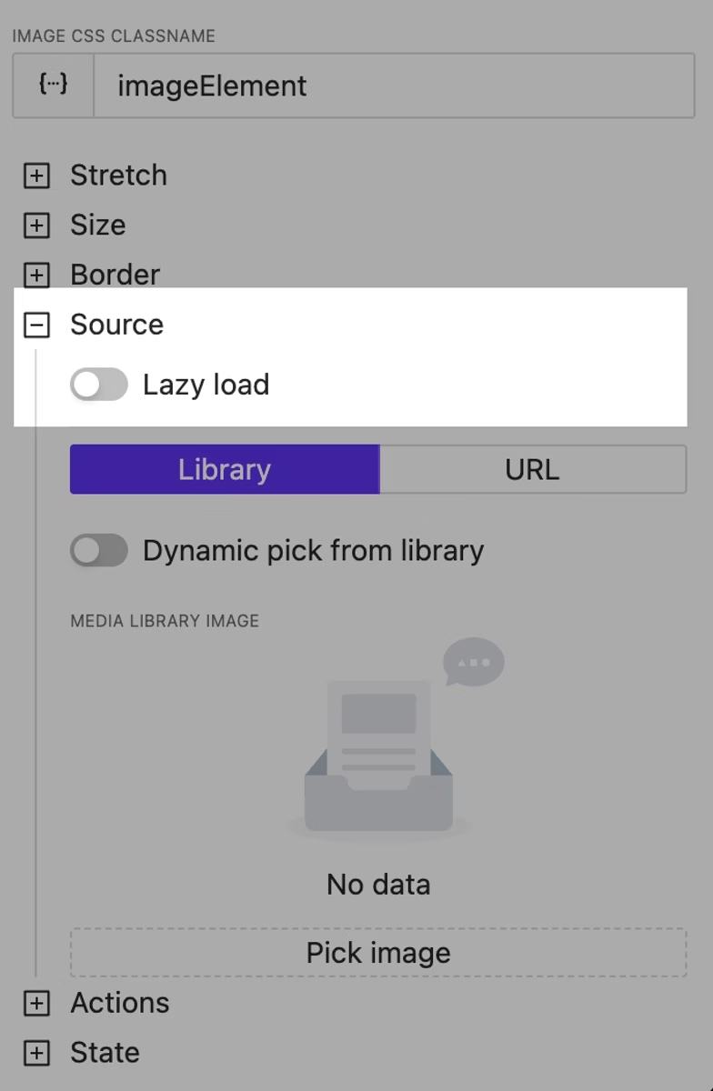
Image Lazy Load Option
NEW
Using this option will allow you to defer the immediate loading of heavy images and improve the user experience.
Image lazy loading
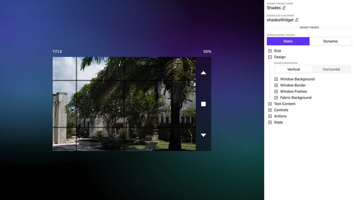
Shades Control Widget Improved
NEW
Advanced settings and bug fixes have been implemented for the shades control widget. You can now configure the curtain style in more detail. Additionally, users can adjust the degree of opening and closing by directly dragging the curtain fabric.
We are thrilled to welcome both new and loyal customers to showcase our flagship offering – AVgator® Studio, a cutting-edge WYSIWYG user interface editor.
Join us to discover the latest in user interface design and share in our newest innovations.
Mark your calendars for June 12 to 14, and find us in the Central Hall. We can’t wait to connect with you and explore what the future holds together. See you there!
Our booth number: C10130
Click the registration link below and use our VIP code for a free exhibit hall pass: https://invt.io/1exbtnte7ar
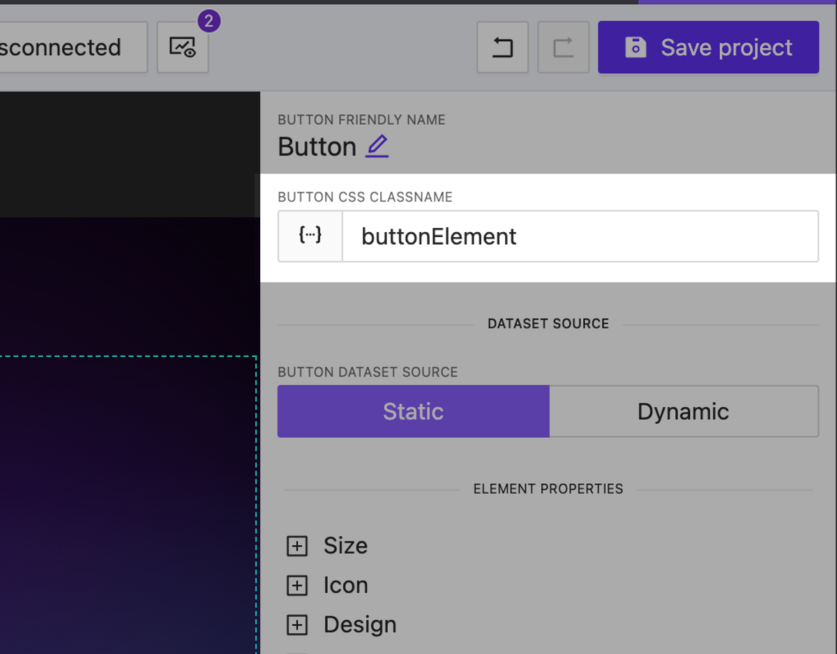
We have added the ability to assign dynamic CSS classes to any element on your page. This allows you to change the appearance of elements using not only built-in settings but also custom CSS styles.
You can assign as many classes as you want separated by a space.
Dynamic CSS classnames for any element
Environments
NEW
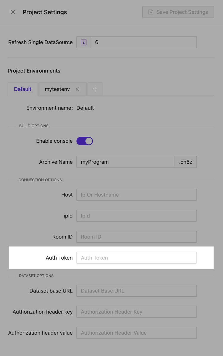
We are pleased to introduce our new feature, Environments. Now, each project can have multiple environments, each storing specific settings that can be used in various scenarios. For example, different connection settings to the processor that you can use at your workplace as well as for final testing on the client’s hardware. It’s easy to switch between environments both during interface creation and when selecting them for building. When changing the active environment in the page editor, the live preview instantly applies all the current settings you have selected.
Crestron processor auth token support
NEW
We have implemented support for authorization tokens for connecting to processors. This allows us to avoid redirects during authentication.
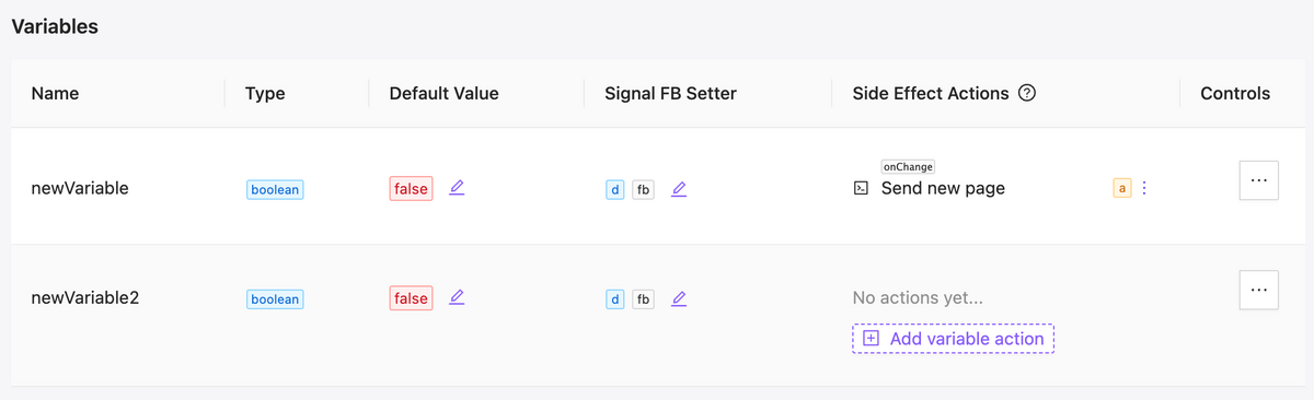
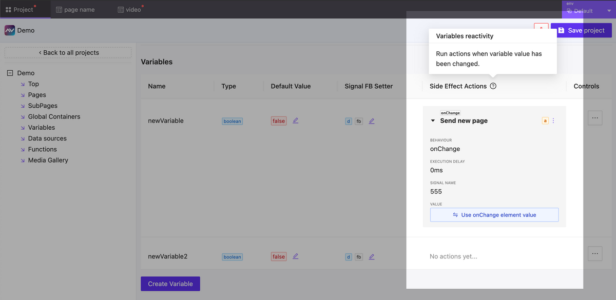
Variables Side Effects
NEW
Now you have the ability to react to changes in variable values. In the event of a variable change, you can create as many actions as needed. This can include actions to send any type of signal, assign a variable, change a page, or anything else necessary to implement your scenario.
Updated variables table
Variables side effects form
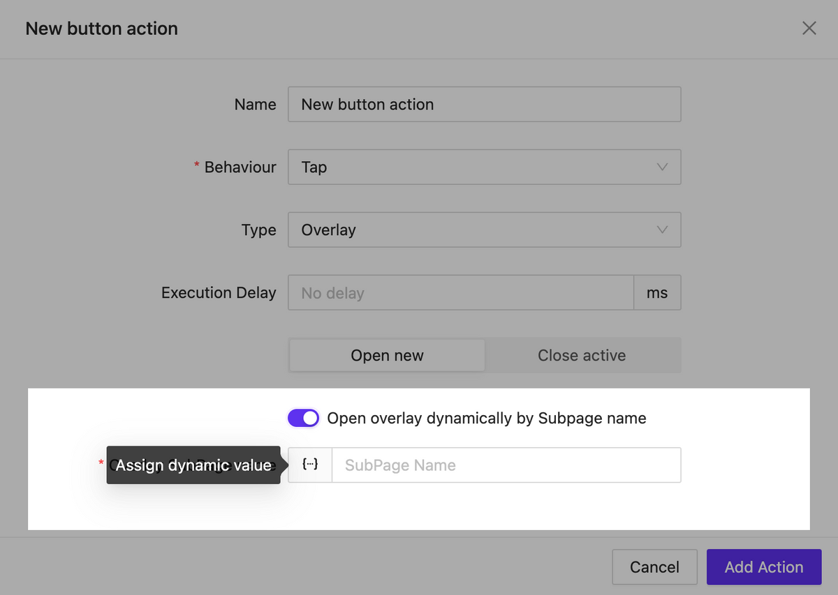
Dynamic subpage inside overlay
NEW
Now, when opening the overlay you can specify the page that should appear in it dynamically. This allows us to implement various interface logic within a single element as part of an action.
Call overlay by subpage name
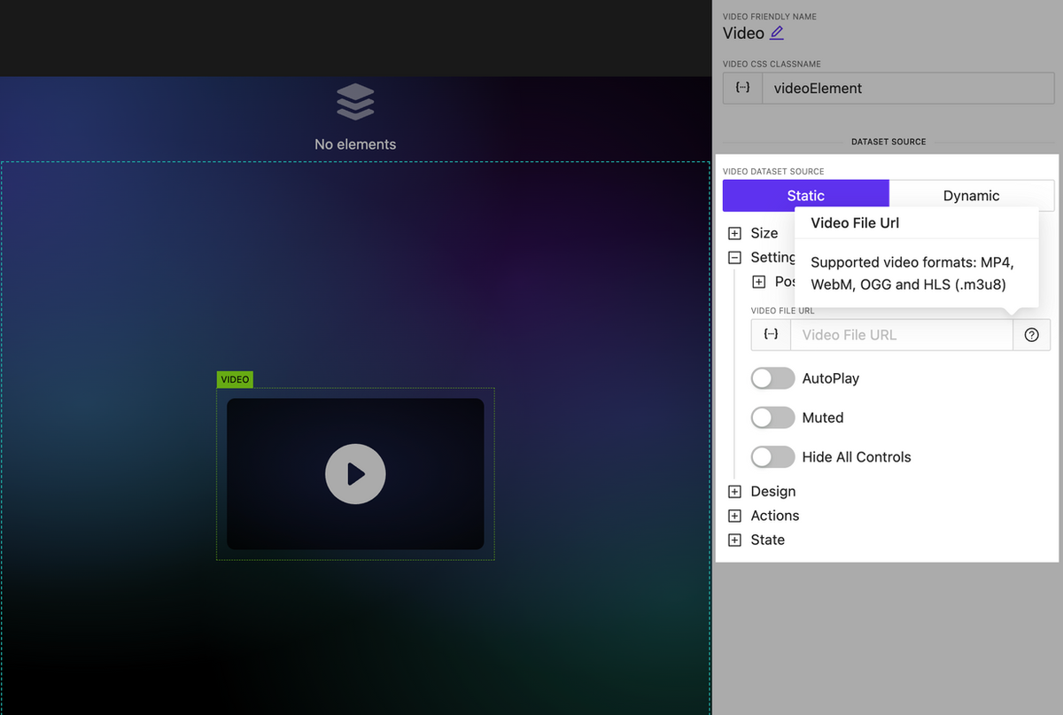
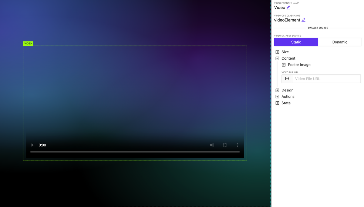
Video element updated: new options and HLS support
NEW
The video element has been significantly enhanced. It now includes extended settings for controlling the display of player interface elements as well as support for the new format: HLS.
Updated video element
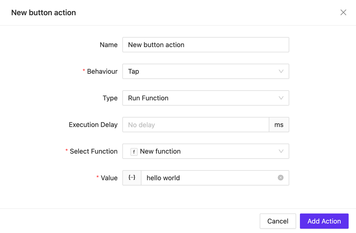
New action type: Run Function
NEW
We have introduced the ability to create an action that allows you to execute any JavaScript function you have previously created. This action can be applied to any element.
Function runner
Bugfix & Small improvements
UPDATE BUGFIX
Better behavior for text input element, slider, circle slider, toggle, checkbox, switch.
Fix Button element pressed state styles
Update fullscreen editors (html block, css)
Back routing doesn’t trigger action if actually no back page exist
Click on image allow open overlay
Better webxpanel initialization method, webxpanel updated to latest version
Fix bugs on touch click events
Fix bugs when sometimes overlay cannot be closed
Stop execute actions from list elements while it scrolling
Edit action form bug with representing wrong initial data
Click event may triggered twice on iOS – fixed
Fix project clone process
Improve page/subpage search
Improve subpage search whet setting up a route action
Live session isolation: one per login instance
Fixed unresponsive field while editing assigned dataset
Fixed: Color field doesn’t show current color value (text element for example)
Fixed: Dpad keep working when disabled
Fixed: Circle slider send wrong value when ends with zero and using fraction
A new widget for controlling shades with rich appearance and display settings.
Shades control
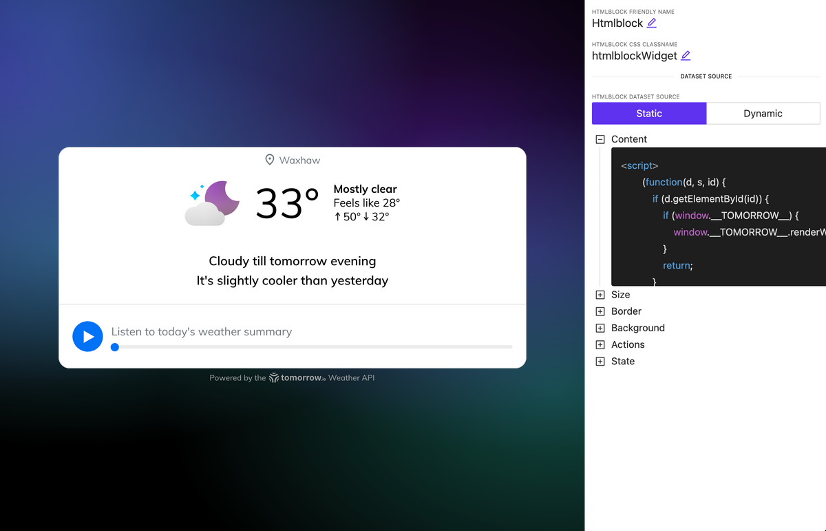
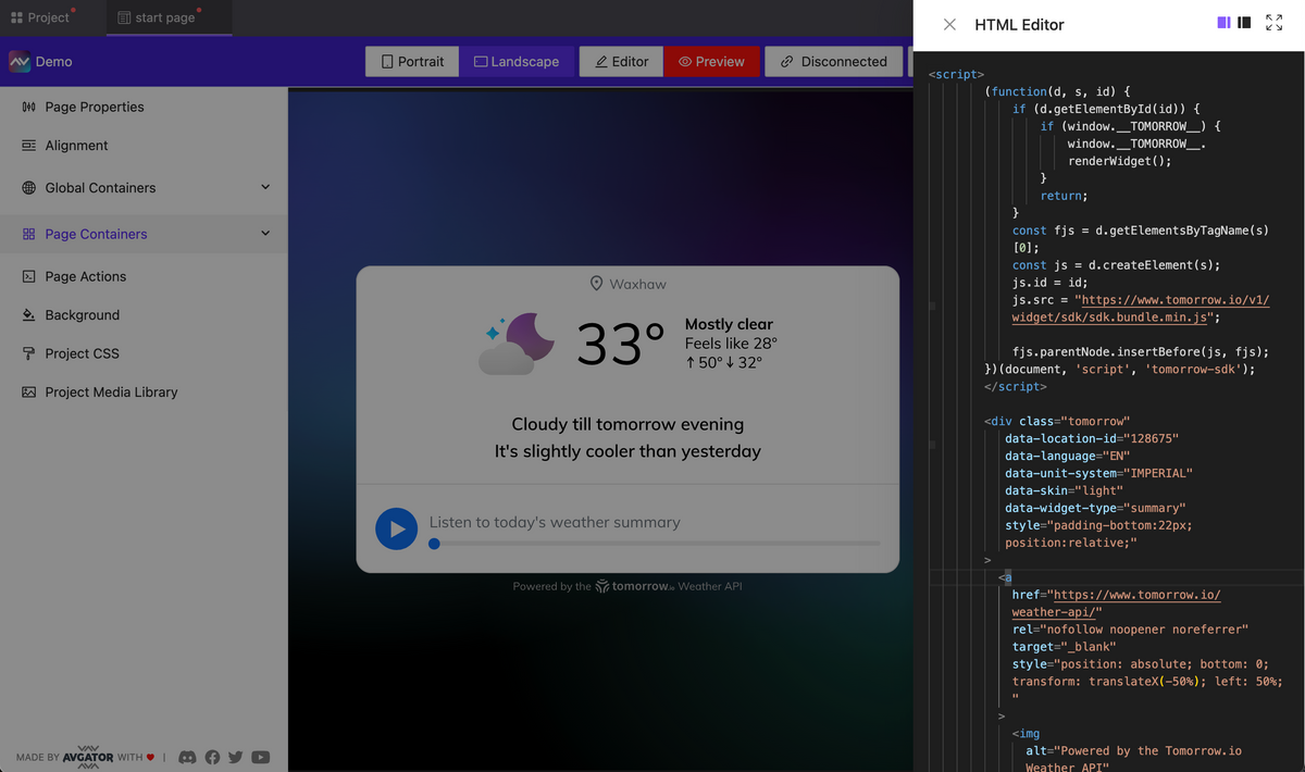
HTML block element
NEW
A new element has been introduced allowing you to embed HTML code, including tags, styles, and scripts. For example, in about 30 seconds, you can insert a fully functional web widget for weather, and it will work seamlessly and display on your page.
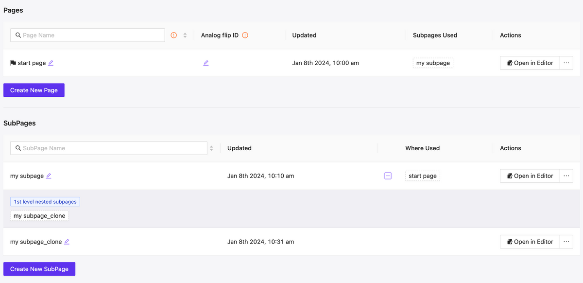
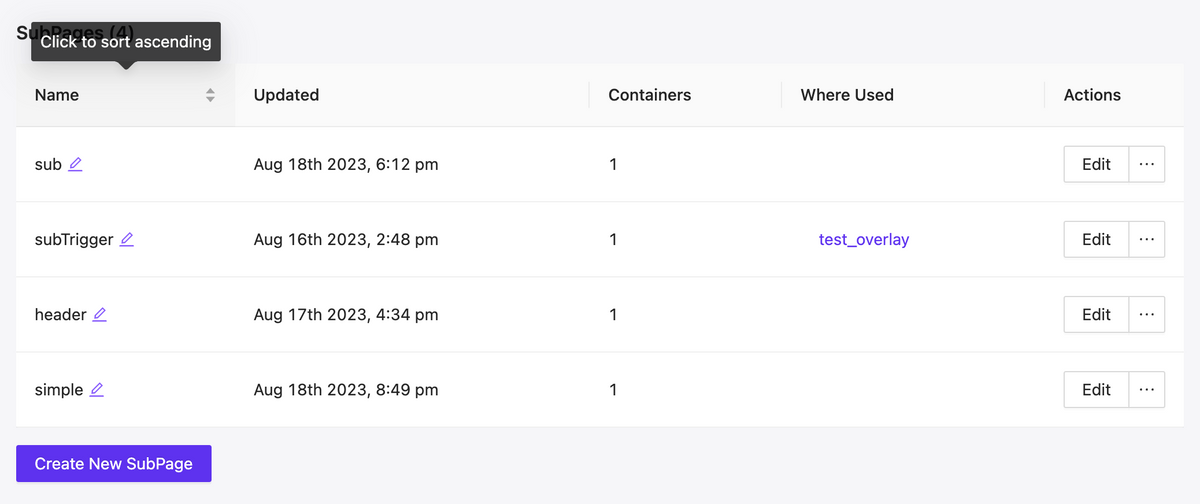
More control over the management of pages and subpages
NEW
Fast filtering as well as mutual mapping of utilized pages and subpages, allows for quick orientation and navigating to edit relevant components, understanding their hierarchy.
Pages & Subpages interface updated
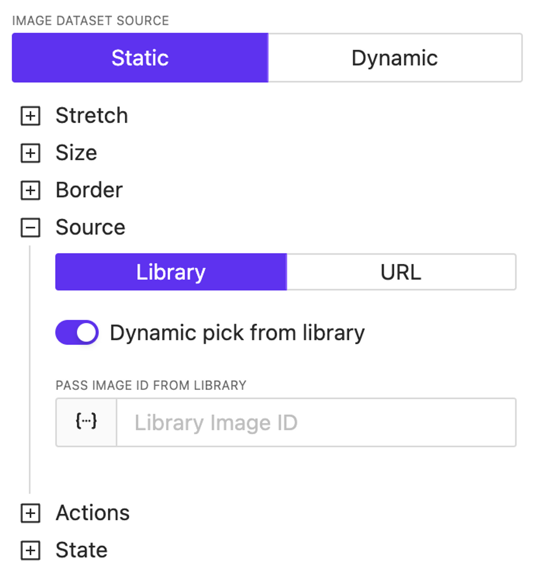
Extend dynamic support
NEW
We’ve introduced dynamic support for color settings across almost all elements. Additionally, the image source specification is now entirely dynamic—you can use both URLs and dynamically reference images previously loaded into the library, including the use of variables and/or a datasource.
Video element
NEW
A video element has been added. Currently, it’s the most basic implementation; later, we’ll update the list of supported properties and display settings for this element.
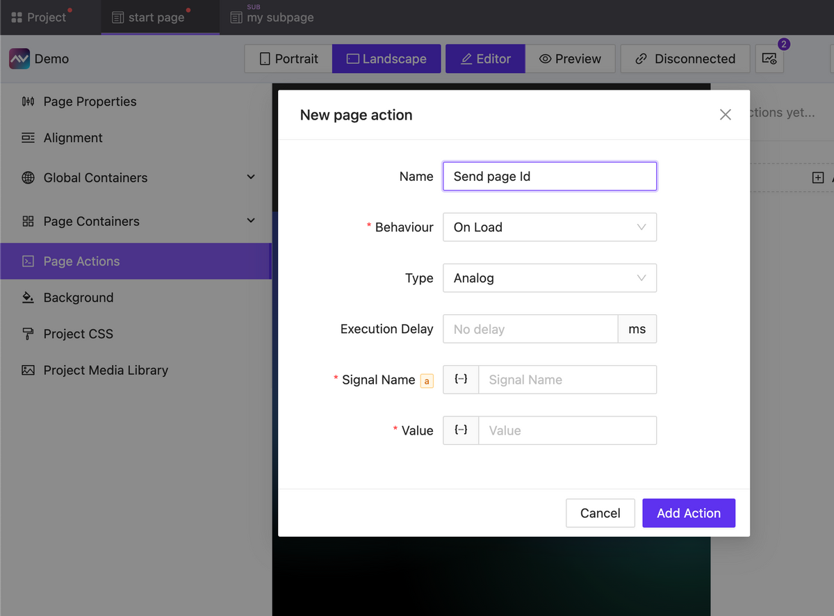
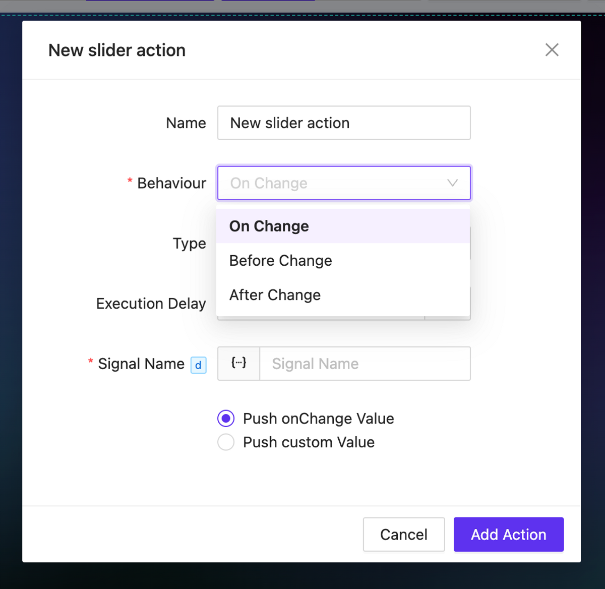
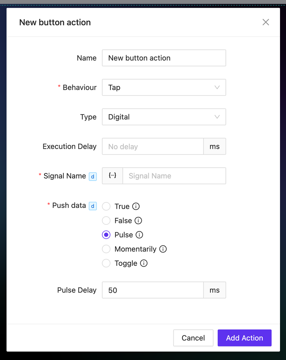
Actions updates: OnChange, Page Actions, new properties
NEW
Actions for pages (and subpages) have been added, which can be triggered upon the loading or unloading of a page (subpage).
For all types of events, you can now set a delay in the action execution.
For elements that imply a change in the value of something (such as sliders, checkboxes, inputs, etc.), onChange actions are available. These actions allow you to trigger any events before or after the value changes, as well as directly manipulate the changing value.
For the digital type action, numerous new options have been added for working with the sent value: momentaries and toggles are now available. Additionally, for the Pulse value type you can configure the delay for value transitions.
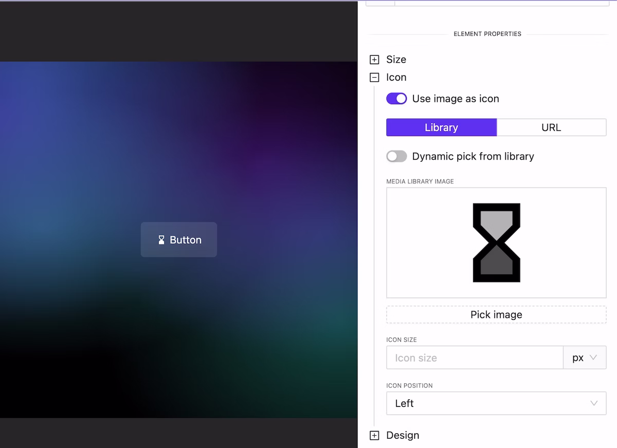
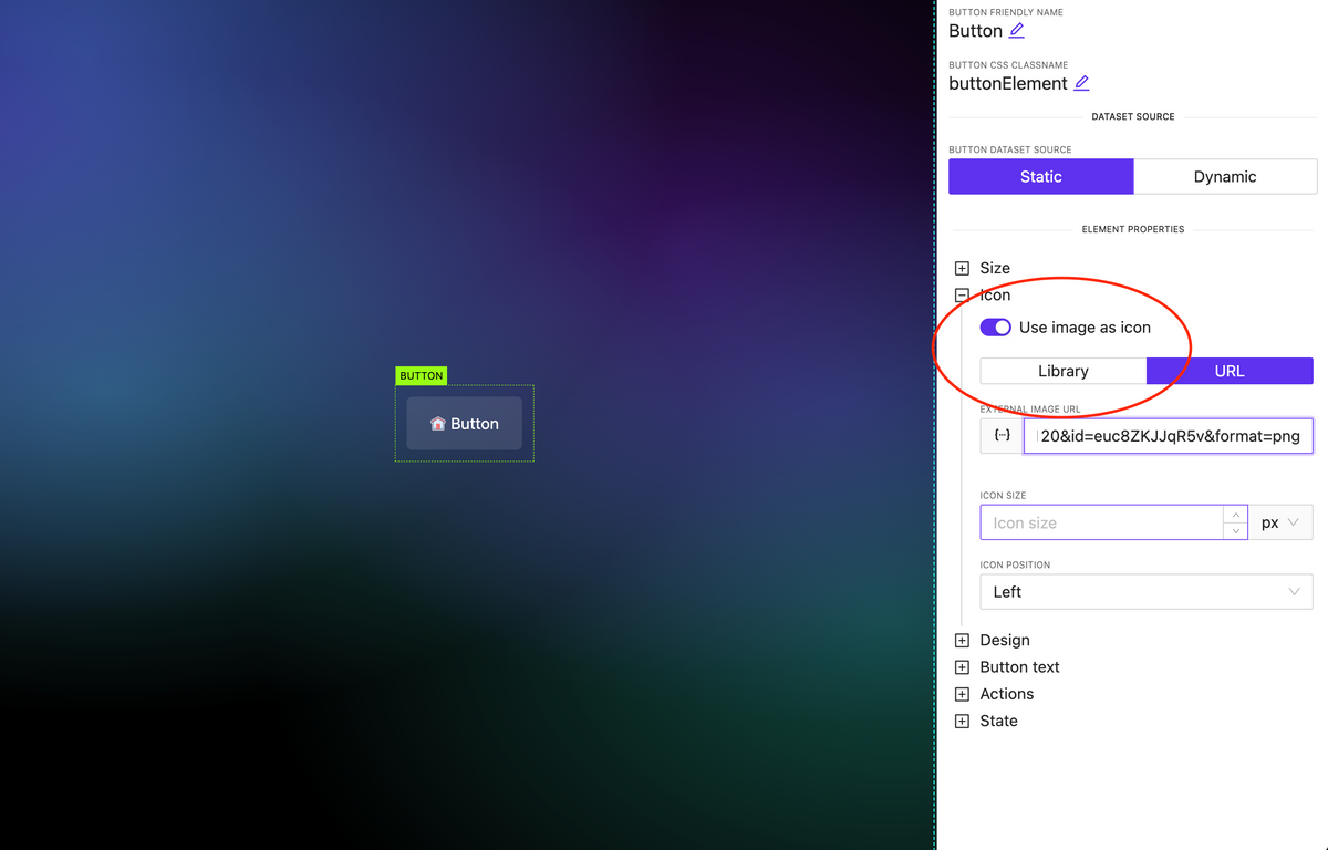
Image as Icon
NEW
In all elements where there is an icon specification (for example, a button), you can attach not only an icon available in one of the preinstalled libraries but also use any image. Moreover, this image can be loaded either from the library or dynamically.
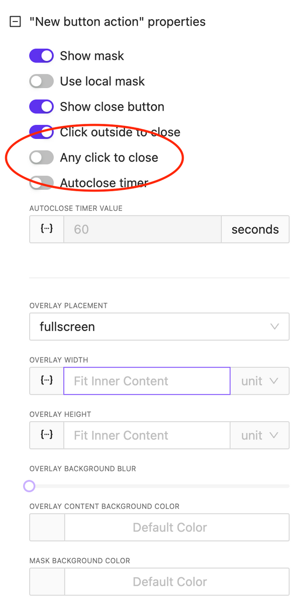
Overlay: Any Click to Close
NEW
An important option has been added for overlay control: the ability to close the overlay by clicking anywhere on the screen. This is useful for implementing informational pop-ups that do not require user interaction.
CSS & Code Editors updates
NEW
We have reformatted the appearance and display settings for code editors used for writing CSS and HTML block code. You can relocate the code edit and also expand it to full screen.
Bugfix & Small improvements
UPDATE BUGFIX
Fix touch actions in Crestron One
Added border support to many element
Fix bugs with value in multiply circle sliders on the page
More stable functions
Fix deep nested parameters values
Fix action info in sidebar, add ability to edit actions without need to recreate them
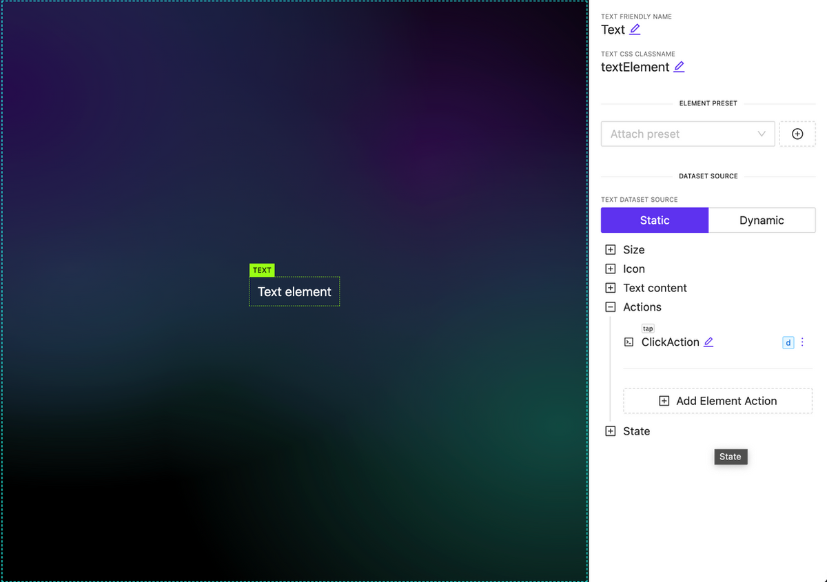
Ability to attach actions to Text, Image and Subpage elements
NEW
You can now associate various types of actions with new elements, such as subpages, images, and text. It’s important to note that any actions used within a subpage are executed independently.
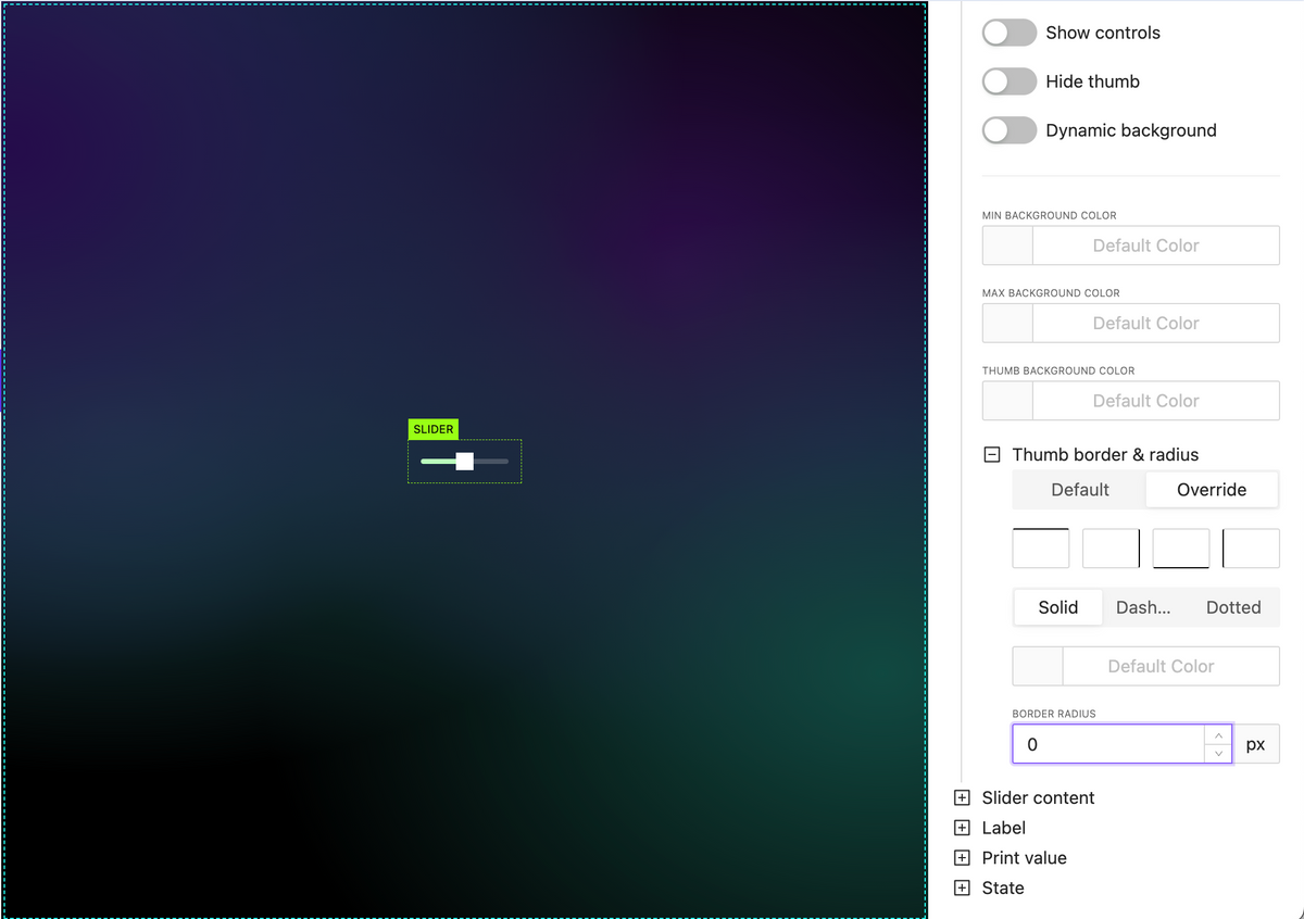
New slider handle style options
NEW
Hand border options including border radius
Hand background color
Pages & Subpages sorting
NEW
Allow set signal value in action as dynamic value (json, variables, etc)
NEW
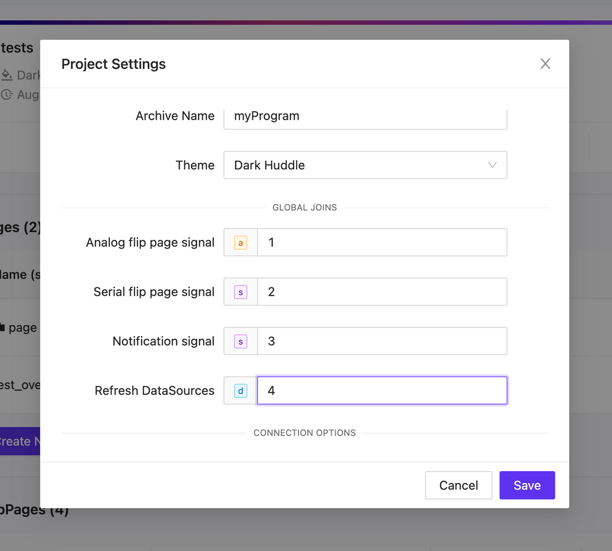
Project global joins
NEW
Analog flip page signal
Initiate a page flip from the processor using analog feedback. Remember to manually set the page flip ID for this operation.
Serial flip page signal
Trigger a page flip using the page name as a reference.
Notification signal
Inside your project settings, you have the option to define a serial signal name. When feedback is received from the processor, the text will be displayed as a notification using the specified signal name.
Refresh DataSources
Activate a datasources update by using signal feedback.
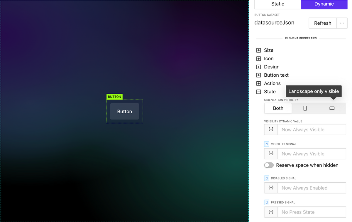
Element extended visibility
NEW
By orientation
Element orientation visibility refers to the position of an element, such as text, an image, or any other component, and whether it’s currently visible within the current orientation.
By dynamic value (variable, parameter, json datasource)
By utilizing dynamic values within your project, you can dynamically update whether elements are visible or not, all without the need for external processor interactions.
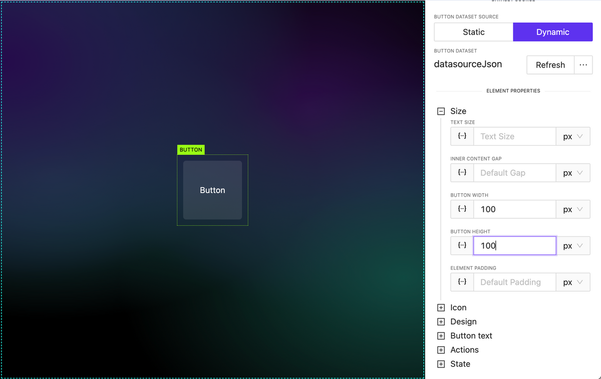
Added button height property
NEW
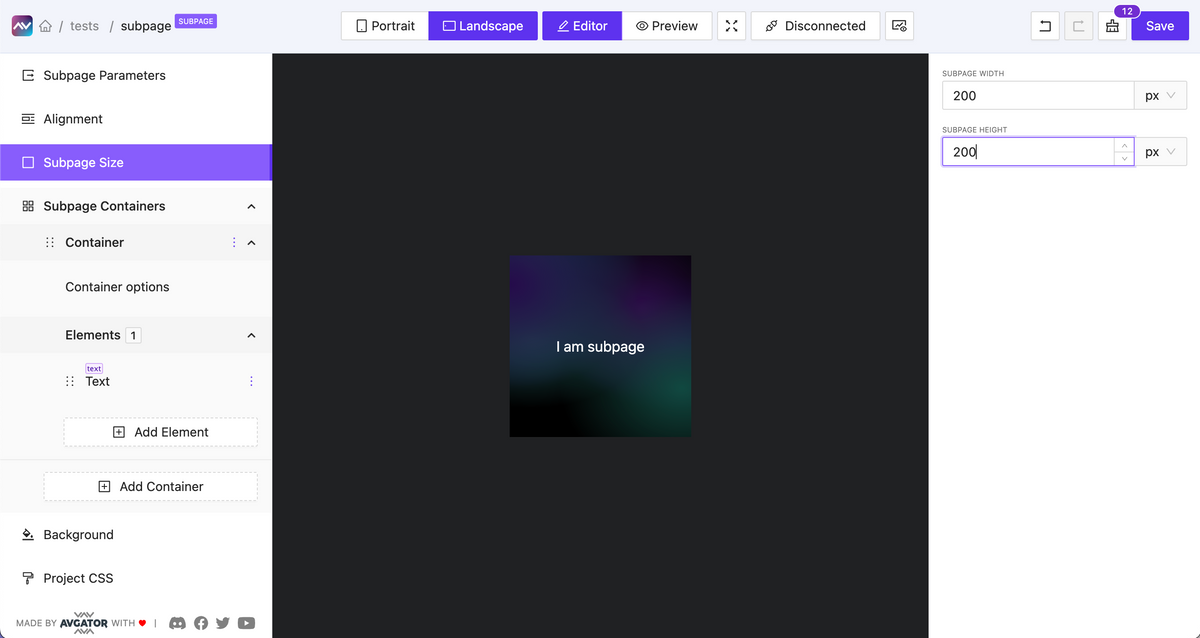
Subpage optional default fixed size
NEW
You can enable the option to set a fixed width and height for a subpage.
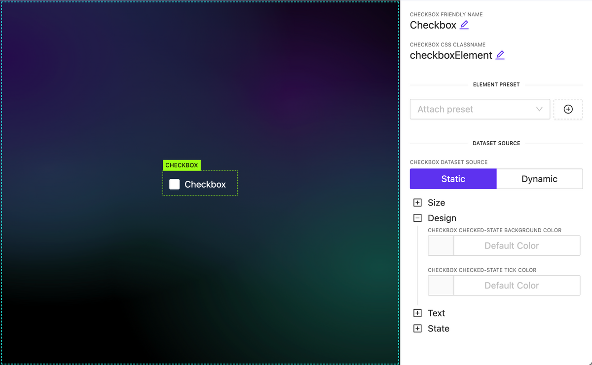
Added Checkbox element
NEW
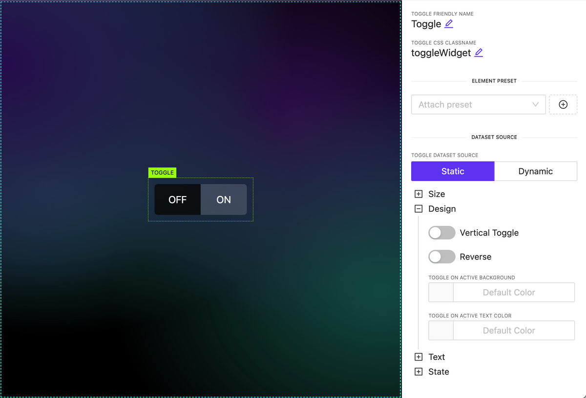
Added Toggle Switch widget
NEW
Added Circle Slider widget
NEW
A highly customizable circular slider widget that can be employed for various purposes, including climate and sound controls, among others. It allows dynamic content configuration for all elements inside.
Subpage parameters
NEW
Pass data from the parent element down to a nested subpage as input parameters and utilize this data within the subpage.
Overlays
NEW
A new action type has been introduced, functioning as a trigger to display an overlay. The overlay can be any type of subpage containing various data, appearing on top of the page content. Numerous customization options are available, including:
Adjustable overlay placement on the page.
Customizable overlay mask styles and local mask design.
Automatic closure by timeout or clicking outside the overlay.
Set icon dynamically
NEW
You can now set the icon name as a string, even when it’s sourced dynamically. To discover the full range of available icons, you can utilize the Icon Explorer feature, providing greater flexibility in choosing and displaying icons within your project.
To create a user interface on HTML5 for a Crestron control system, you can use a software tool like AVstudio by AVgator® Inc, which is specifically designed for this purpose.
Here are the basic steps to create a user interface using AVstudio:
Launch AVstudio and create a new project.
Configure the connection to your Crestron control system (e.g., IP address, WebSocket token).
Add UI elements (buttons, sliders, video windows, etc.) to your layout.
Assign join numbers or data bindings to connect interface elements to control system signals.
Use preview mode to test interactions in real time.
Customize layout using Fluid or Static page design approaches.
Save and export your project for deployment.
AVstudio supports various environments like Crestron One, Android App, PWA, and browsers, so you can create an interface that works across different platforms.
Additionally, AVstudio provides a built-in smart console and live debugging with a real processor to help you troubleshoot any issues and optimize your interface.
AVstudio by AVgator® Inc is an online-based HTML5 editor for creating GUIs for control systems like Crestron. You can access it at the following address: AVgator® Studio
Once you log in, you can start creating your project and designing your user interface. If you have any questions or issues, you can also contact support team for assistance.
Bright Conference Space HTML5 GUI
The difficulty level of creating a GUI in AVstudio will depend on your previous experience with GUI design and HTML5 development. However, AVstudio is designed to be a user-friendly and intuitive tool that requires no coding skills, making it accessible for people who are new to GUI design.
Riseup HTML5 GUI
AVstudio provides a drag-and-drop interface that allows you to select and place various elements, widgets, and controls onto your GUI canvas. You can customize the design and layout of your GUI using a variety of built-in themes, styles, and colors. Additionally, the tool provides a library of pre-built components, including buttons, sliders, labels, and images, that you can use to add interactivity and functionality to your interface.
Violet Huddle HTML5 GUI
If you do have coding skills, you can also add custom CSS and JavaScript to your project for even more flexibility and control.
Bright Modern Nest HTML5 GUI
Overall, while there may be a bit of a learning curve to become proficient with the tool, AVstudio is designed to be intuitive and accessible for users with varying levels of GUI design experience.
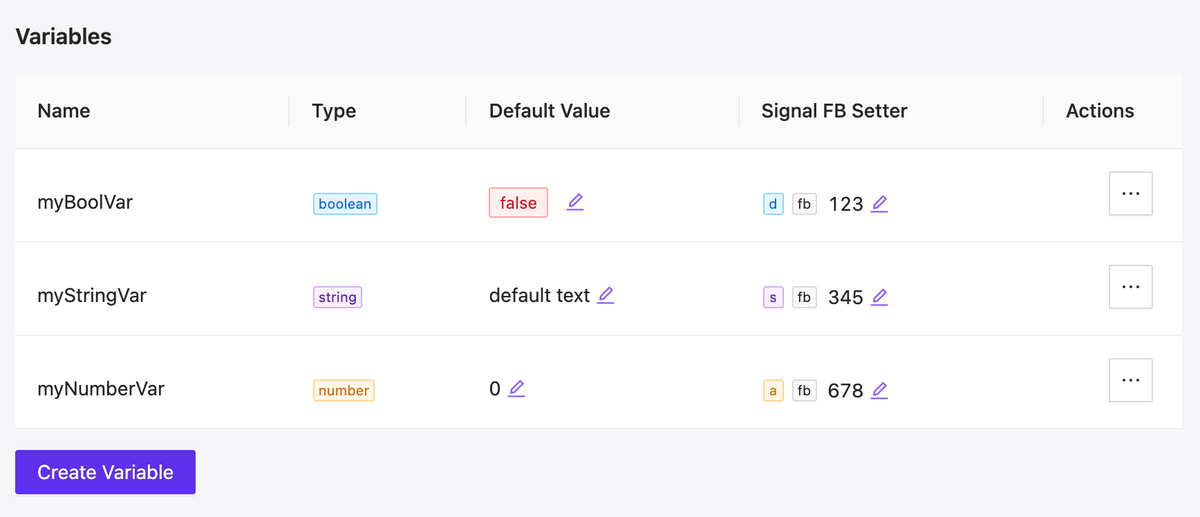
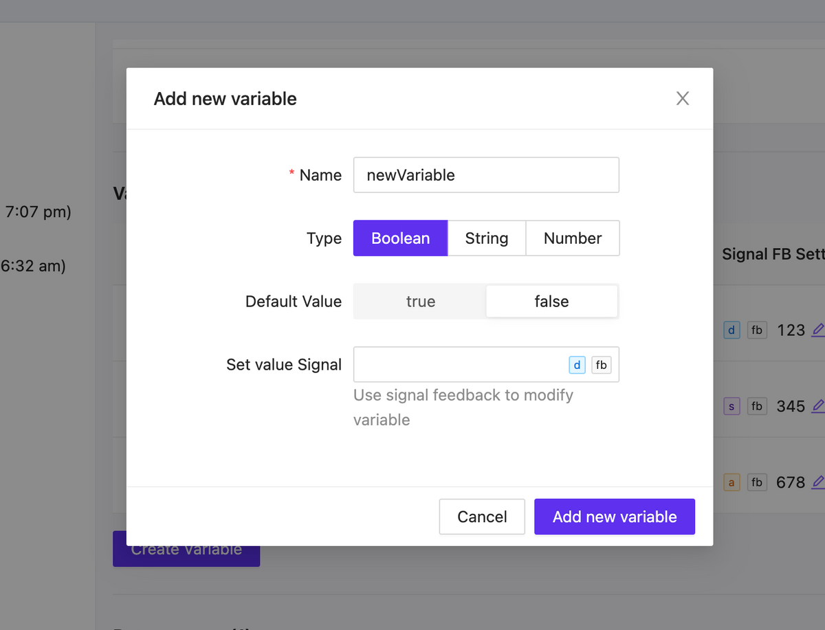
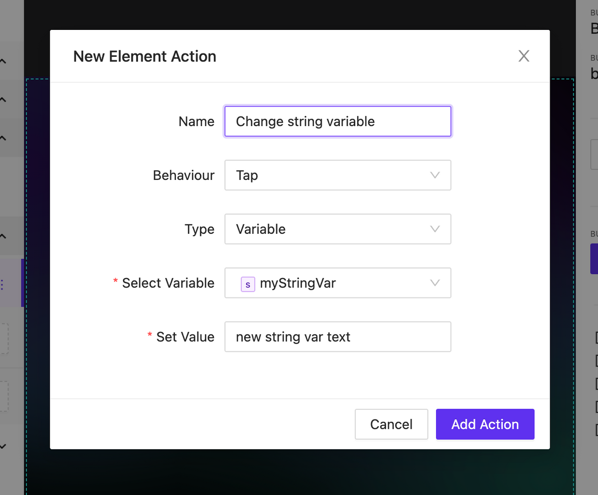
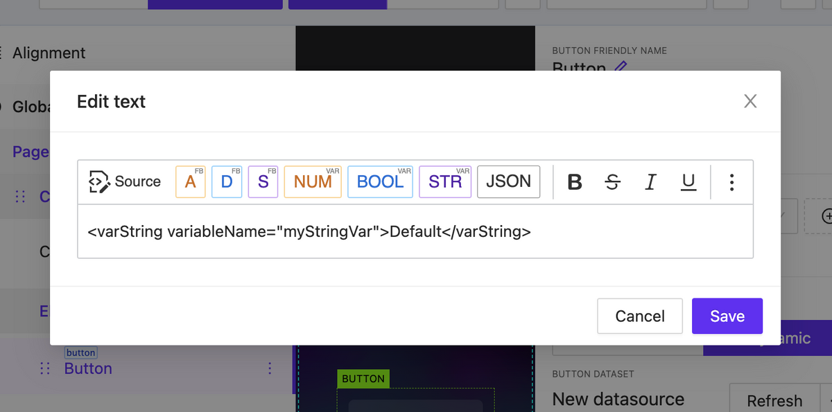
We have added local variables that can be used in your project. There are three types of variables: string, number, and boolean. The variables have default values and can be modified within the UI interaction, either without the involvement of the central processor or with its involvement taking on the value of signal feedback.
As a result you can implement a significant part of internal logic without involving the processor.
Variable list
Variable form
Action to change variable
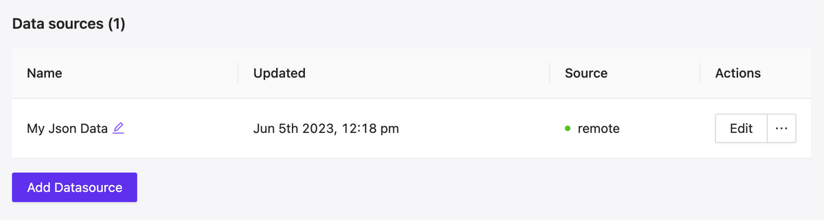
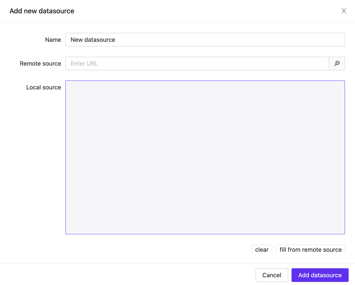
Project Datasources
NEW
A new feature has been added that allows you to connect JSON data to the project, either through a remote link or locally. These data can be used in any way you prefer: as text labels, numeric values for styling elements, data for building lists of items and much more.
Currently, after building, some of the logic with data sources may not work properly. However, in the upcoming updates, full support for data sources will be provided.
Datasource list
Datasource Modal
Rich text datasource & Variables support
NEW
Rich text content can now contain more than just plain text and print output signals feedback. It also supports working with connected data sources and local variables.
New Element: Button List
NEW
We have started adding a new type of element – lists. The first one released is called ButtonList, which is a set of buttons that can be generated based on static data or using a data source attached to the element.
Lists have a wide range of display settings for their child elements. These settings include specifying the scroll axis, the number of rows and columns, positioning within the container, and much more.
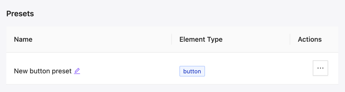
Presets for elements
NEW
We have added presets for elements, which allow you to save the appearance and settings of an element and efficiently reuse it. Additionally, you can easily change the appearance of all buttons in the project that are linked to a preset with just a few clicks.