Tag: Updates

  • What’s New in Version 0.24: A Comprehensive Overview of the Latest Updates and Features

    New Element: Text Input

     NEW

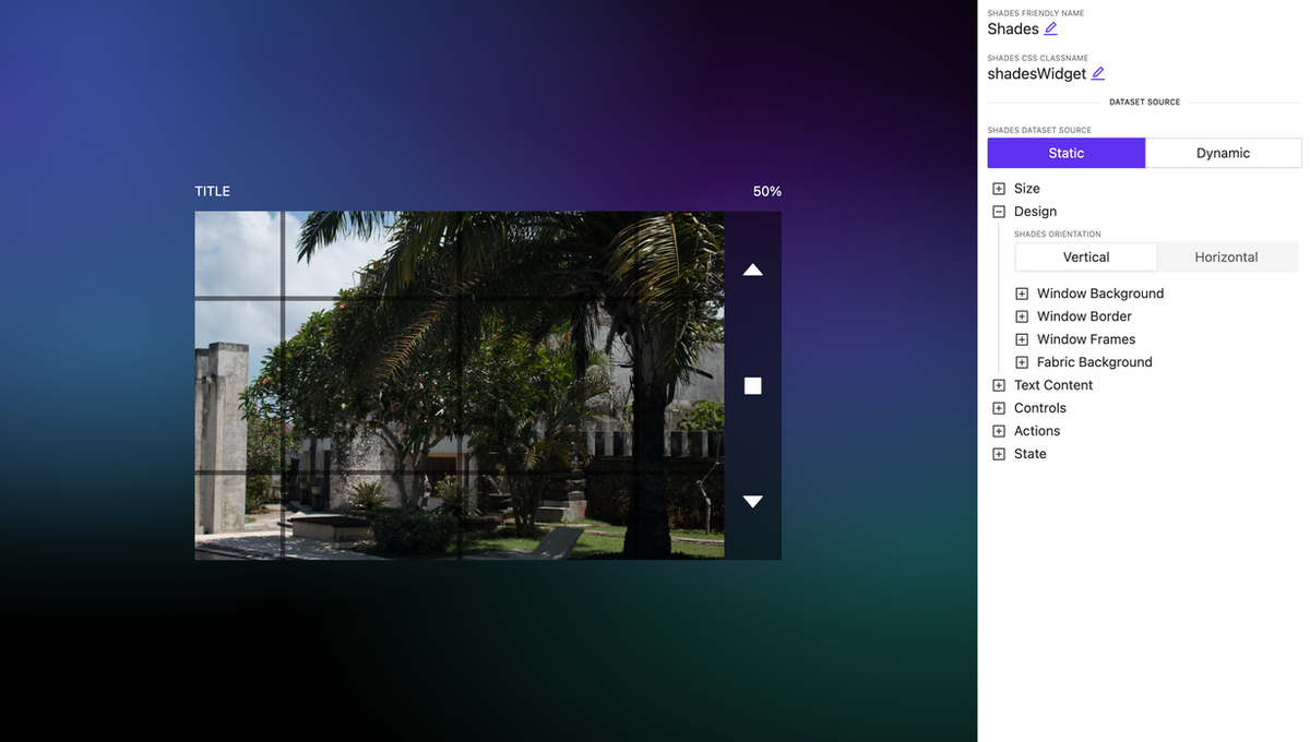
    A new widget for controlling shades with rich appearance and display settings.

    Shades control

    Shades control

    HTML block element

     NEW

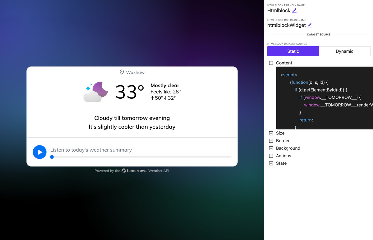
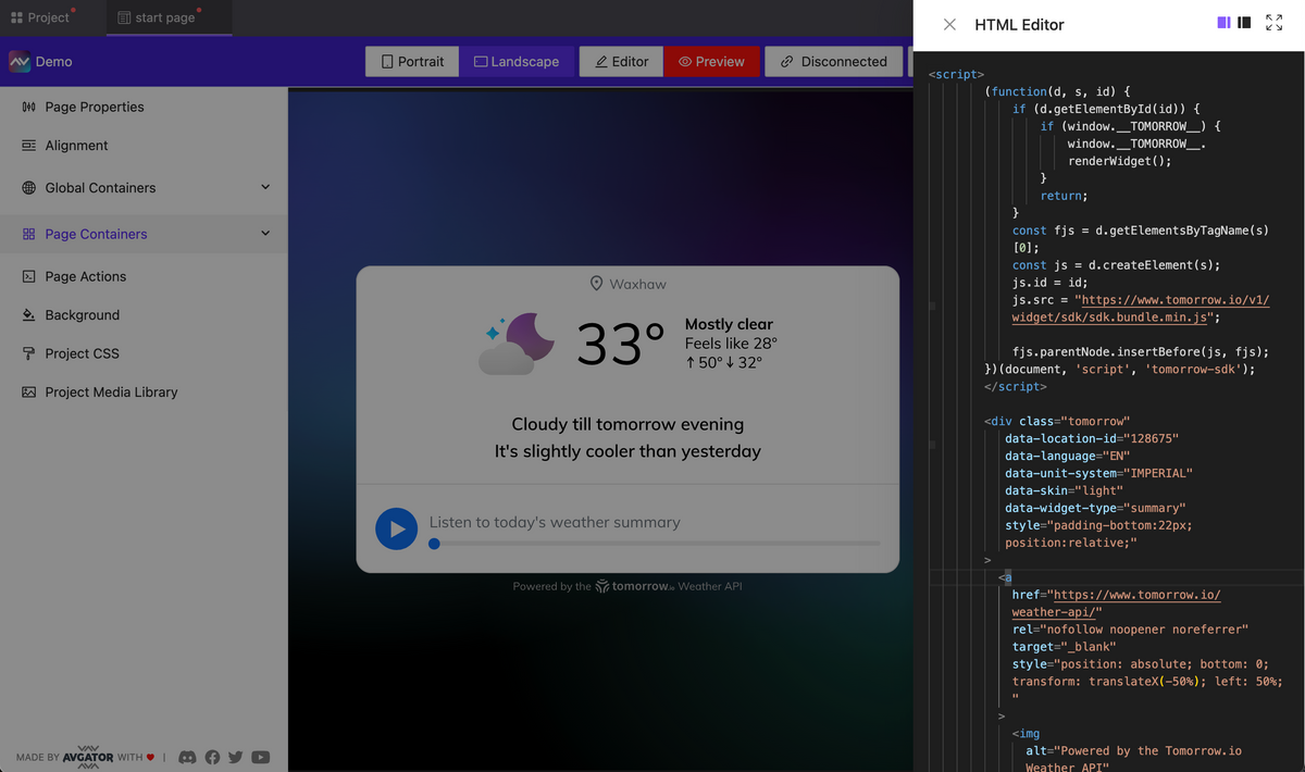
    A new element has been introduced allowing you to embed HTML code, including tags, styles, and scripts. For example, in about 30 seconds, you can insert a fully functional web widget for weather, and it will work seamlessly and display on your page.

    HTML block element

    More control over the management of pages and subpages

     NEW

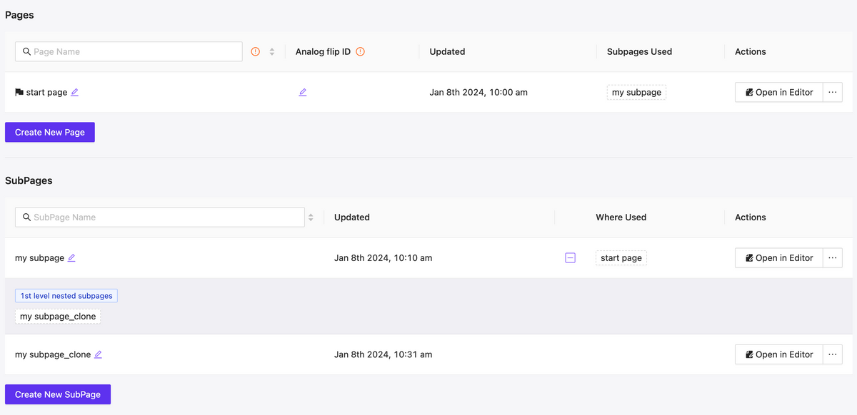
    Fast filtering as well as mutual mapping of utilized pages and subpages, allows for quick orientation and navigating to edit relevant components, understanding their hierarchy.

    Pages & Subpages interface updated

    Pages & Subpages interface updated

    Extend dynamic support

     NEW

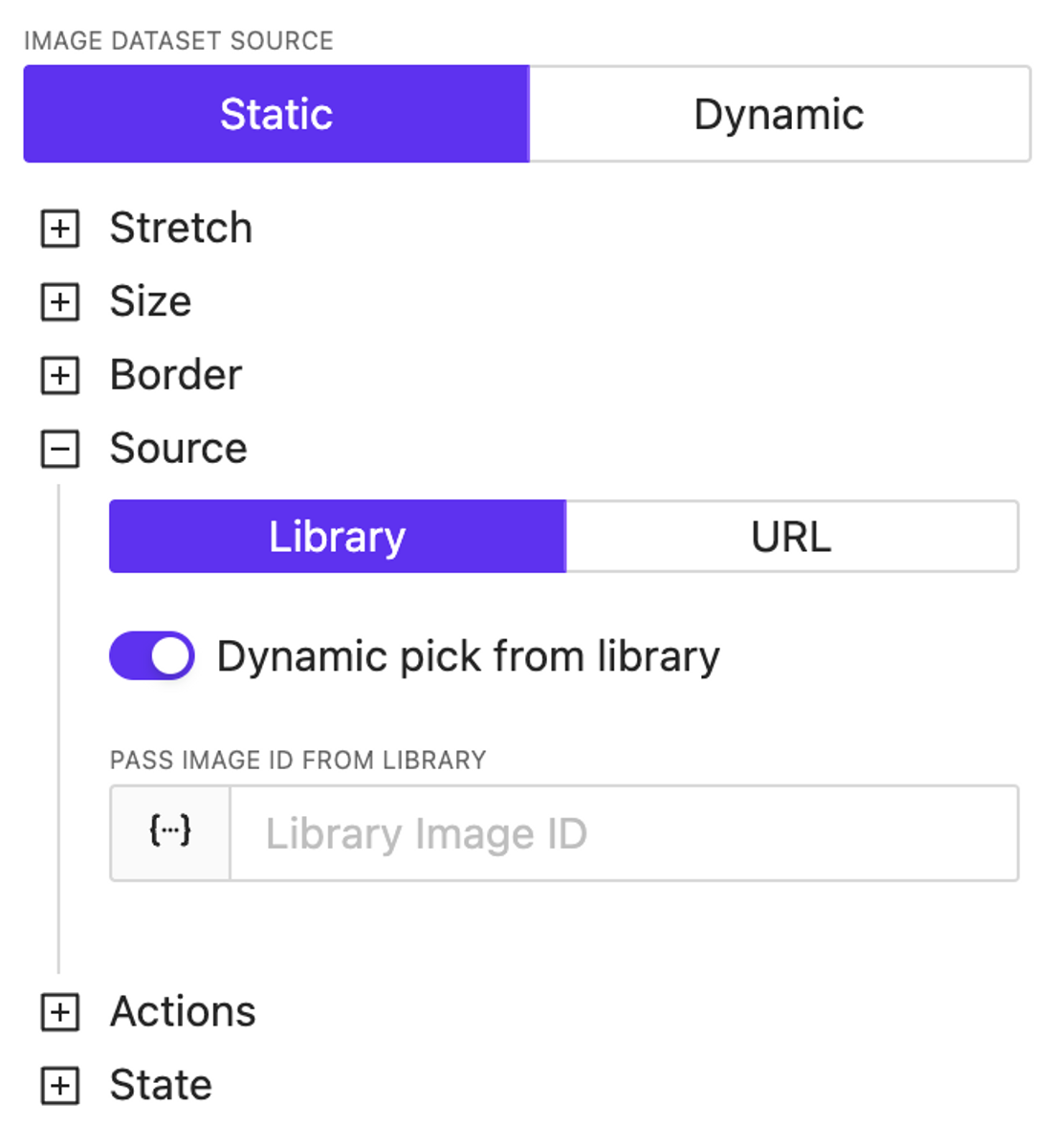
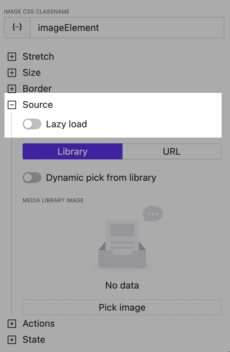
    We’ve introduced dynamic support for color settings across almost all elements. Additionally, the image source specification is now entirely dynamic—you can use both URLs and dynamically reference images previously loaded into the library, including the use of variables and/or a datasource.
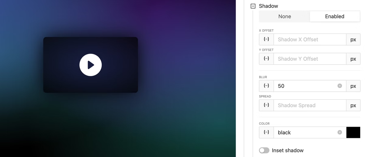
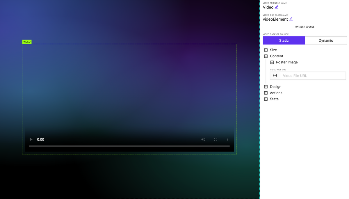
    Video element

     NEW

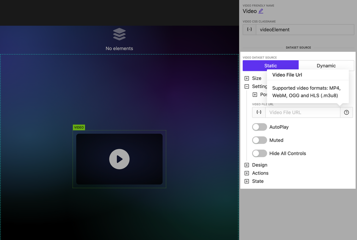
    A video element has been added. Currently, it’s the most basic implementation; later, we’ll update the list of supported properties and display settings for this element.

    Video element

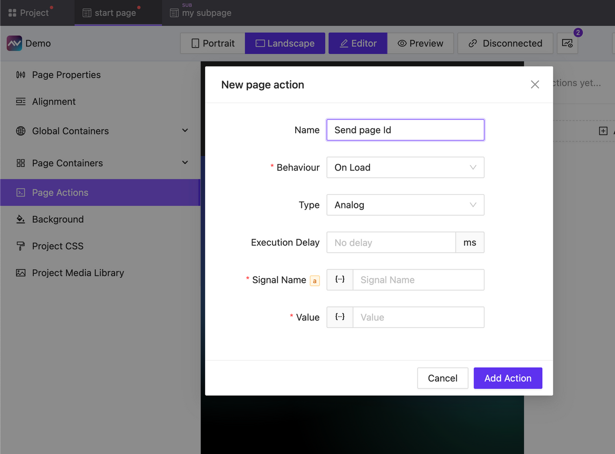
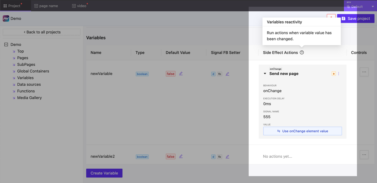
    Actions updates: OnChange, Page Actions, new properties

     NEW

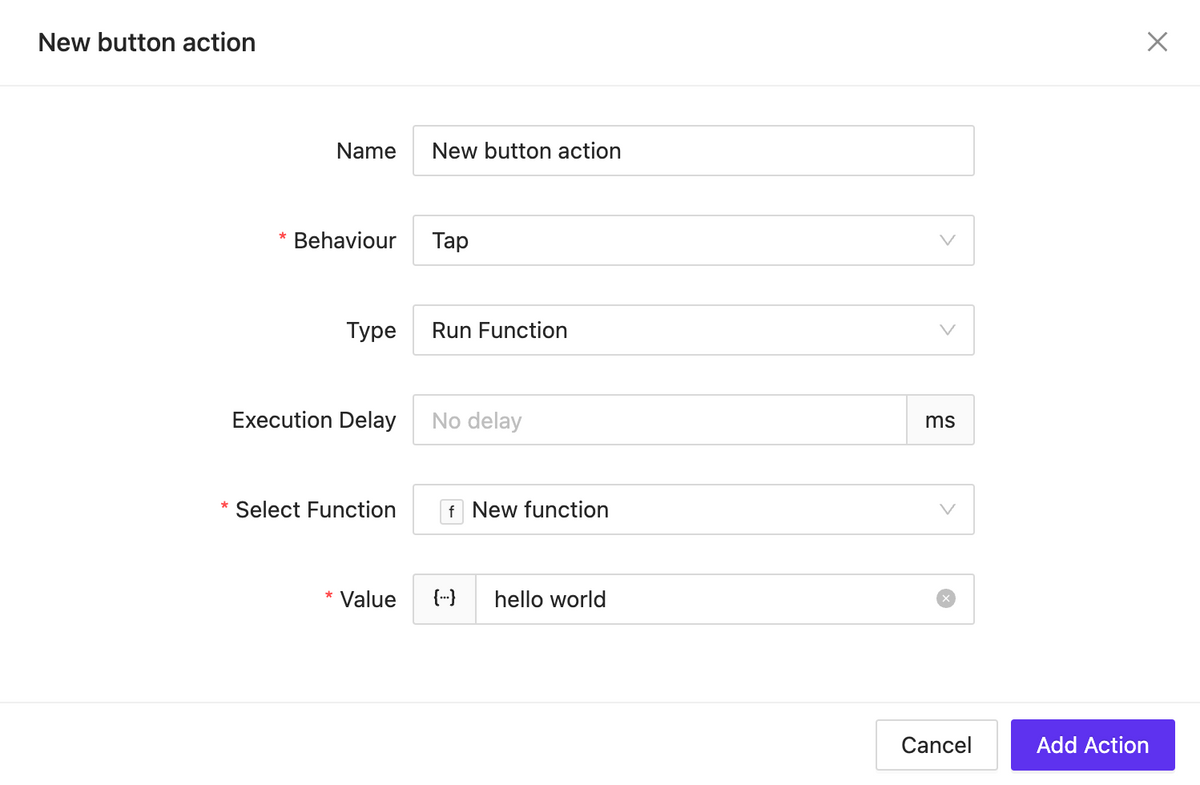
    Actions for pages (and subpages) have been added, which can be triggered upon the loading or unloading of a page (subpage).

    For all types of events, you can now set a delay in the action execution.

    Actions updates: OnChange, Page Actions, new properties

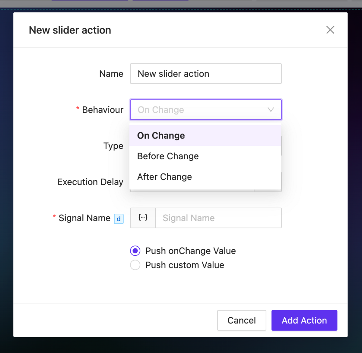
    For elements that imply a change in the value of something (such as sliders, checkboxes, inputs, etc.), onChange actions are available. These actions allow you to trigger any events before or after the value changes, as well as directly manipulate the changing value.

    For elements that imply a change in the value of something (such as sliders, checkboxes, inputs, etc.), onChange actions are available

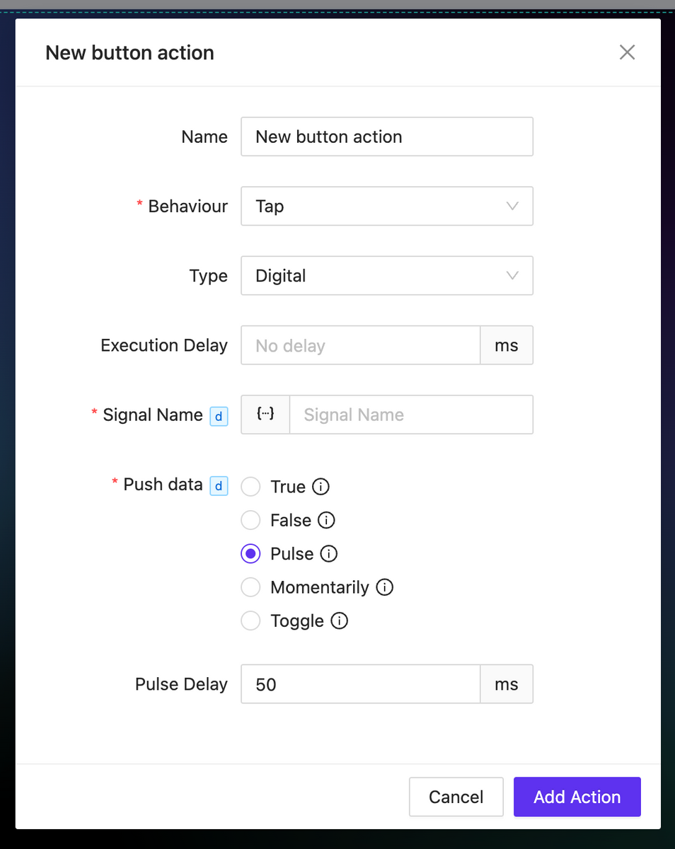
    For the digital type action, numerous new options have been added for working with the sent value: momentaries and toggles are now available. Additionally, for the Pulse value type you can configure the delay for value transitions.

    digital action

    Image as Icon

     NEW

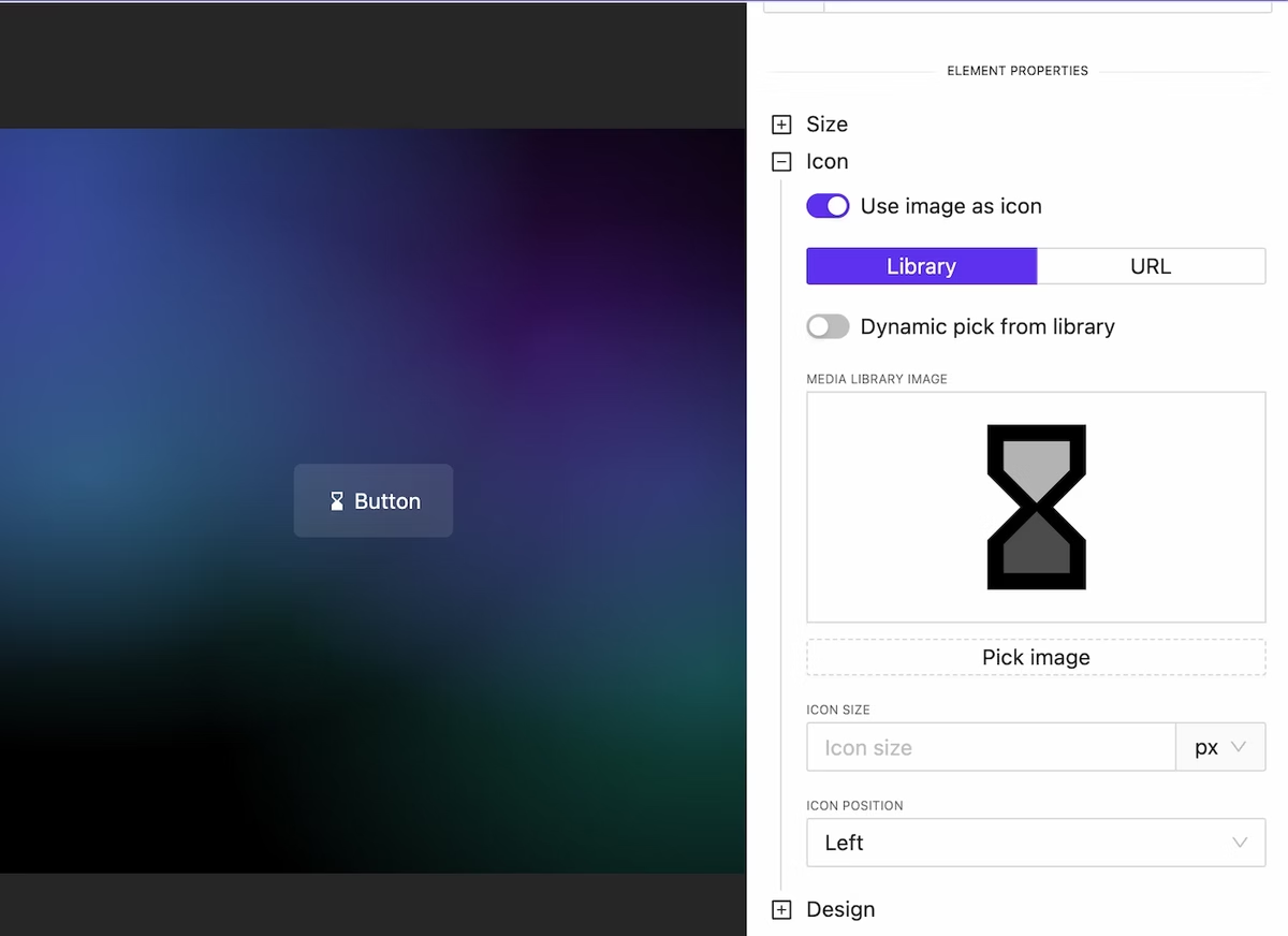
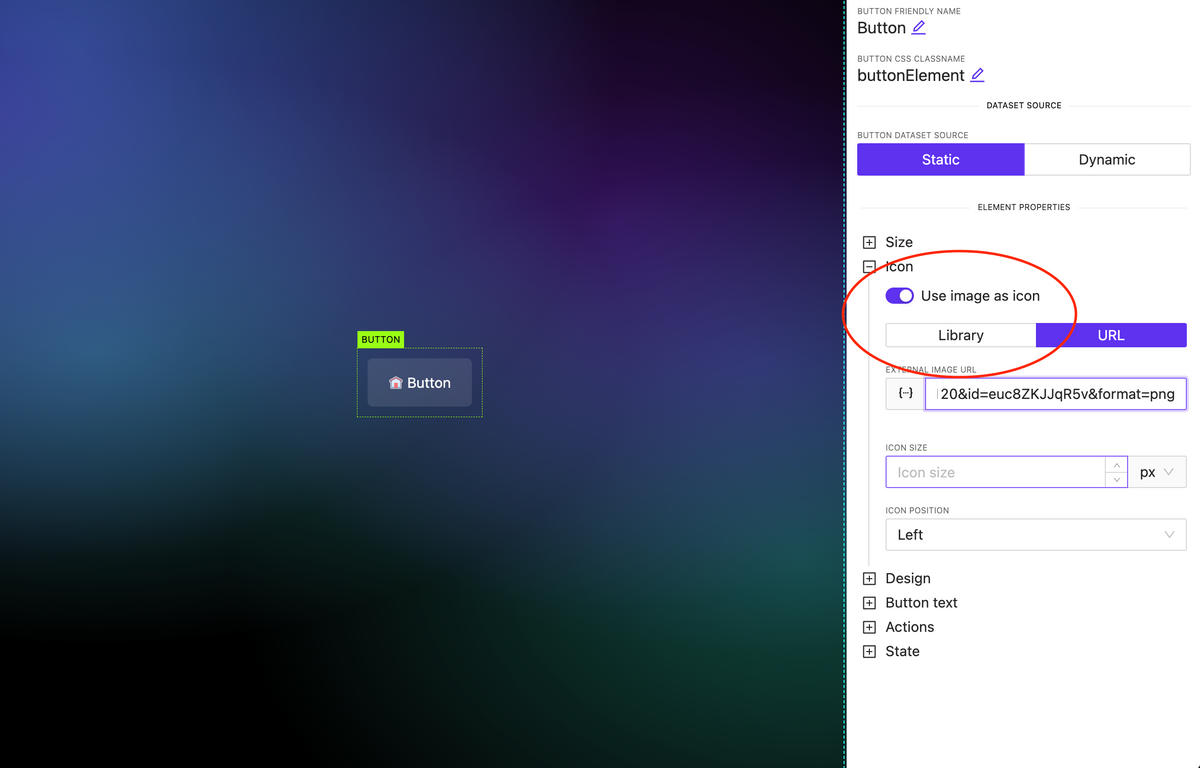
    In all elements where there is an icon specification (for example, a button), you can attach not only an icon available in one of the preinstalled libraries but also use any image. Moreover, this image can be loaded either from the library or dynamically.

    Image as Icon

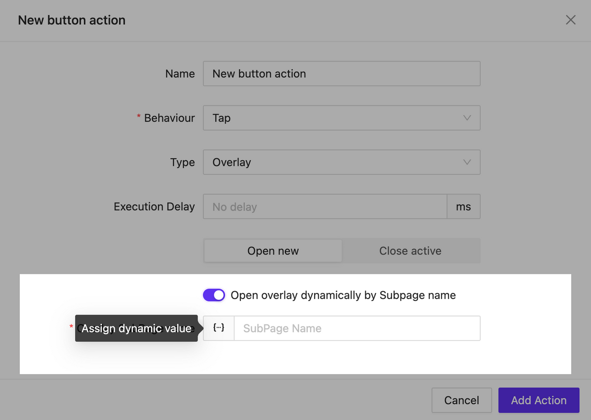
    Overlay: Any Click to Close

     NEW

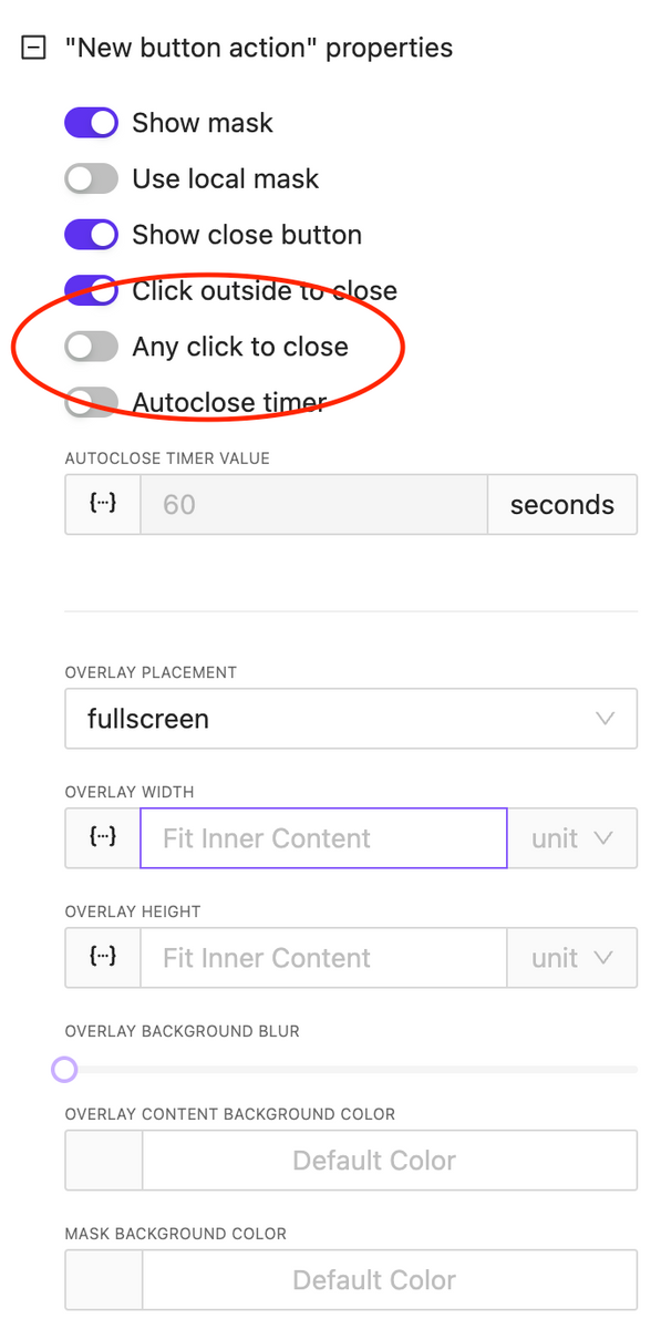
    An important option has been added for overlay control: the ability to close the overlay by clicking anywhere on the screen. This is useful for implementing informational pop-ups that do not require user interaction.

    overlay any click to close

    CSS & Code Editors updates

     NEW

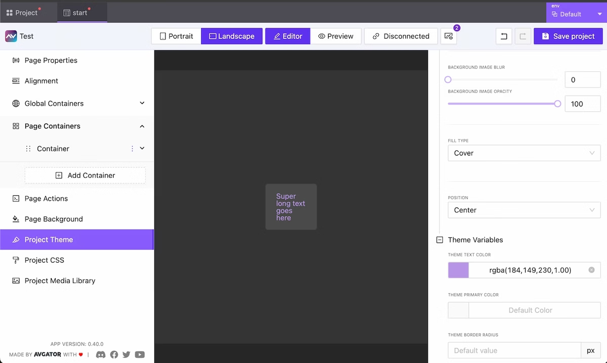
    We have reformatted the appearance and display settings for code editors used for writing CSS and HTML block code. You can relocate the code edit and also expand it to full screen.

    CSS & Code Editors updates

    Bugfix & Small improvements

     UPDATE BUGFIX

    • Fix touch actions in Crestron One
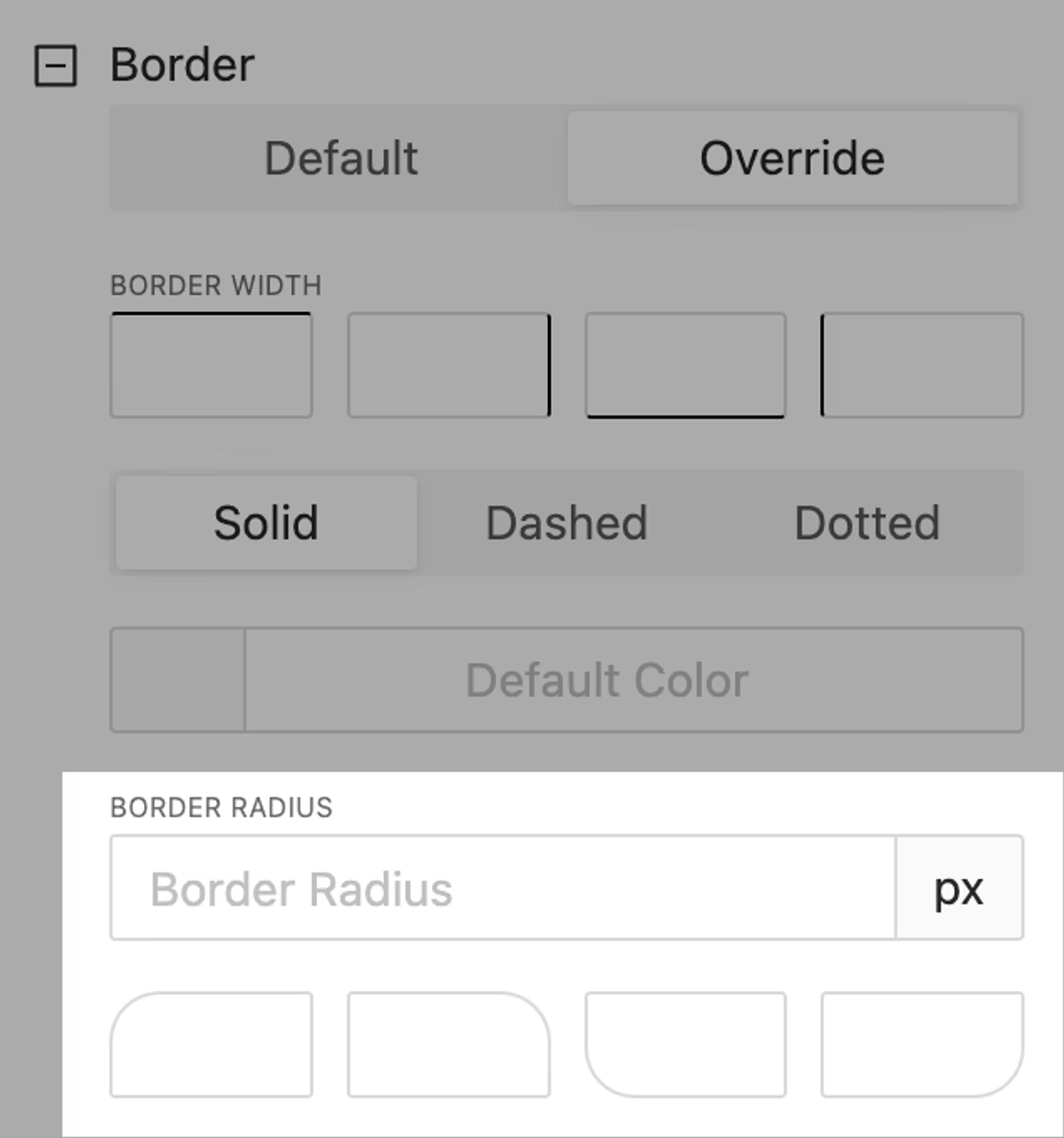
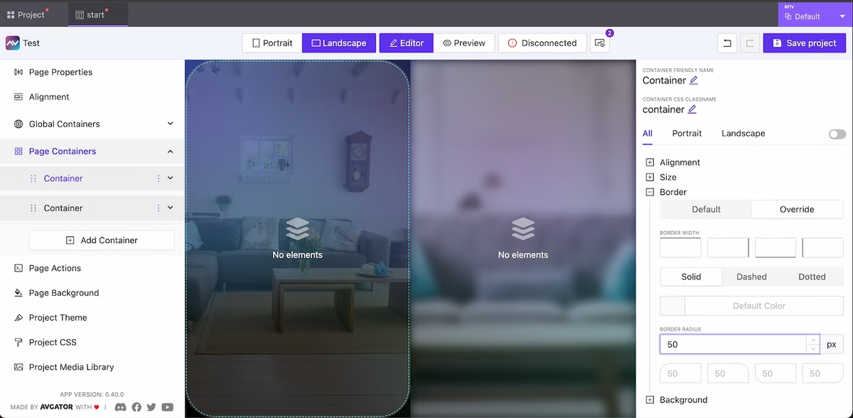
    • Added border support to many element
    • Fix bugs with value in multiply circle sliders on the page
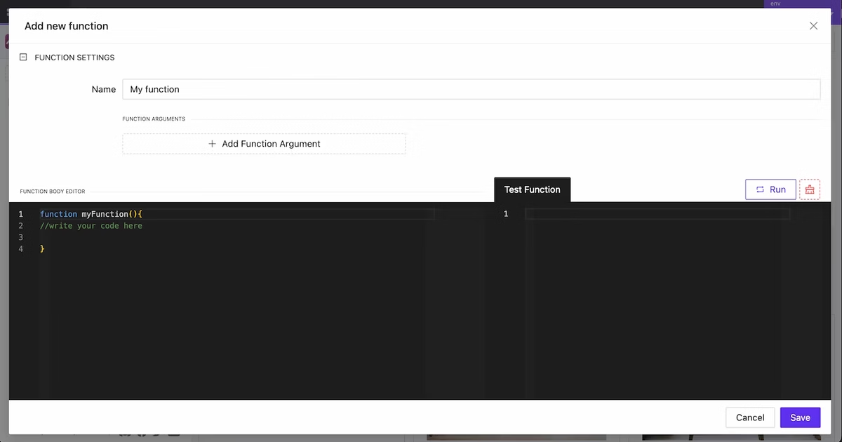
    • More stable functions
    • Fix deep nested parameters values
    • Fix action info in sidebar, add ability to edit actions without need to recreate them
    • Create user profile page
    • Added background color for toggle widget
    • Change JSON viewer to the code editor
    • Added dynamic support to the page BG
    • Added filtering for the single element generation
    • Fix show Overlay when subpage is a trigger
    • Fix element selection in global container
    • Improved element reposition by drag
    • Added background blur option for overlay
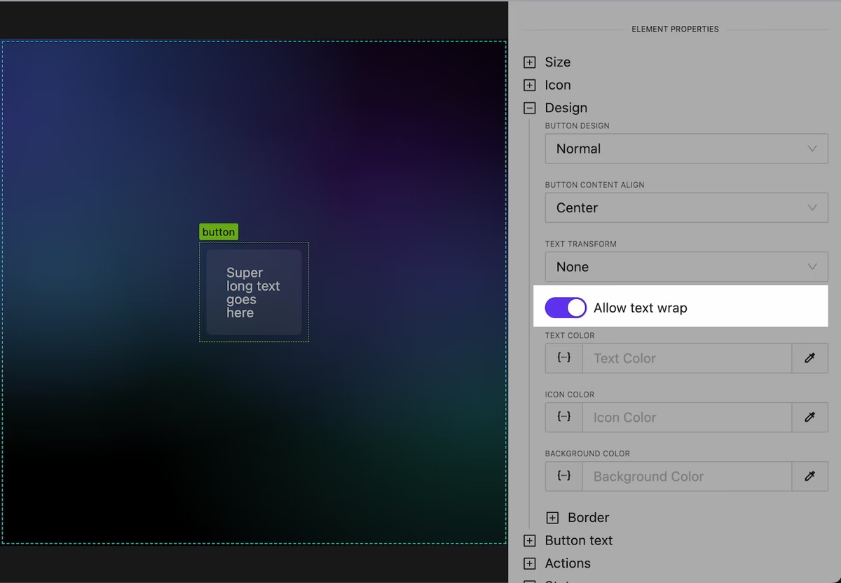
    • Added text uppercase option
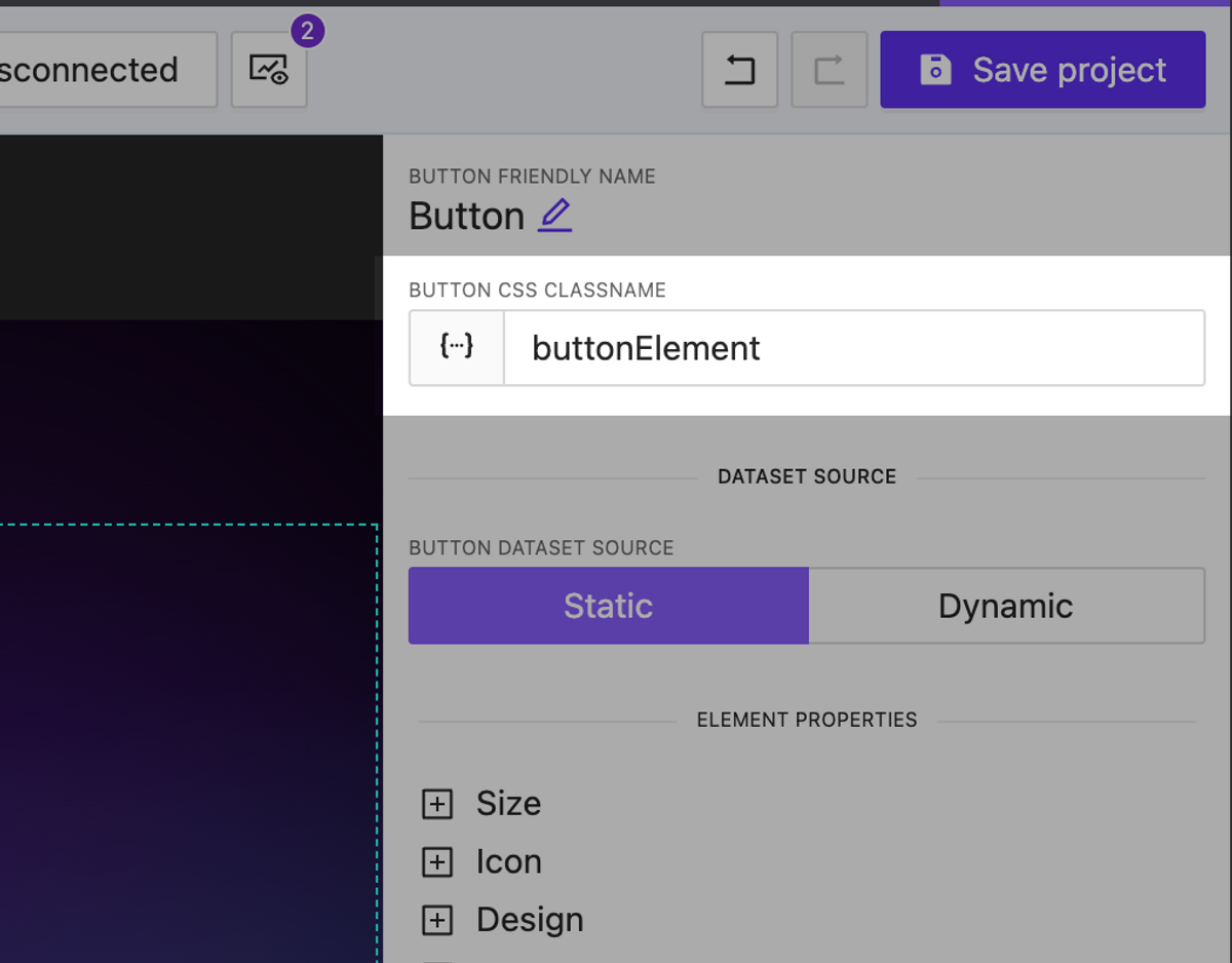
    • Added text color to button, text elements
    • Better image caching
    • …and many more
  • Version 0.21

    Version 0.21

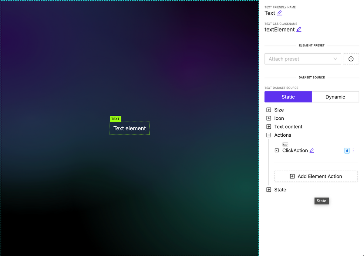
    Ability to attach actions to Text, Image and Subpage elements

     NEW

    You can now associate various types of actions with new elements, such as subpages, images, and text. It’s important to note that any actions used within a subpage are executed independently.

    Ability to attach actions to Text, Image and Subpage elements

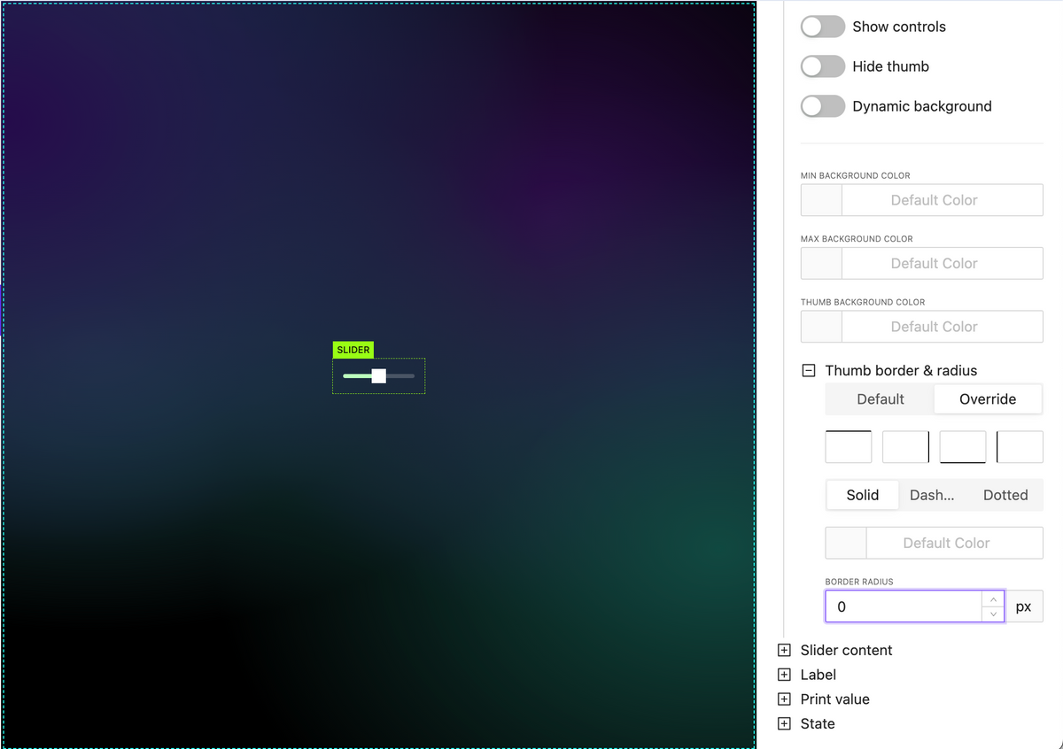
    New slider handle style options

     NEW

    • Hand border options including border radius
    • Hand background color
    New slider handle style options

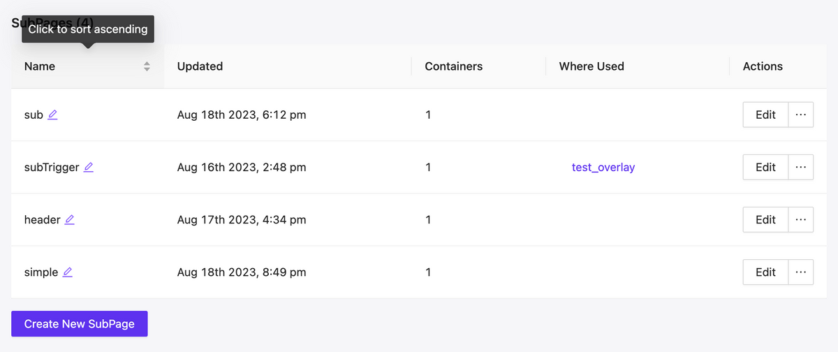
    Pages & Subpages sorting

     NEW

    Pages & Subpages sorting

    Allow set signal value in action as dynamic value (json, variables, etc)

     NEW

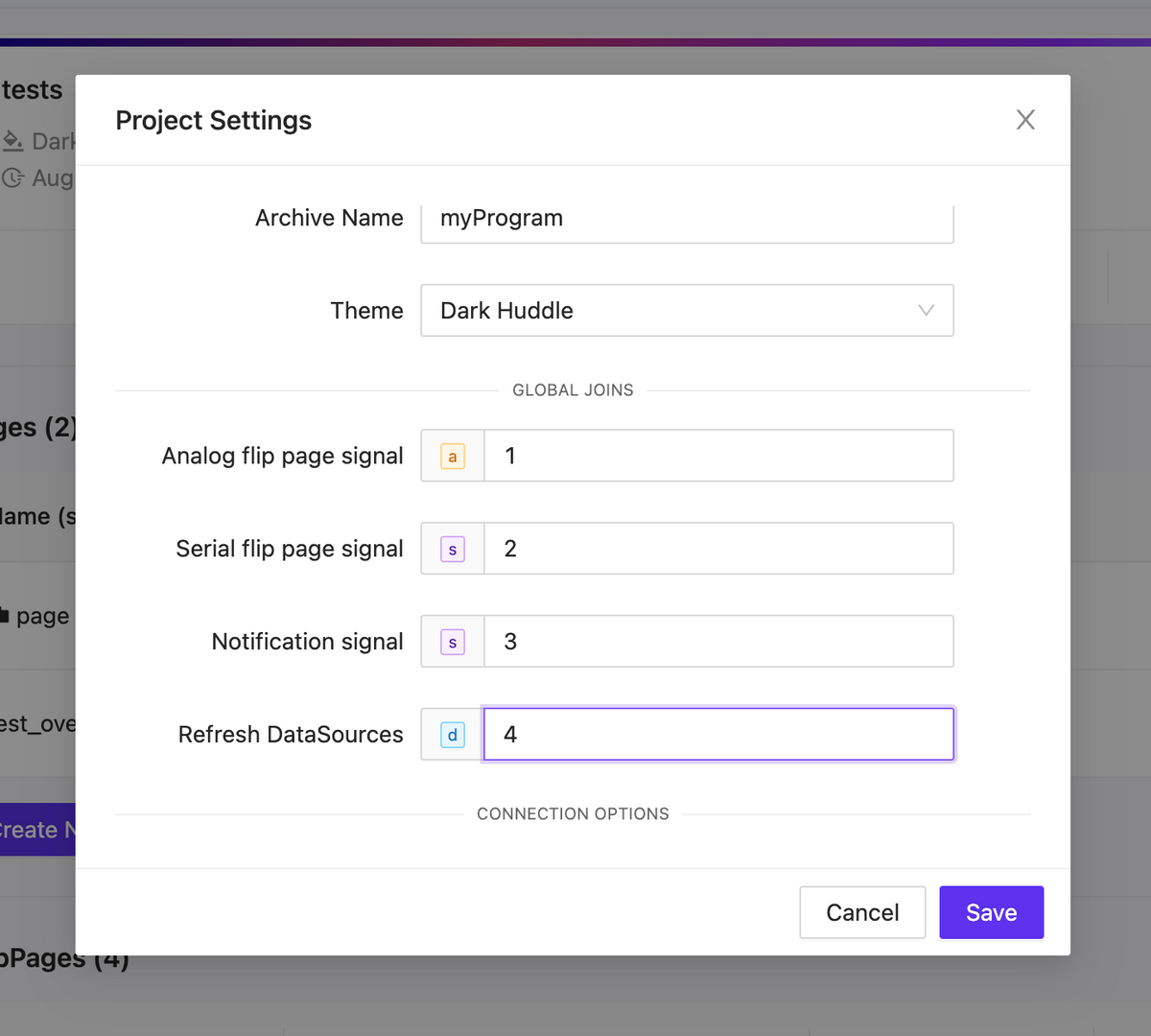
    Project global joins

     NEW

    • Analog flip page signal

    Initiate a page flip from the processor using analog feedback. Remember to manually set the page flip ID for this operation.

    • Serial flip page signal

    Trigger a page flip using the page name as a reference.

    • Notification signal

    Inside your project settings, you have the option to define a serial signal name. When feedback is received from the processor, the text will be displayed as a notification using the specified signal name.

    • Refresh DataSources

    Activate a datasources update by using signal feedback.

    Project global joins

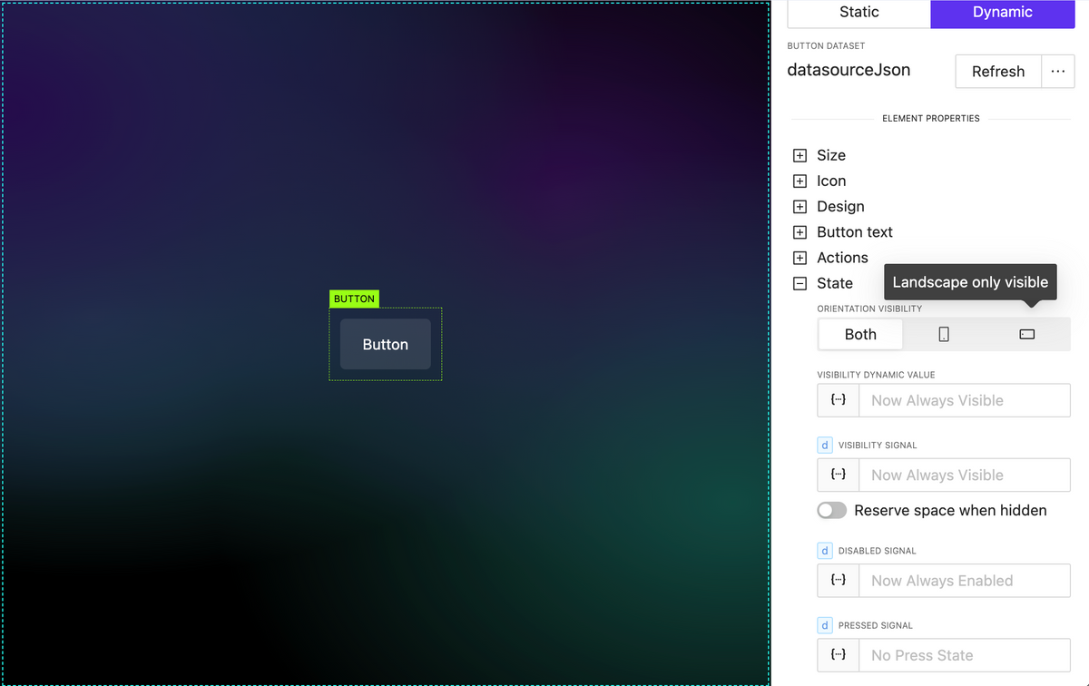
    Element extended visibility

     NEW

    • By orientation

    Element orientation visibility refers to the position of an element, such as text, an image, or any other component, and whether it’s currently visible within the current orientation.

    • By dynamic value (variable, parameter, json datasource)

    By utilizing dynamic values within your project, you can dynamically update whether elements are visible or not, all without the need for external processor interactions.

    Element extended visibility

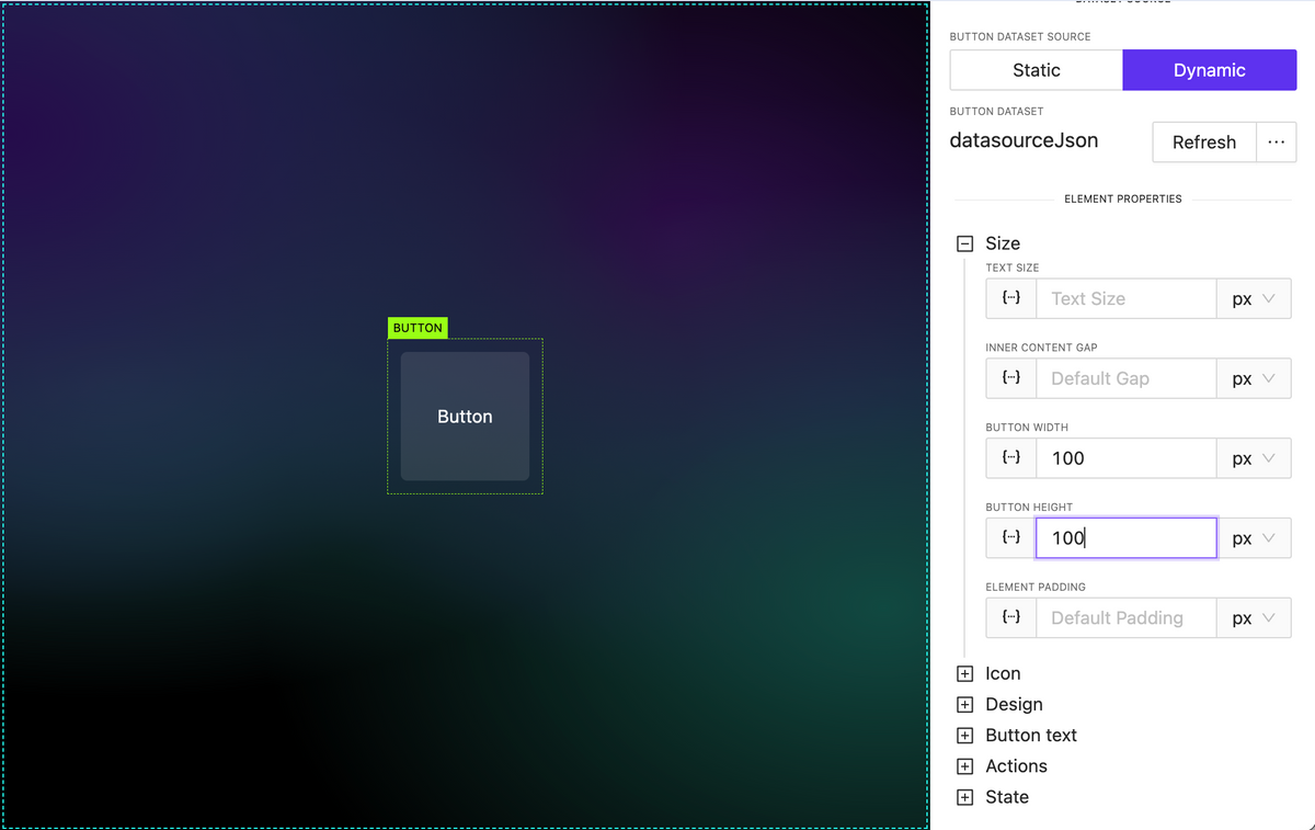
    Added button height property

     NEW

    Added button height property

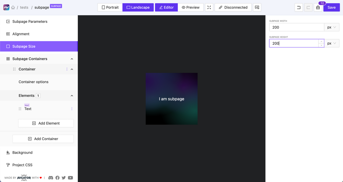
    Subpage optional default fixed size

     NEW

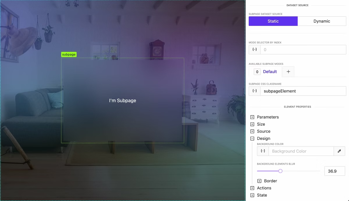
    You can enable the option to set a fixed width and height for a subpage.

    Subpage optional default fixed size

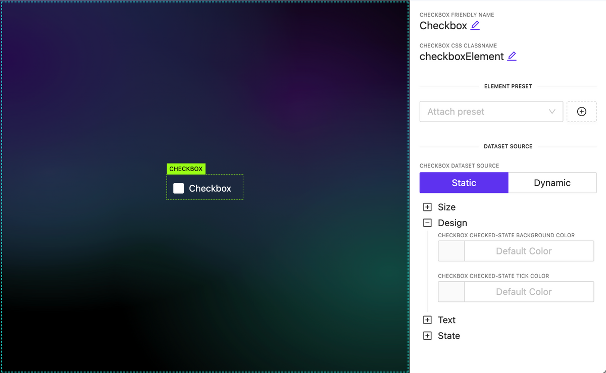
    Added Checkbox element

     NEW

    Added Checkbox element

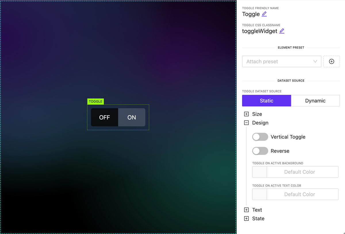
    Added Toggle Switch widget

     NEW

    Added Toggle Switch widget

    Added Circle Slider widget

     NEW

    A highly customizable circular slider widget that can be employed for various purposes, including climate and sound controls, among others. It allows dynamic content configuration for all elements inside.

    Subpage parameters

     NEW

    Pass data from the parent element down to a nested subpage as input parameters and utilize this data within the subpage.

    Overlays

     NEW

    A new action type has been introduced, functioning as a trigger to display an overlay. The overlay can be any type of subpage containing various data, appearing on top of the page content. Numerous customization options are available, including:

    • Adjustable overlay placement on the page.
    • Customizable overlay mask styles and local mask design.
    • Automatic closure by timeout or clicking outside the overlay.

    Set icon dynamically

     NEW

    You can now set the icon name as a string, even when it’s sourced dynamically. To discover the full range of available icons, you can utilize the Icon Explorer feature, providing greater flexibility in choosing and displaying icons within your project.

    Dynamic image external source

    NEW

  • Version 0.20 | Project variables

    Version 0.20 | Project variables

    Project variables

     NEW

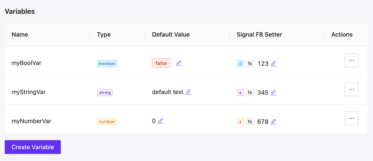
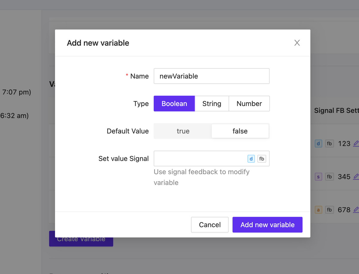
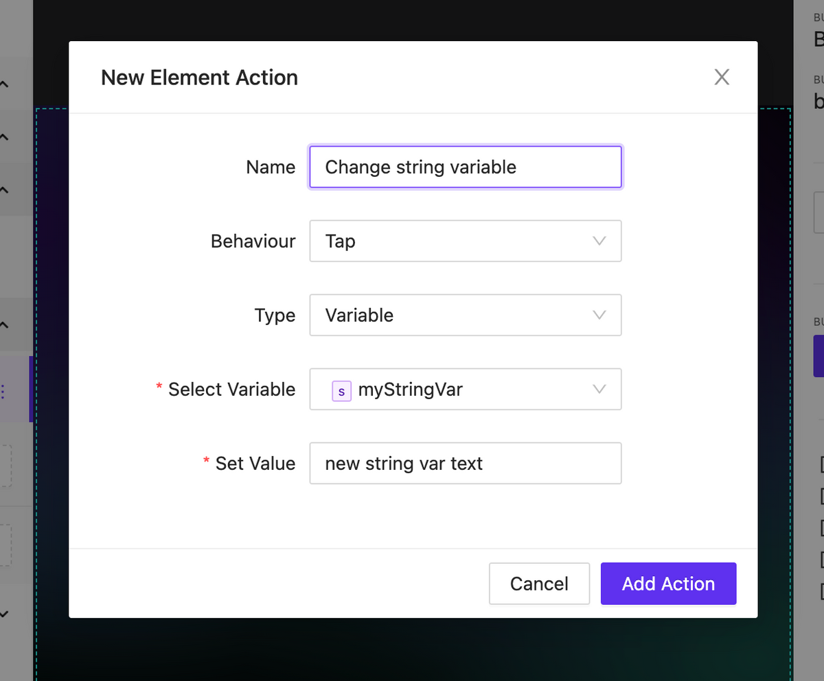
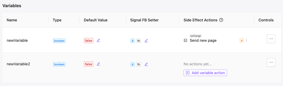
    We have added local variables that can be used in your project. There are three types of variables: string, number, and boolean. The variables have default values and can be modified within the UI interaction, either without the involvement of the central processor or with its involvement taking on the value of signal feedback.

    As a result you can implement a significant part of internal logic without involving the processor.

    variable list

    Variable list

    variable form

    Variable form

    action to change variable

    Action to change variable

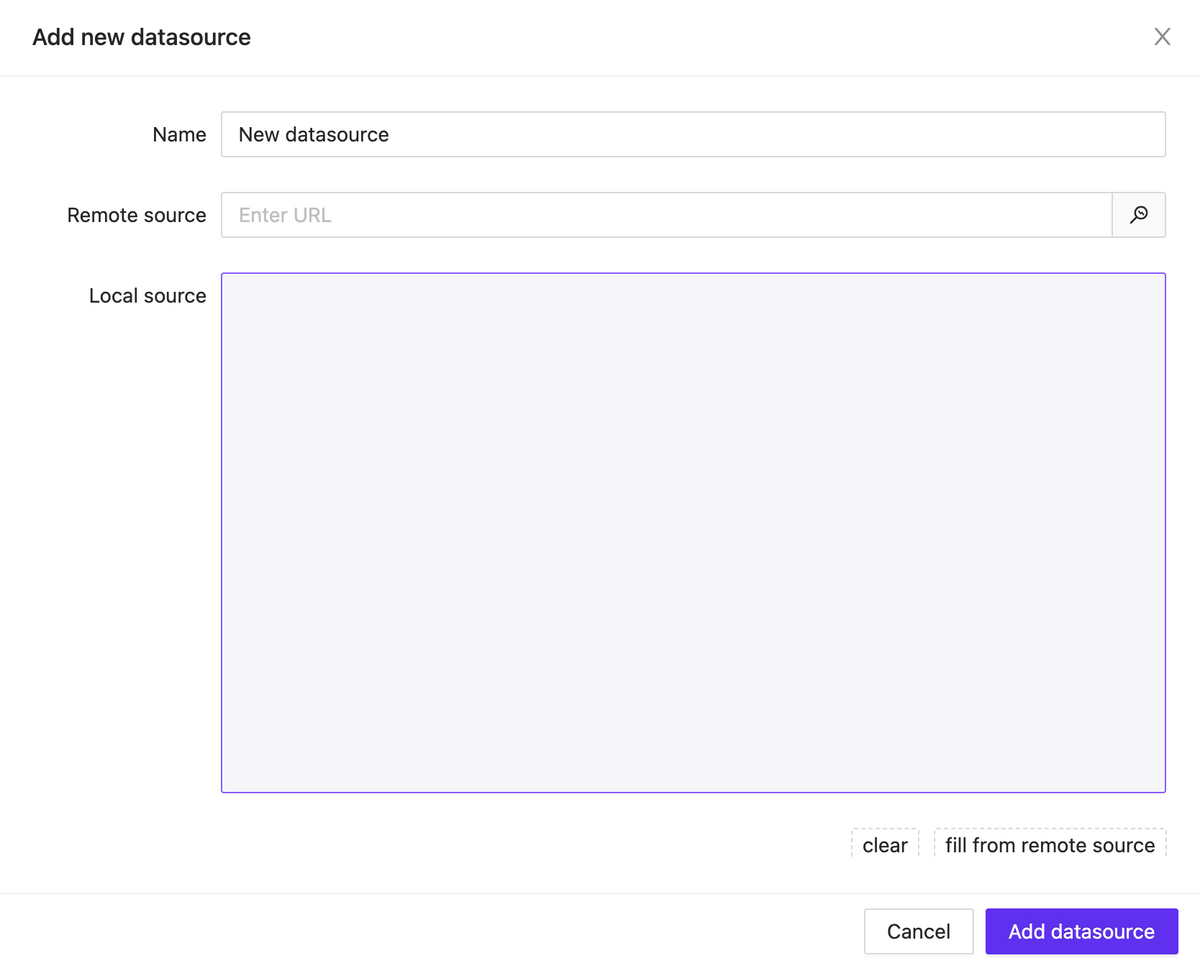
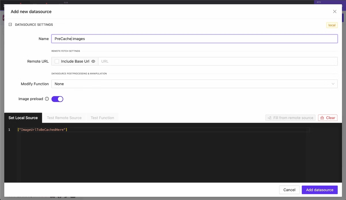
    Project Datasources

     NEW

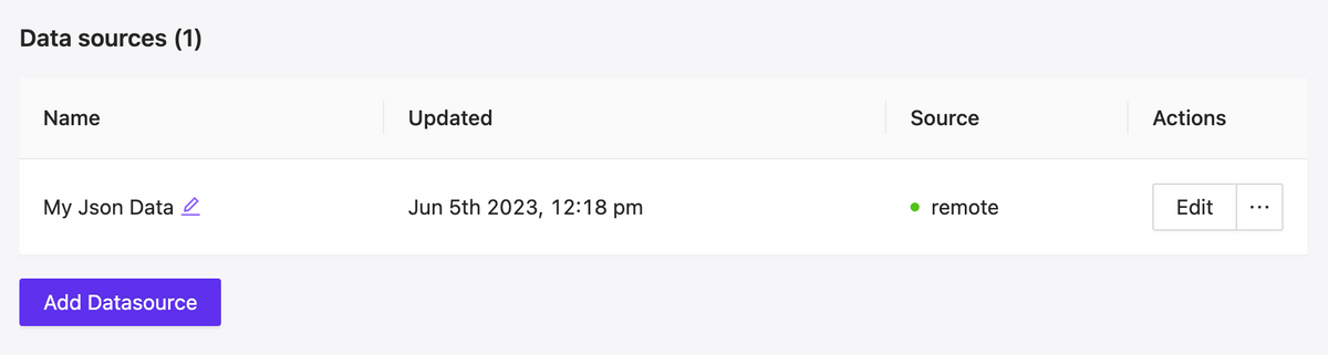
    A new feature has been added that allows you to connect JSON data to the project, either through a remote link or locally. These data can be used in any way you prefer: as text labels, numeric values for styling elements, data for building lists of items and much more.

    Currently, after building, some of the logic with data sources may not work properly. However, in the upcoming updates, full support for data sources will be provided.

    Datasource list

    Datasource list

    Datasource Modal

    Datasource Modal

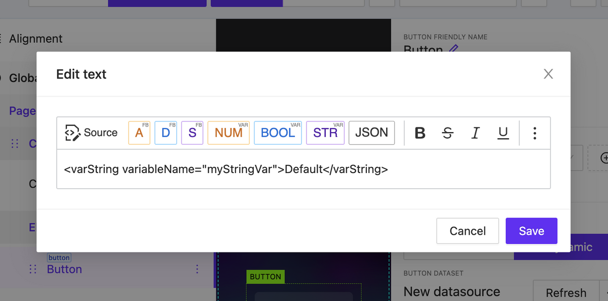
    Rich text datasource & Variables support

     NEW

    Rich text content can now contain more than just plain text and print output signals feedback. It also supports working with connected data sources and local variables.

    Rich text content can now contain more than just plain text and print output signals feedback

    New Element: Button List

     NEW

    We have started adding a new type of element – lists. The first one released is called ButtonList, which is a set of buttons that can be generated based on static data or using a data source attached to the element.

    Lists have a wide range of display settings for their child elements. These settings include specifying the scroll axis, the number of rows and columns, positioning within the container, and much more.
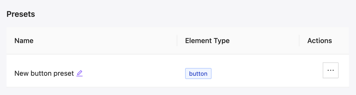
    Presets for elements

    NEW

    We have added presets for elements, which allow you to save the appearance and settings of an element and efficiently reuse it. Additionally, you can easily change the appearance of all buttons in the project that are linked to a preset with just a few clicks.

    Project elements presets listing
  • Version 0.18 | Media player Widget

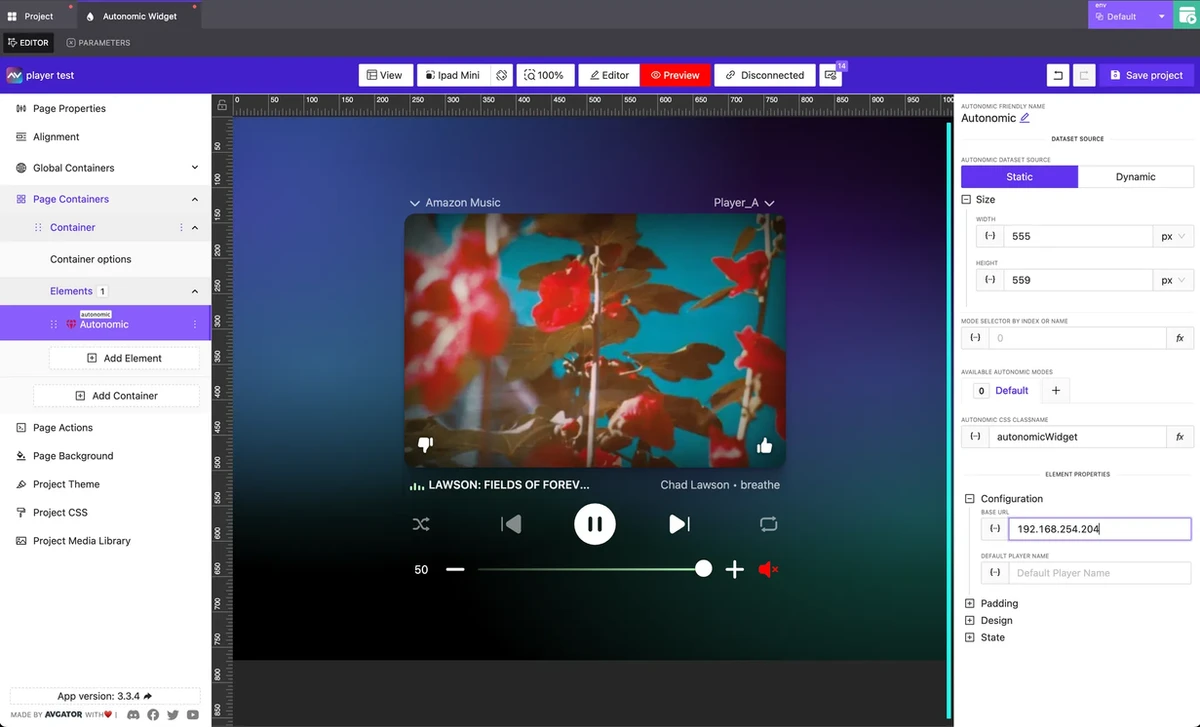
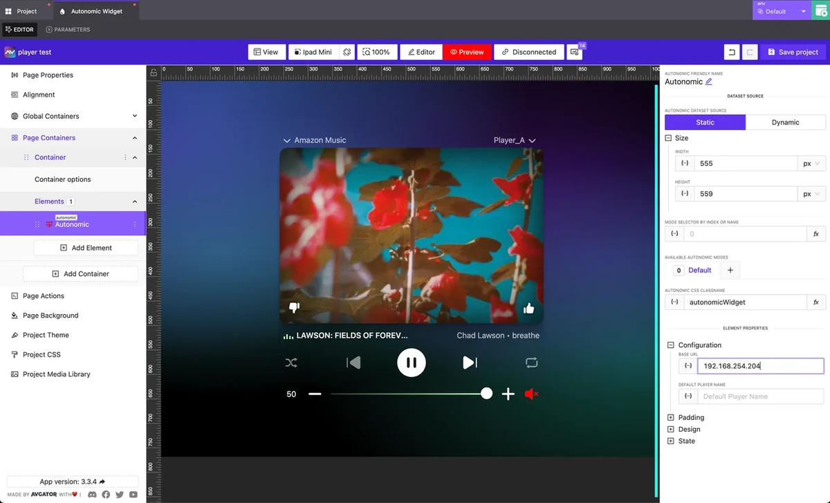
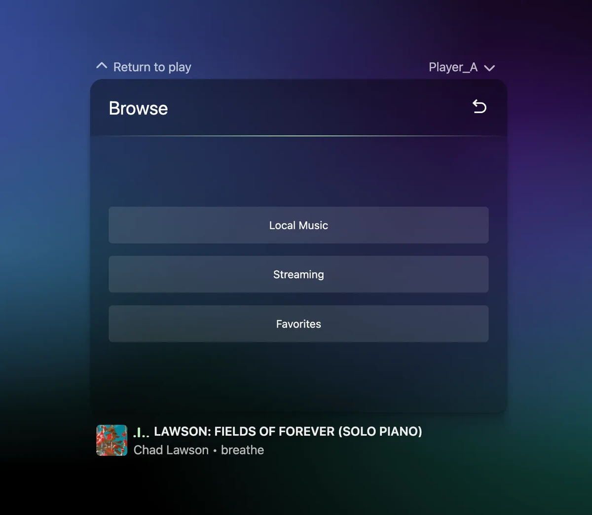
    Media player Widget

     NEW

    Beautiful and flexible media player widget.

    Handle scroll automatically inside container of elements

     NEW

    Doesn’t matter how many elements you add to the container – it will always looks nice and all child scroll smooth and accessible from any type/size of screens.

    Updated Rich Text Editor and Feedback Printing

    NEW

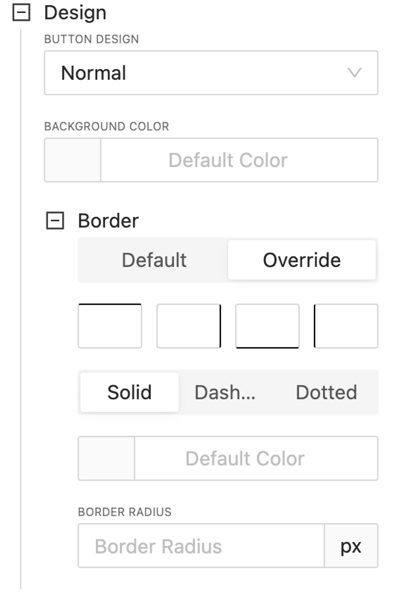
    Extended Button Design options

    NEW

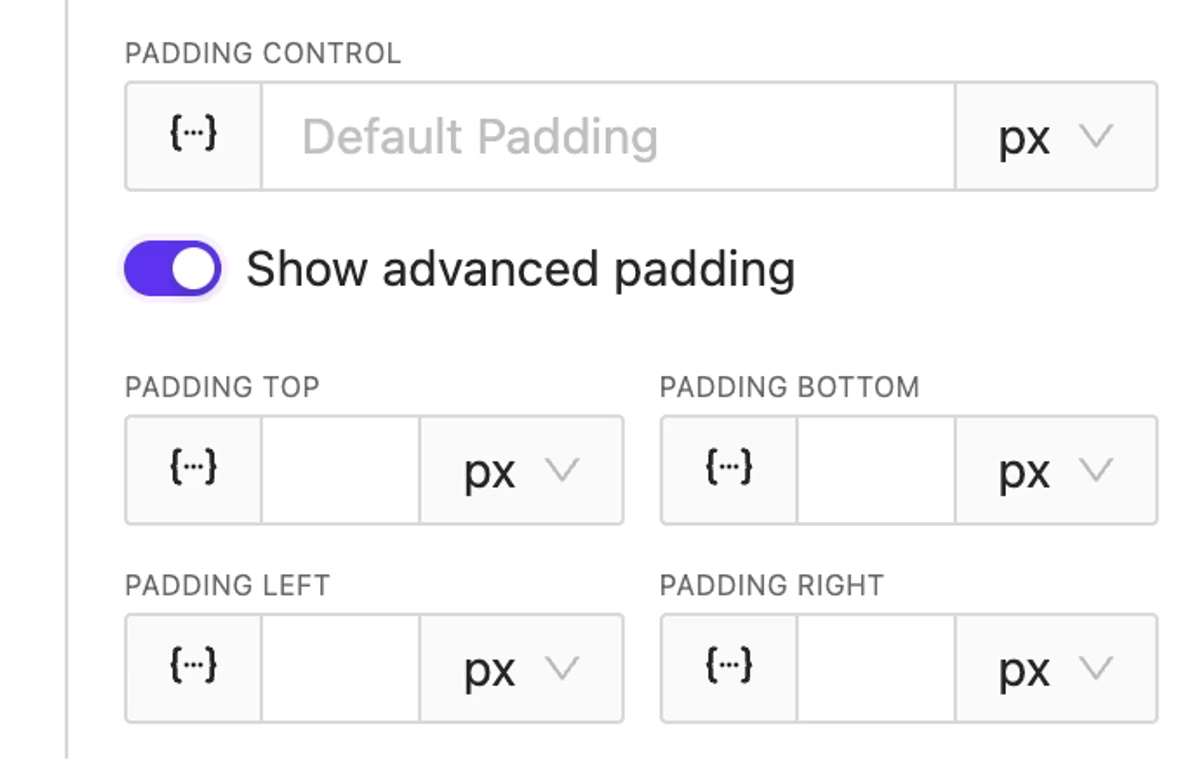
    Now support background color and rich border options, padding in size section.

    Now support background color and rich border options, padding in size section.

  • Version 0.17 | Building ch5z project is now possible

    Version 0.17 | Building ch5z project is now possible

    Building ch5z project is now possible

     NEW

    Now you can build your project in one click and do the following:

    1. Run it on your own web server
    2. Upload the project to a Crestron processor and use it as a web project or a Crestron One project
    3. Run on touch panel

    Widget: Clock

     NEW

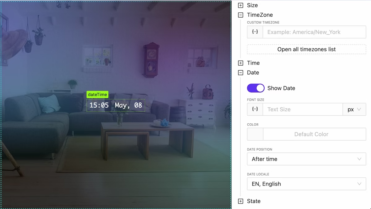
    A label for the current device time can be printed, and it will be updated with the ability to set time zones and many more features.

    Element: Dpad

     NEW

    Nice, simple and customizable dpad element added

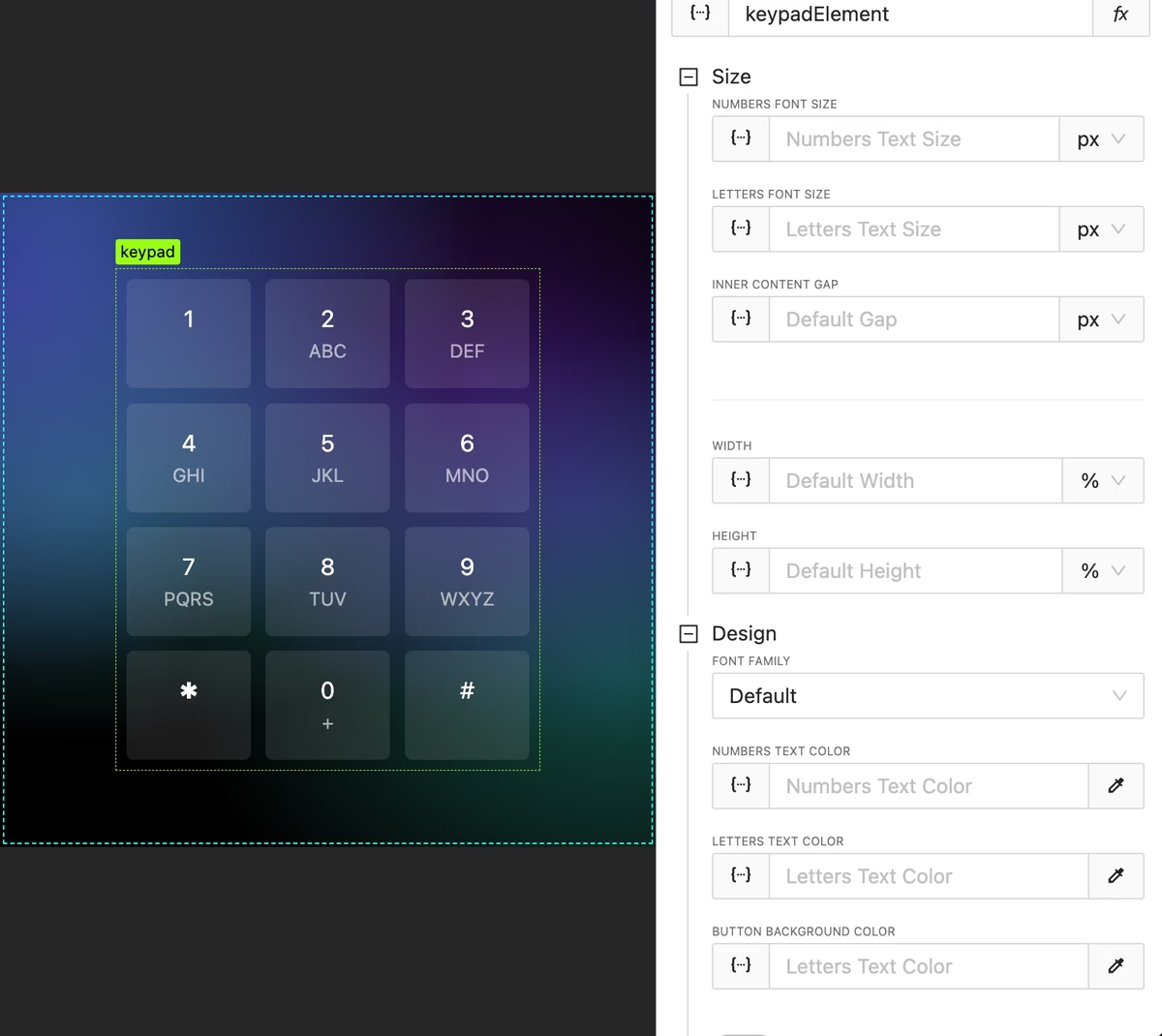
    Element: Keypad

     NEW

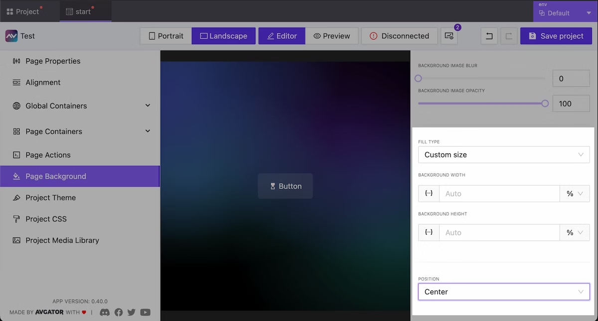
    Project and Page background

     NEW

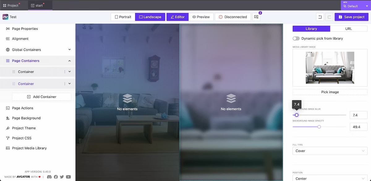
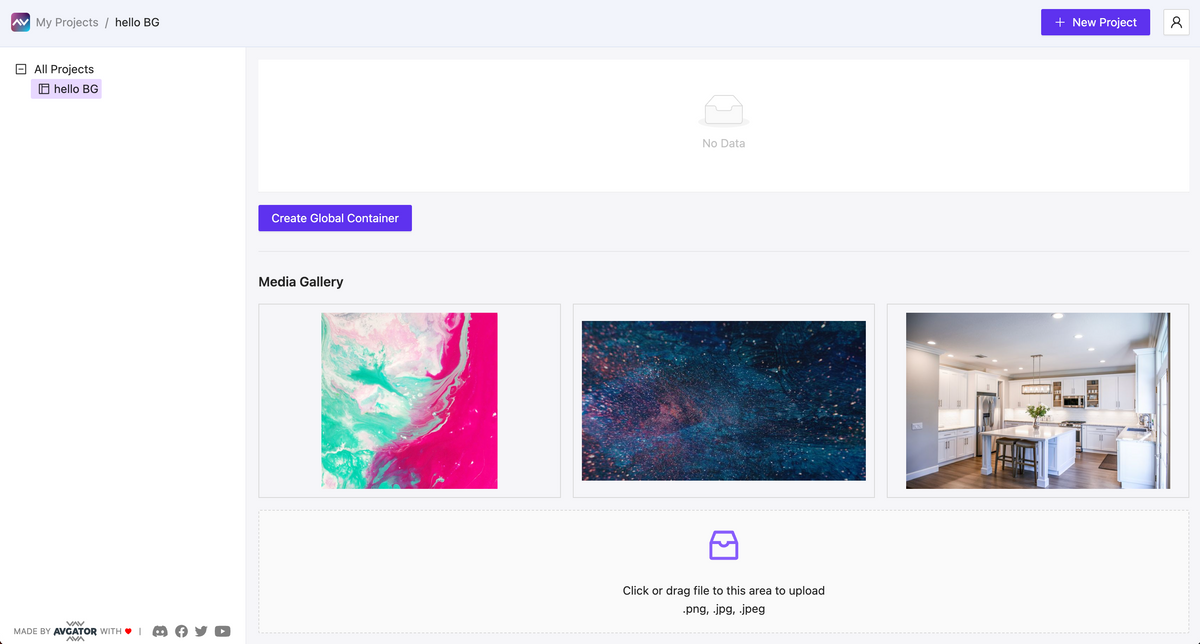
    Now it’s easy to set a Background color and/or image globally to project and to current page.

    Options are: color, image (from library or external link), background image opacity, background image blur, background image mix blend mode value.

    CSS built in editor

     NEW

    Project cloning

     NEW

    Clone any project in one click.

    Project media library

     NEW

    View and control all of your project’s media assets in one place.

    View and control all of your project's media assets in one place.

  • Version 0.09

    Version 0.09

    New Element: Text Input

    NEW

    This feature includes the ability to manage input and output serial signals, control statements with focus management, and adjust size options.

    Elements state and behavior control

     NEW

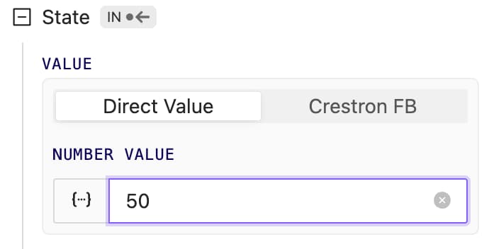
    Now all elements have at least visibility and enabled state control. Depending on the element type, other controls are available.

    State control options for Text Input Element

    Project Media Library added

     NEW

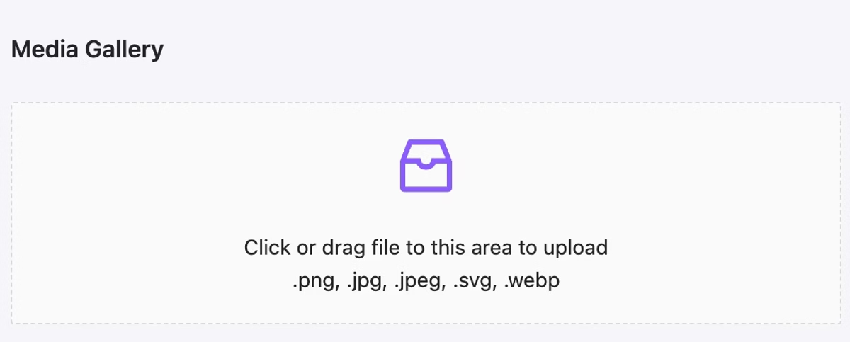
    Upload your media file and use it as an Image element or background image. Now we allow file formats: .jpg, .png. New updates allow attaching more media formats: .svg, .webm, .mp3, .mp4, and more to create a video background, animated & interactive SVG objects, and other effects.
    New Element added – Image

     NEW

    Image elements allow rendering images from the project media library or external URL.

    Has rich stretching and size options.
    Background Color for containers

     NEW

    Now containers support background-color property.
    Accept any kind of color format.

    Editor/Preview mode UI changed

     UPDATE

    More clear implementation of changing development mode in the header from icon to Editor/Preview buttons.

  • Version 0.07

    Version 0.07

    Crestron Processor communication

    NEW

    Real time communication between your AVstudio project and Crestron processor!

    • Push to processor any type of signal: analog, digital or serial
    • Execute push on tap, on hold, on double tap
    • Subscribe to signal feedback and print it

    Current Version Limitation Only button elements has been implemented in the current release. In the following updates we will implement for all types of elements and pages actions too.

    Smart Console Events

    UPDATE

    Now when some action is triggered it will be printed in console with additional information:

    • Additional information printed in the console includes what type of event trigger was fired, such as onEnter, OnExit, OnTap, OnHold, or OnDoubleClick.
    • How many actions should be executed
    • Listed all fired actions colored by its type with signal name (or join number) and value pushed.

    Auth

    BUGFIX

    Sometimes project data can’t be fetched due to auth issues. Now redirecting to login.

  • Version 0.06 | Instant Crestron Debug

    Version 0.06 | Instant Crestron Debug

    Instant Crestron Debug

    NEW

    Just in a few clicks, connect your AVStudio project to the actual Crestron Processor and start testing and debugging your GUI in real time! Send any Signal and work with the true feedback as usual.

    Just in a few clicks, connect your AVStudio project to the actual Crestron Processor and start testing and debugging your GUI in real time! Send any Signal and work with the true feedback as usual.

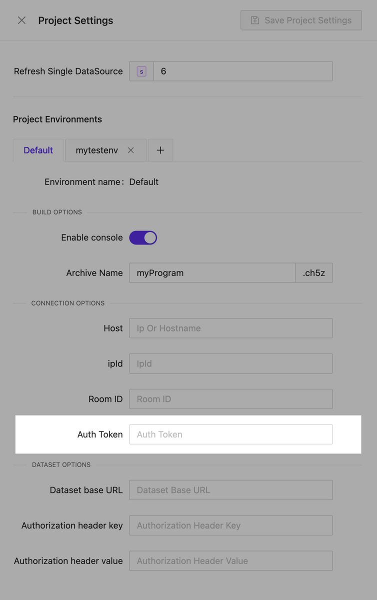
    Connection options should be set in project settings:

    Connection options should be set in project settings:

    To make a successful connection processor certificate must be trusted by the browser where AVStudio opened. You can make the cert valid manually or install the CA cert on the processor. Follow Crestron Docs.

    Auto Sync Crestron Connection

    NEW

    Auto sync Crestron connection between editor and page fullscreen preview!

    Auto sync Crestron connection between editor and page fullscreen preview!

    Avstudio Console

    NEW

    Control the connection status and choose what, when, and what type of signals to push to the connected processor, and see the feedback received.

    Control the connection status and choose what, when, and what type of signals to push to the connected processor, and see the feedback received.

    Better Element Layout

    UPDATE

    The element type is now printed directly on its name in the main menu, making it easy to understand what type of element is being used.

    The element type is now printed directly on its name in the main menu, making it easy to understand what type of element is being used.

    Text Element Icon Support

    UPDATE

    Now you can attach an icon to any Text element on the page.

    Now you can attach an icon to any Text element on the page.

    Smart Drag Ordering for Elements

    UPDATE

    When elements are dragged from one container to another, the place where they are dropped makes sense based on the start or end of the elements list, taking into account the element’s current flow (row/column)

    When elements are dragged from one container to another, the place where they are dropped makes sense based on the start or end of the elements list, taking into account the element's current flow (row/column)

    Error Editor Page Loading

    BUGFIX

    Sometimes when a project contains zero global containers, the Editor crashes – fixed.

  • Version 0.04 – Selection and hotkeys

    Version 0.04 – Selection and hotkeys

    Smart Interactive Selection & Control in Preview

    NEW

    Smart selection and drag&drop actions inside preview for containers and elements: easy switch between containers to see options, dragging elements to reorder and/or changing its parent.

    Smart Selection works only when bounding box is ON. Now supported in fullscreen preview too.

    Smart selection and drag&drop actions inside preview for containers and elements: easy switch between containers to see options, dragging elements to reorder and/or changing its parent.

    Selection helpers

    NEW

    Print selected element name.

    Print selected element name.

    Editor hotkeys

    NEW

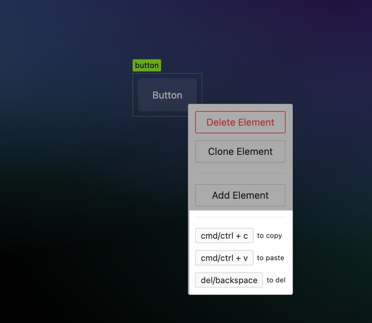
    • Ctrl/Cmd + S tosave
    • Ctrl/Cmd + Z toundo
    • Ctrl/Cmd + Shift + Z toredo

    More stable previews

    UPDATE

    The preview is now more stable with super fast initial loading and some bugs fixed.

  • Version 0.5 | Project global containers

    Version 0.5 | Project global containers

    Project Global Containers have been added

    NEW

    This feature allows you to easily create global layout containers: menus, headers, footers, and any global data you want.

    • Create containers that automatically attach to all project pages;
    • It easily manages visibility, position, inner content, and view options depending on display orientation and pages;
    • Drag&drop elements between global and regular containers; from the sidebar menu or inside the editor’s preview!

    Project global containers list

    Global menu sample

    Easy drag & drop

    Icons added: +793

    NEW

    Fast search

    Edit page name and URL directly from list

    NEW

    Edit page name and URL directly from list

    Main menu elements group layout

    UPDATE

    The ‘Create new element’ button is now located inside the ‘Elements’ collapsible group, and a simple element counter has been added to display the number of elements inside each container.

    The 'Create new element' button is now located inside the 'Elements' collapsible group, and a simple element counter has been added to display the number of elements inside each container.

    Editor layout Highlighting

    NEW

    Now all containers presented on the page when bounding box is ON have a border: page layout looks more simple and understandable.

    Now all containers presented on the page when bounding box is ON have a border: page layout looks more simple and understandable.

    “Save” button fix

    BUGFIX

    Sometimes after the page was saved to the server, the button state was ‘active,’ but this issue has now been fixed

    Project css

    BUGFIX

    The issue where project CSS wasn’t affecting the preview has been fixed

    Redo hotkey

    BUGFIX

    The issue where the REDO hotkey (CTRL/CMD + SHIFT + Z) wasn’t working sometimes has been fixed

    Project listing vertical scroll page

    BUGFIX

    The issue of a buggy layout when having a lot of projects has been fixed

    Preview orientation

    BUGFIX

    The issue of buggy orientation detection while the preview renders has been fixed