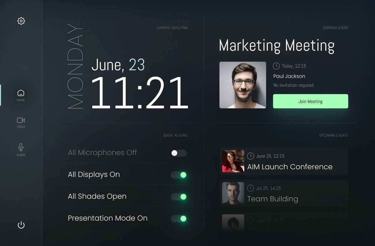
Added support for dynamic classnames
NEW
We have added the ability to assign dynamic CSS classes to any element on your page. This allows you to change the appearance of elements using not only built-in settings but also custom CSS styles.
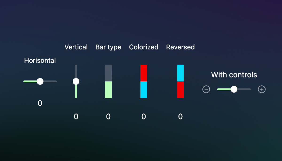
You can assign as many classes as you want separated by a space.
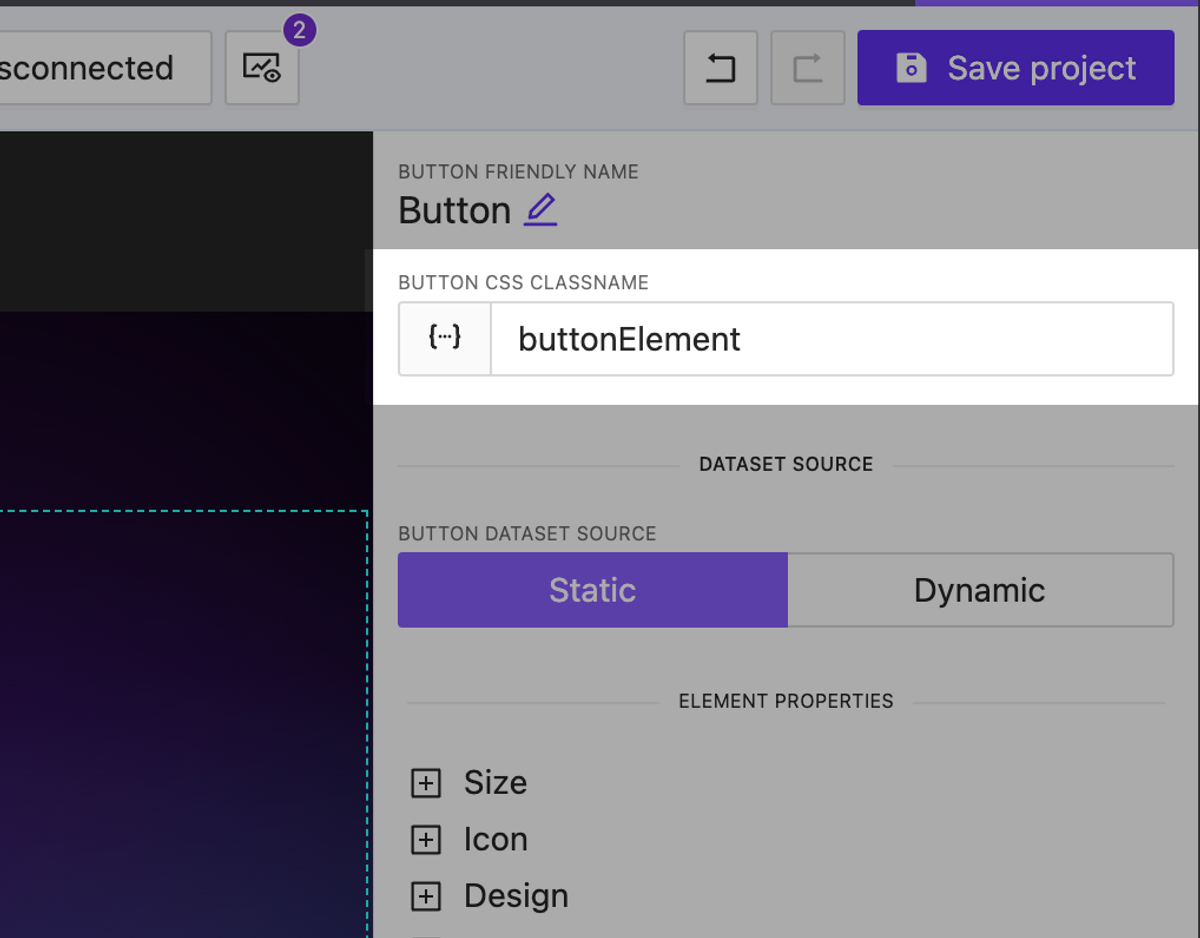
Dynamic CSS classnames for any element
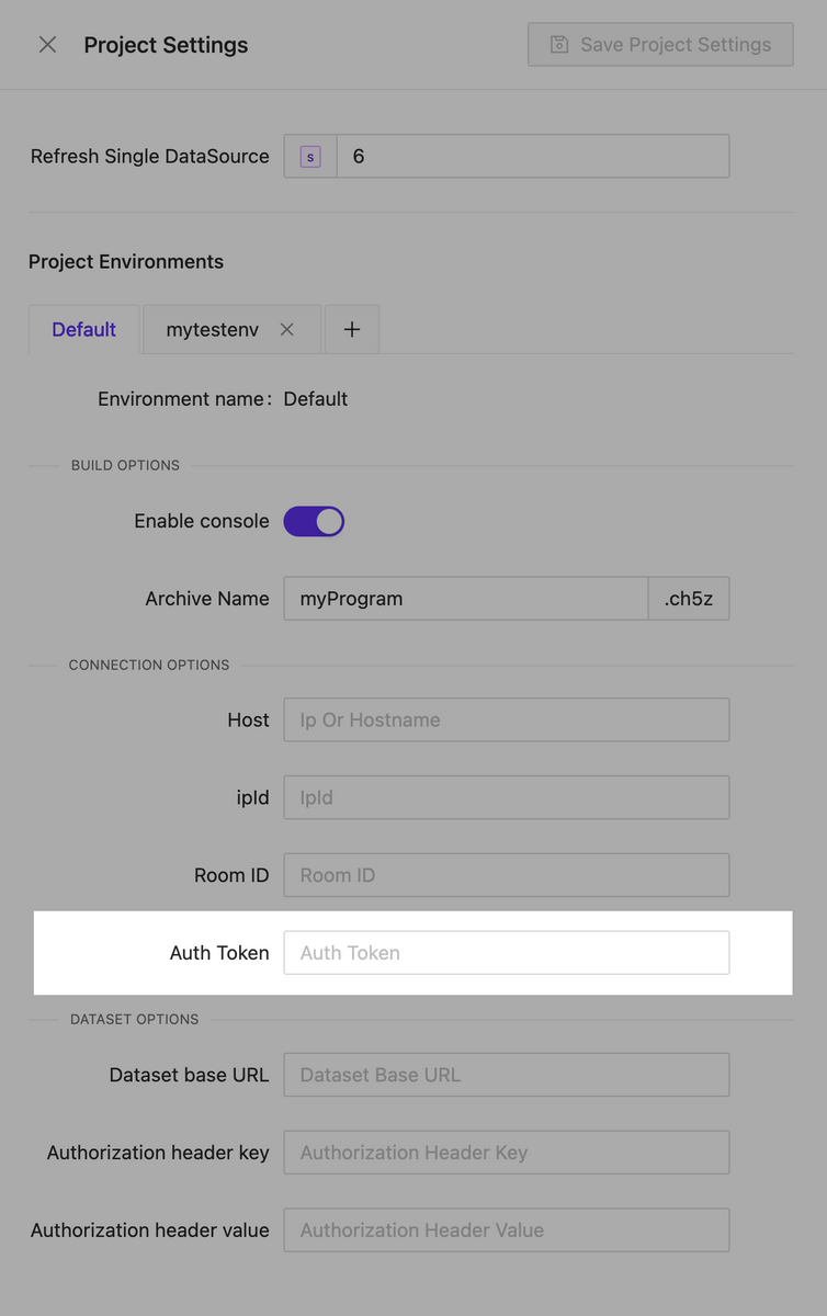
Environments
NEW
We are pleased to introduce our new feature, Environments. Now, each project can have multiple environments, each storing specific settings that can be used in various scenarios. For example, different connection settings to the processor that you can use at your workplace as well as for final testing on the client’s hardware. It’s easy to switch between environments both during interface creation and when selecting them for building. When changing the active environment in the page editor, the live preview instantly applies all the current settings you have selected.
Crestron processor auth token support
NEW
We have implemented support for authorization tokens for connecting to processors. This allows us to avoid redirects during authentication.
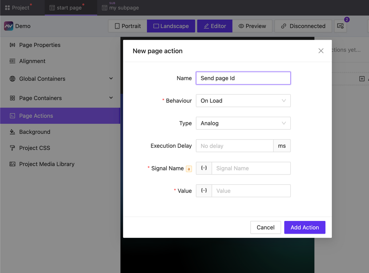
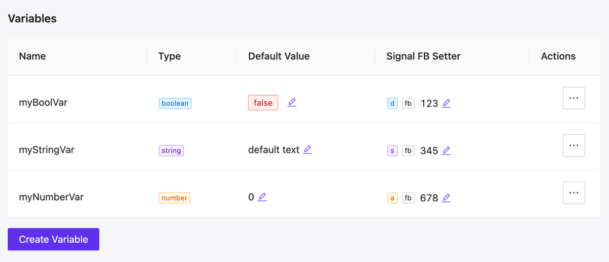
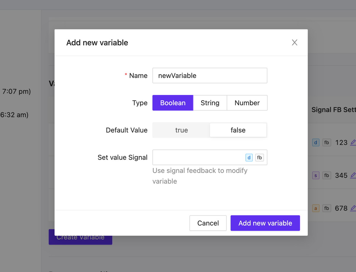
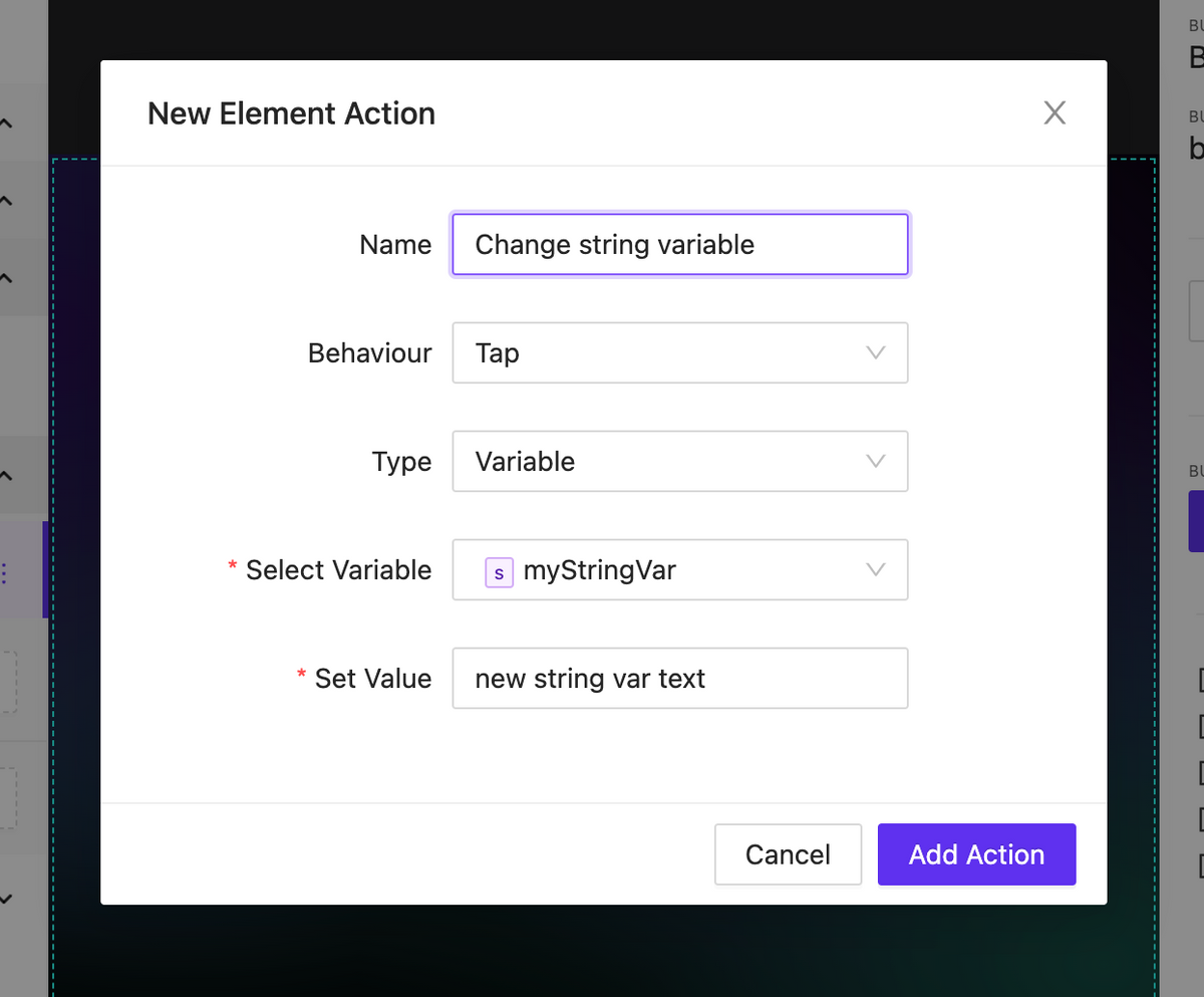
Variables Side Effects
NEW
Now you have the ability to react to changes in variable values. In the event of a variable change, you can create as many actions as needed. This can include actions to send any type of signal, assign a variable, change a page, or anything else necessary to implement your scenario.
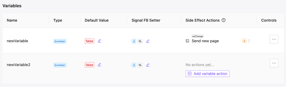
Updated variables table
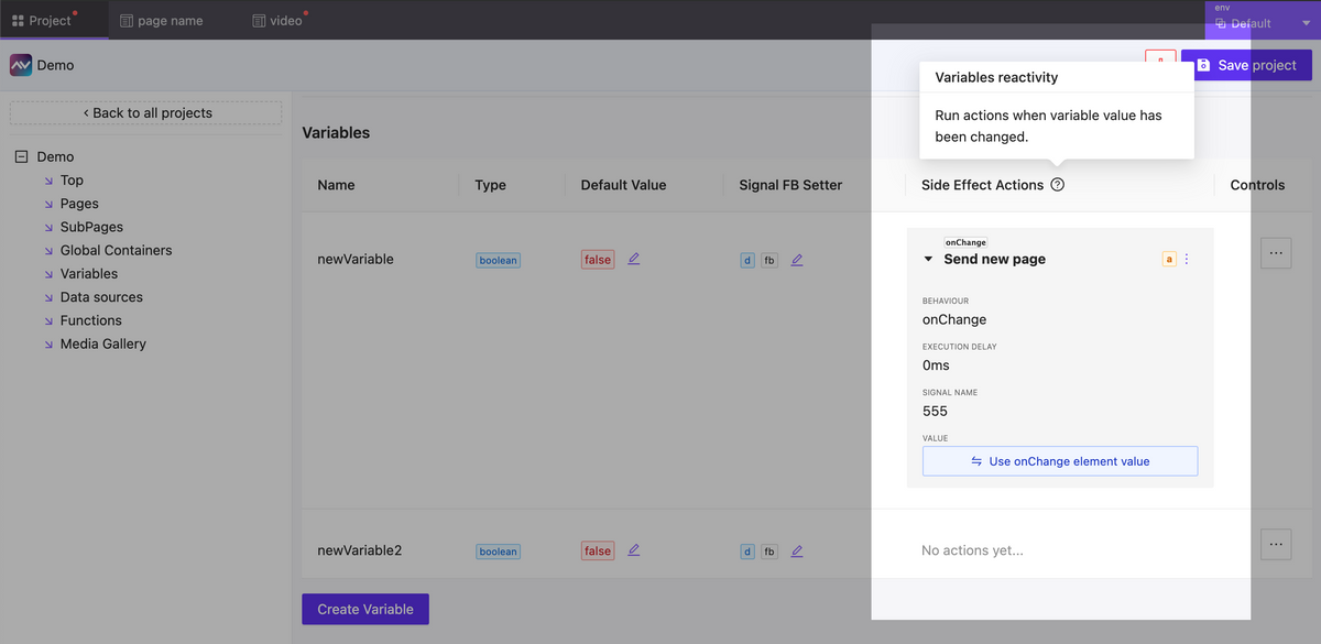
Variables side effects form
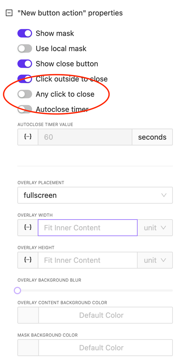
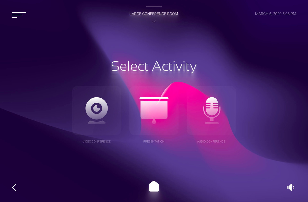
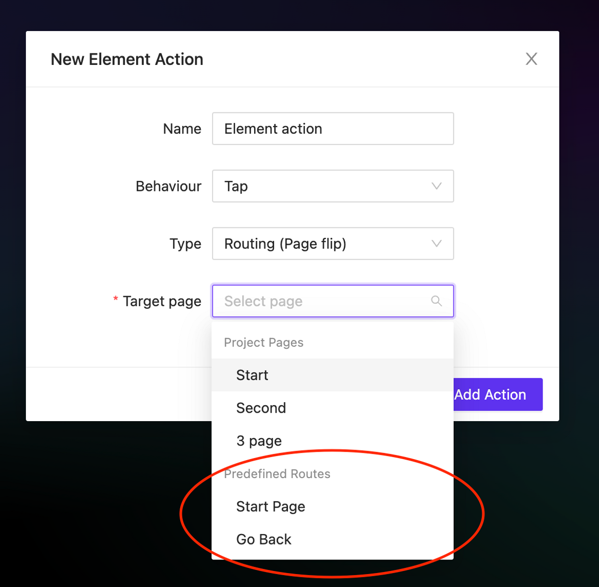
Dynamic subpage inside overlay
NEW
Now, when opening the overlay you can specify the page that should appear in it dynamically. This allows us to implement various interface logic within a single element as part of an action.
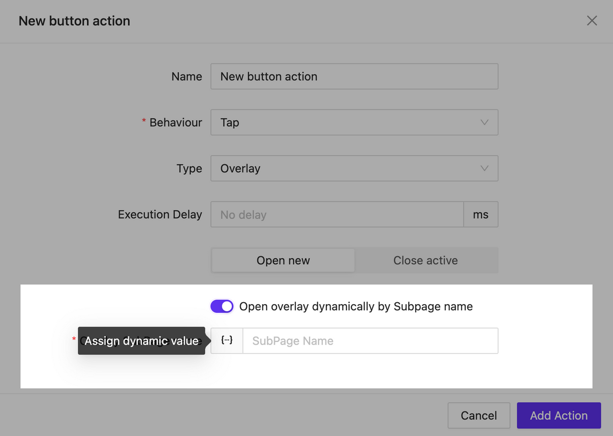
Call overlay by subpage name
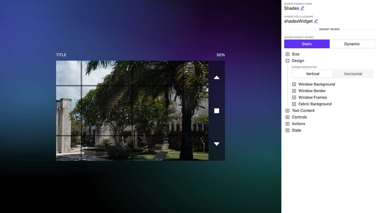
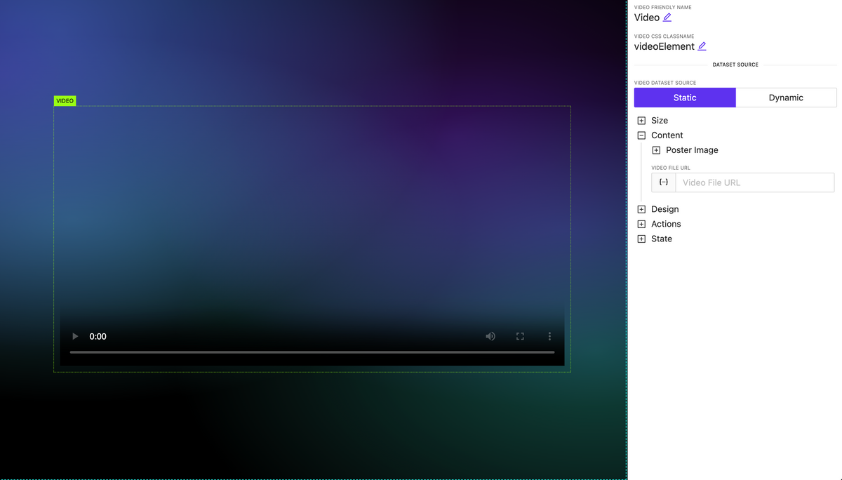
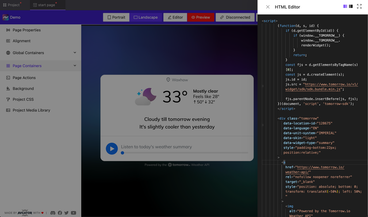
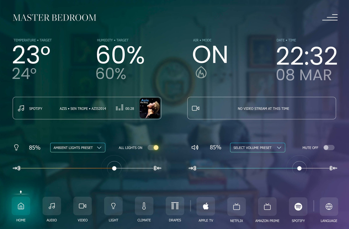
Video element updated: new options and HLS support
NEW
The video element has been significantly enhanced. It now includes extended settings for controlling the display of player interface elements as well as support for the new format: HLS.
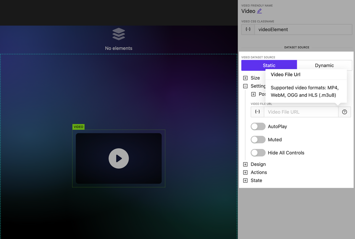
Updated video element
New action type: Run Function
NEW
We have introduced the ability to create an action that allows you to execute any JavaScript function you have previously created. This action can be applied to any element.
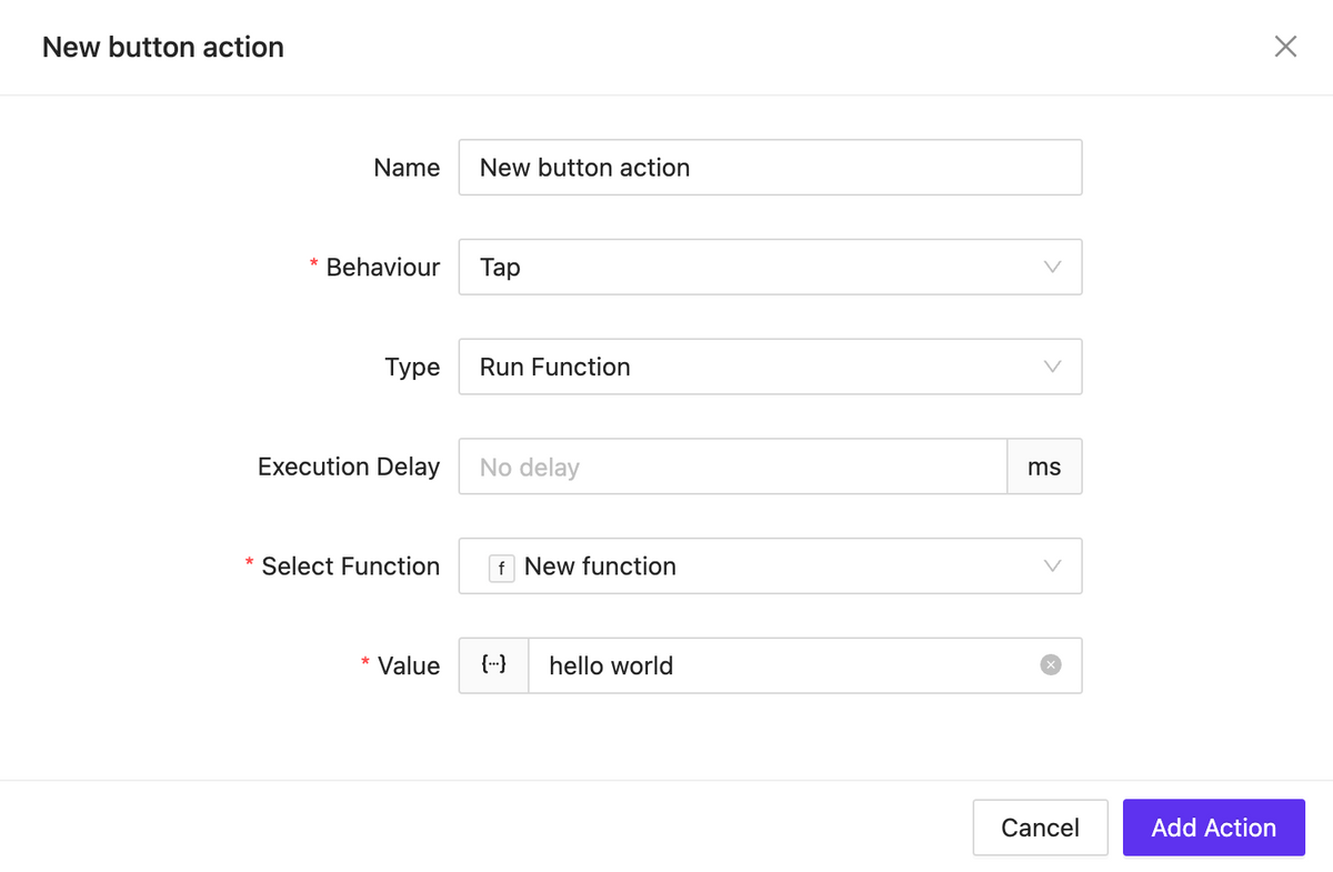
Function runner
Bugfix & Small improvements
UPDATE BUGFIX
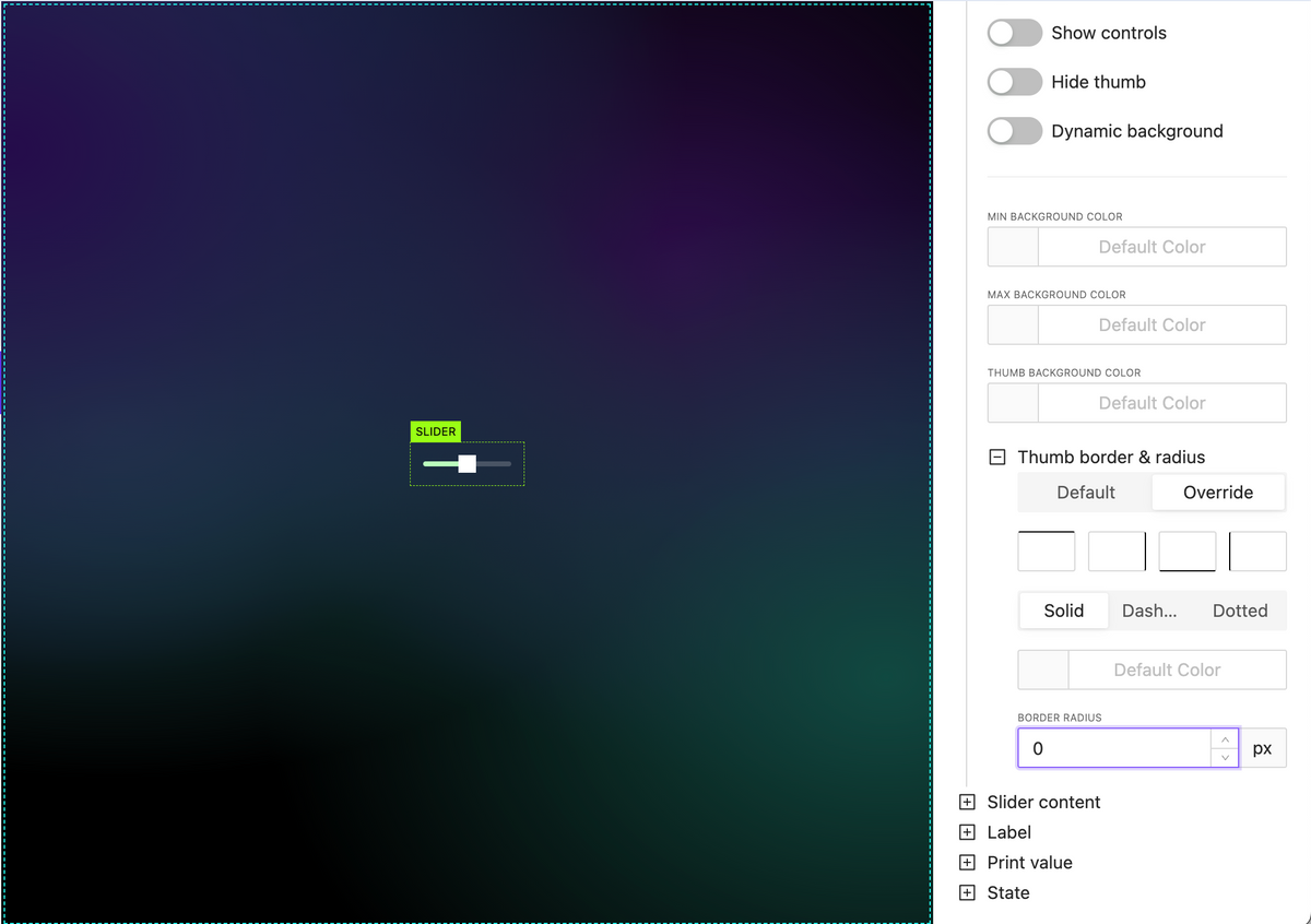
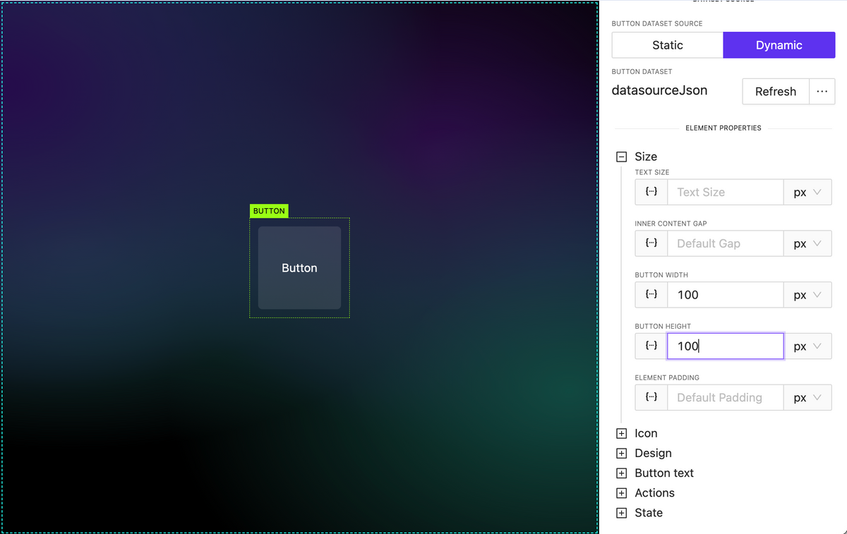
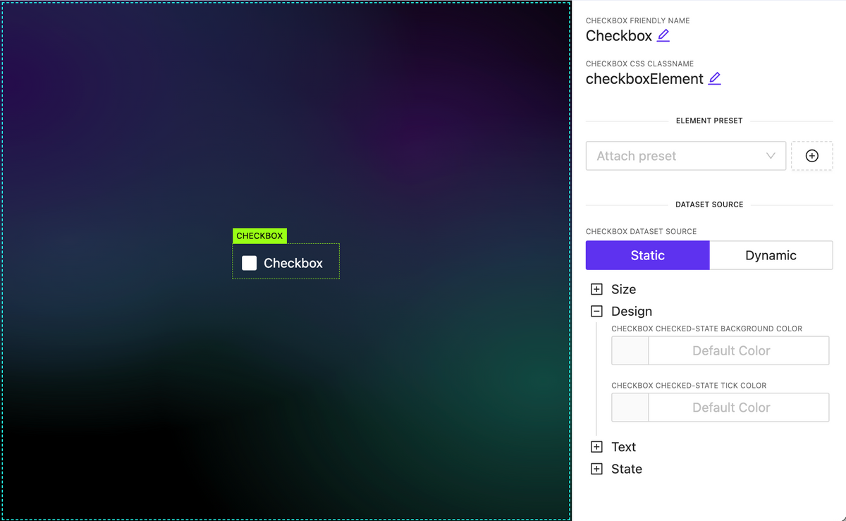
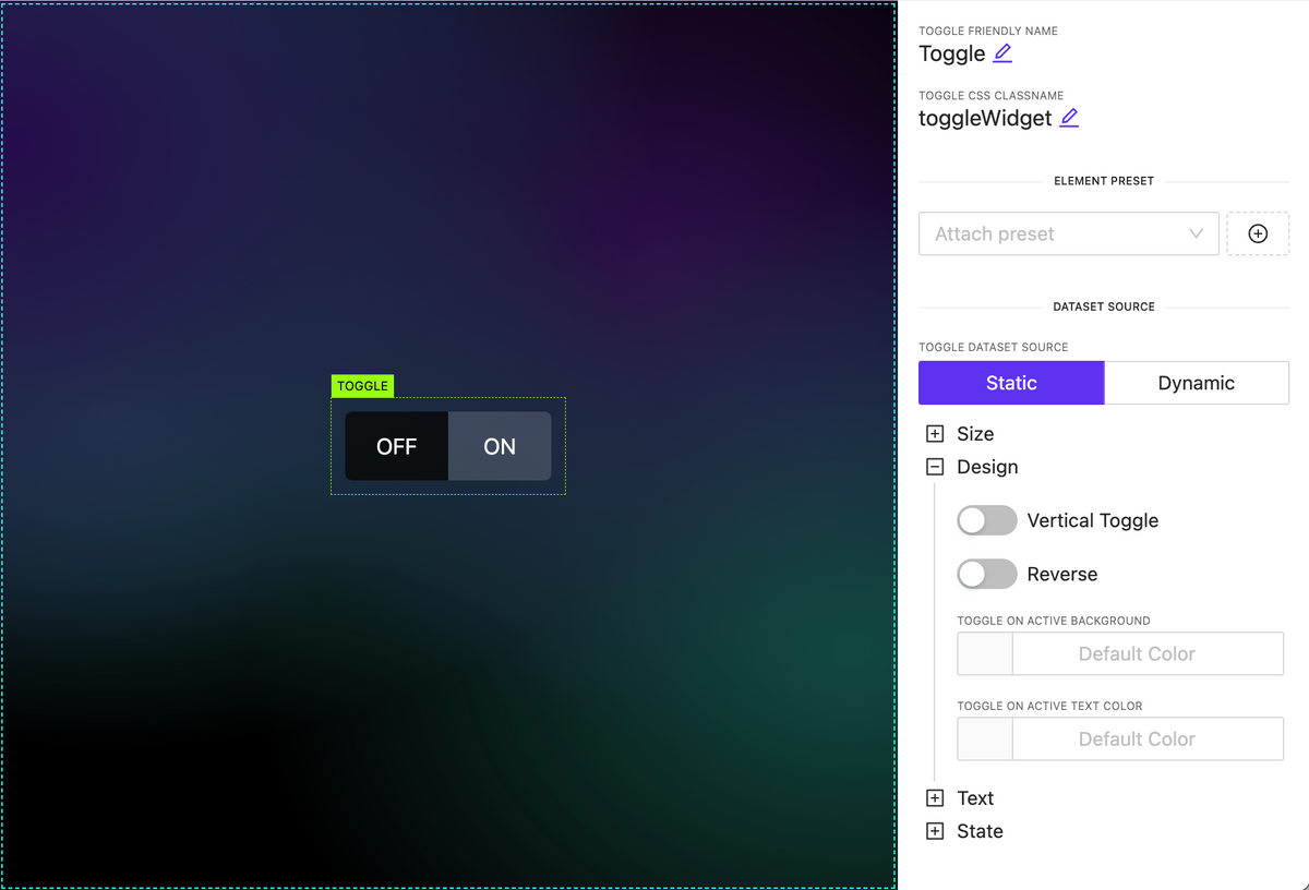
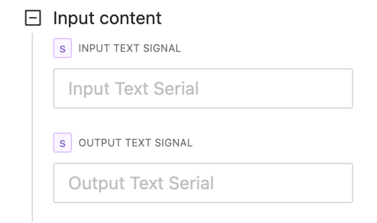
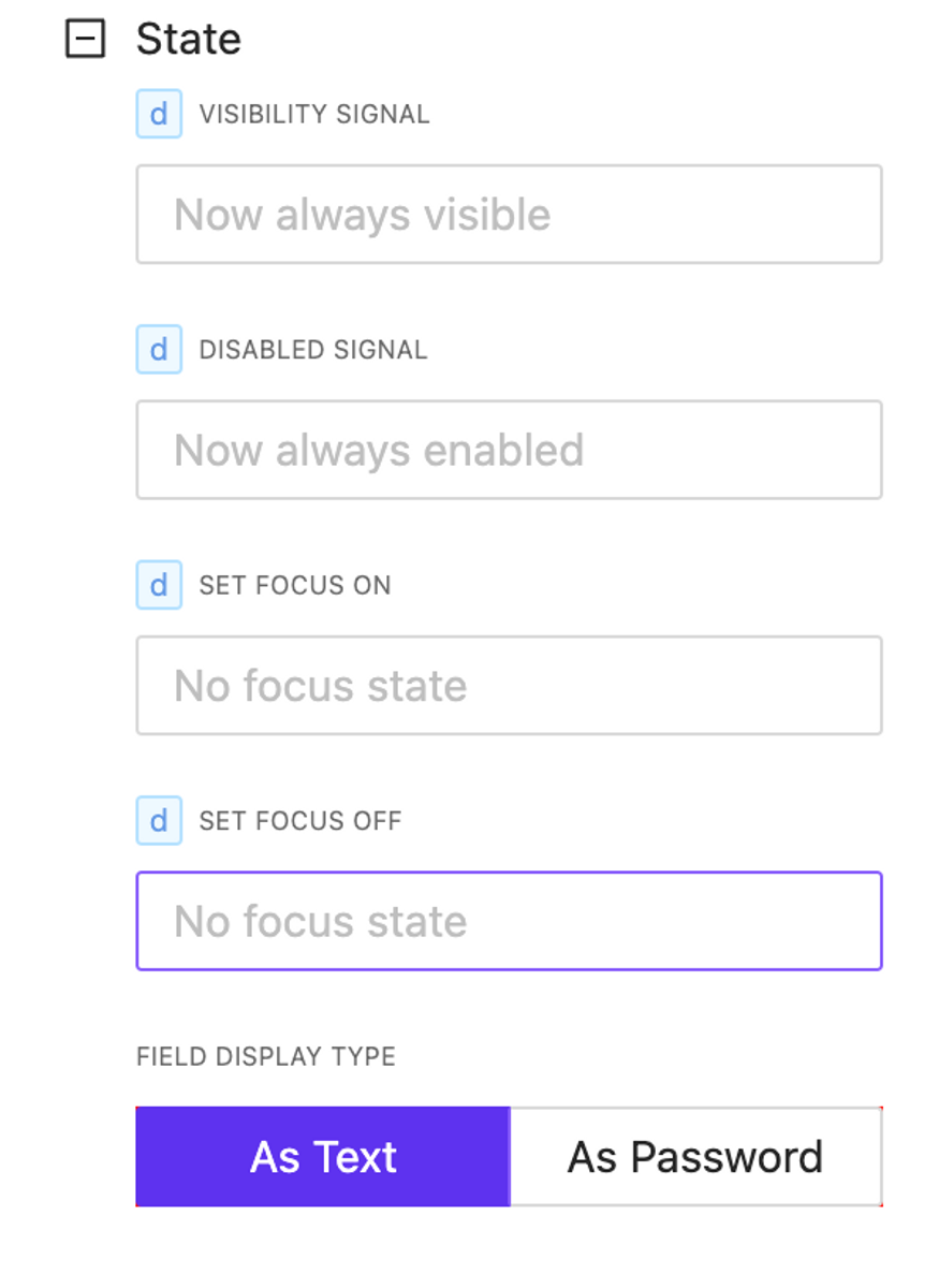
- Better behavior for text input element, slider, circle slider, toggle, checkbox, switch.
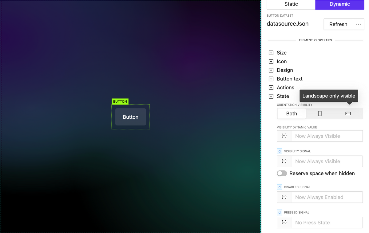
- Fix Button element pressed state styles
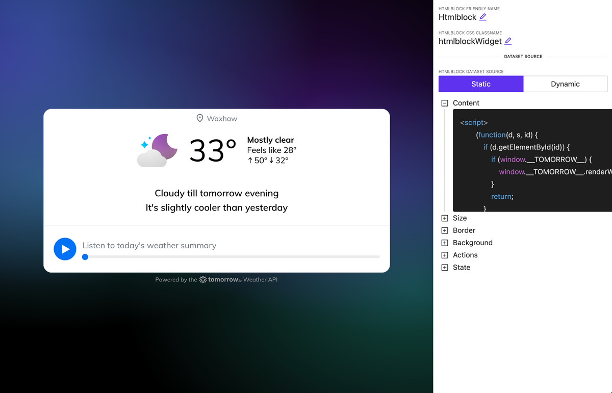
- Update fullscreen editors (html block, css)
- Back routing doesn’t trigger action if actually no back page exist
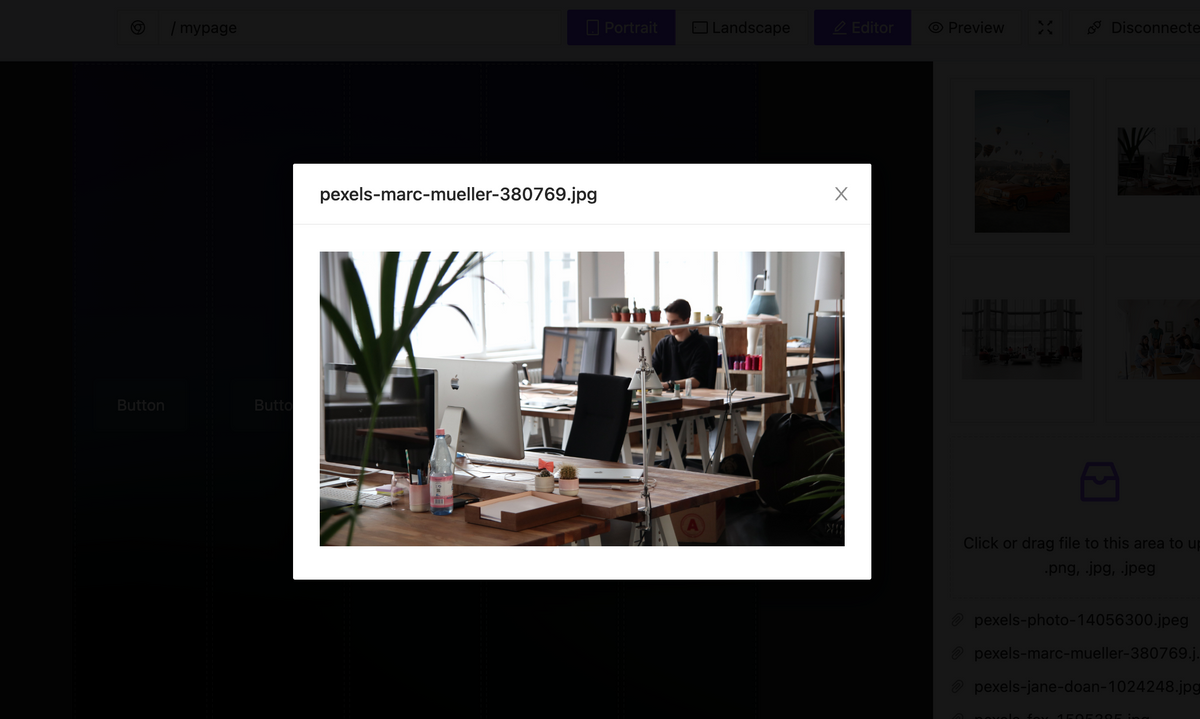
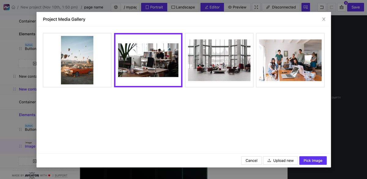
- Click on image allow open overlay
- Better webxpanel initialization method, webxpanel updated to latest version
- Fix bugs on touch click events
- Fix bugs when sometimes overlay cannot be closed
- Stop execute actions from list elements while it scrolling
- Edit action form bug with representing wrong initial data
- Click event may triggered twice on iOS – fixed
- Fix project clone process
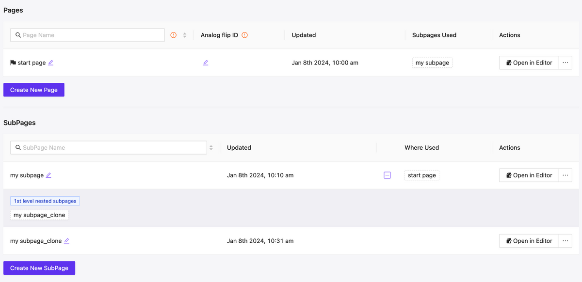
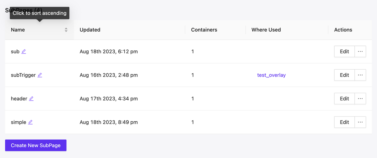
- Improve page/subpage search
- Improve subpage search whet setting up a route action
- Live session isolation: one per login instance
- Fixed unresponsive field while editing assigned dataset
- Fixed: Color field doesn’t show current color value (text element for example)
- Fixed: Dpad keep working when disabled
- Fixed: Circle slider send wrong value when ends with zero and using fraction
- Add project clone progress indicator