We are happy to introduce two new elements to AVstudio Editor: the Compact Shades Control widget and the State Control element.
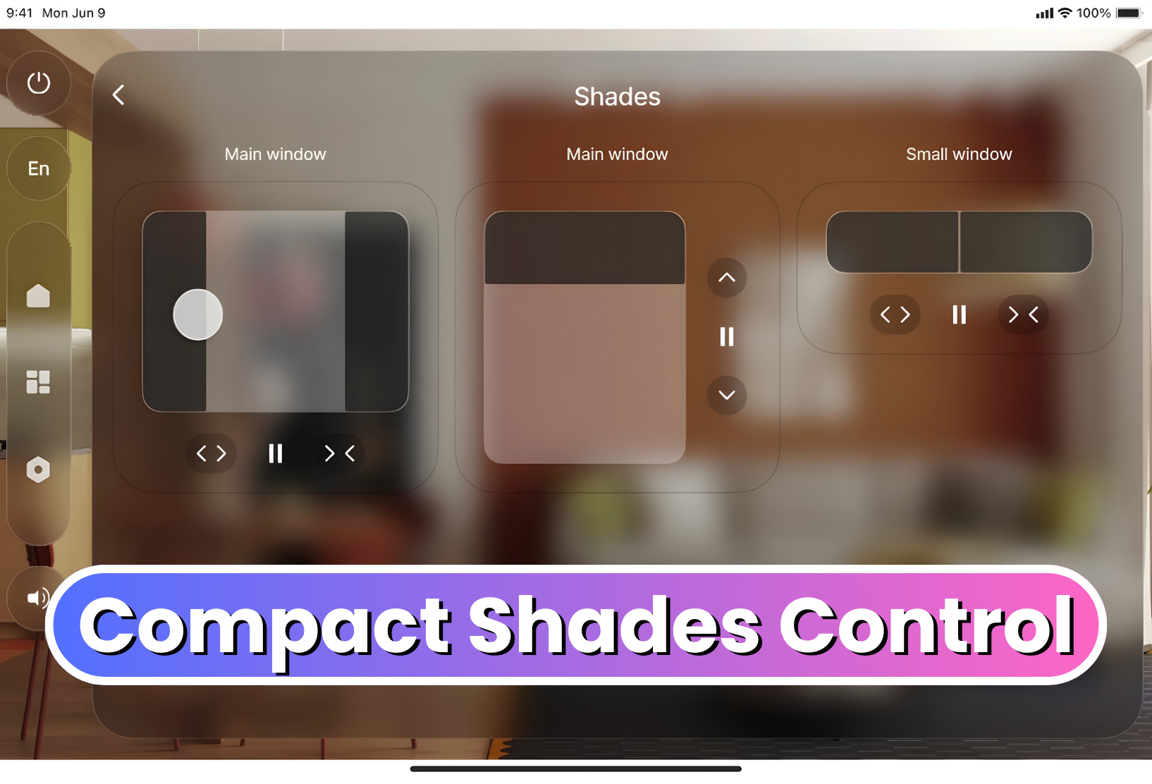
Compact Shades Control
The Compact Shades Control widget is a more compact and efficient way to control shades in interfaces with limited space.
Despite its smaller form, this new widget maintains the core function of the original Shades Control element. It supports vertical, horizontal, and dual-shade control modes, allowing developers to choose the configuration that best fits their project. Shades Control can now be fit into tighter spaces on the UI, allowing even more customization in design layout and flow.
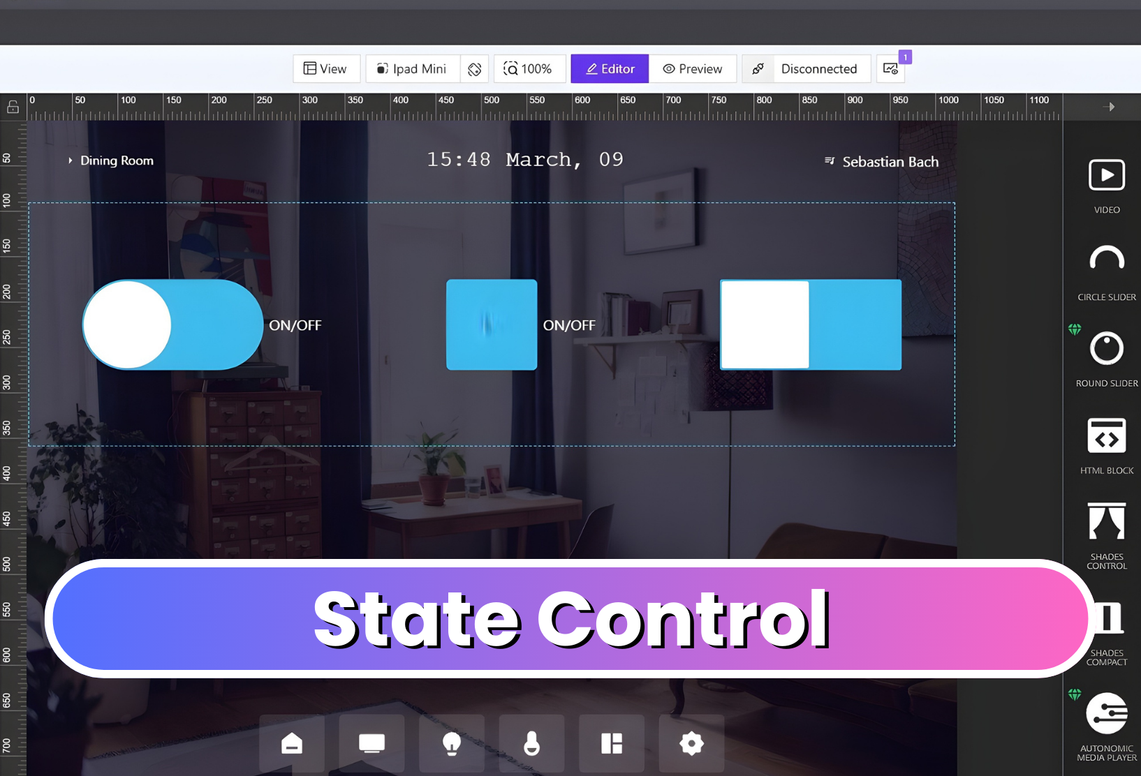
State Control
The State Control element consolidates multiple true/false state controls into a single configurable component. Users can easily change its display to a checkbox, switch, or toggle, depending on preference.
The element is also highly customizable, allowing developers to adjust its styling, colors, borders, and other visual properties to match their interface’s design.
Together, these new elements expand the range of tools available in AVstudio Editor, helping developers create more efficient and unique interfaces.
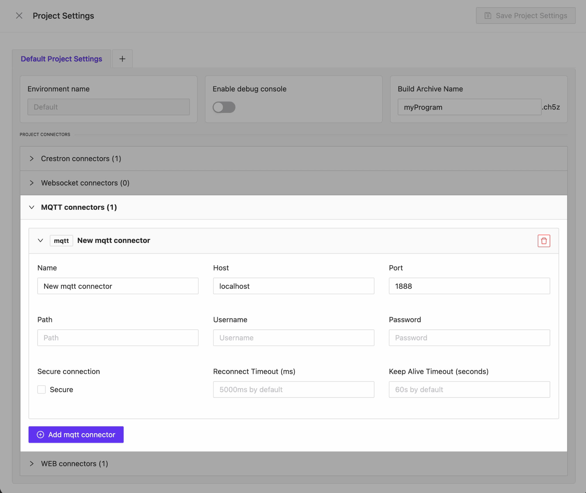
AVstudio is proud to introduce one of our most powerful updates yet. Version 3.9.12 brings full MQTT connector support, enabling developers and integrators to build interfaces that communicate in real time across devices, control systems, and automation environments.
This update not only expands what AVstudio Editor can connect to, but also the capabilities of projects created in the editor. Data can move fast and seamlessly between your UI and the systems it manages like never before.
Full MQTT Protocol Support
We’ve added complete support for the MQTT protocol, allowing you to:
Connect to multiple hosts and ports
Use secure (SSL/TLS) connections
Authenticate with login and password
Modify the PATH for total configuration control
Whether you’re building local prototypes or deploying enterprise-grade automation, AVstudio gives you everything needed to fine-tune your MQTT setup for stability and flexibility.
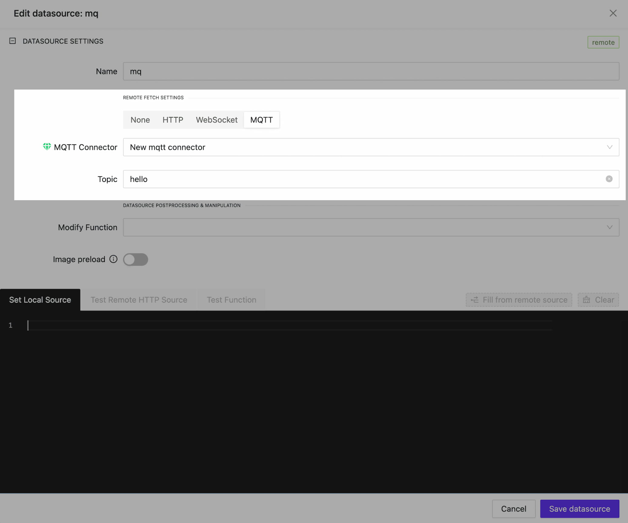
Dynamic Data Through MQTT Data sources
With MQTT connectors, your AVstudio data sources can now be dynamically updated with live data. By linking to a specific topic, data inside your interface can be continuously synchronized.
To streamline your development workflow, we’ve also introduced a Mixed DataSource Type. By combining local data with MQTT feedback, you can maintain a solid local copy of the data, enabling you to prototype your interface seamlessly.
Once you switch to production mode, the data will be updated in real time via the MQTT channel. This means no more waiting for data to arrive. You can build, preview, and deploy with uninterrupted speed.
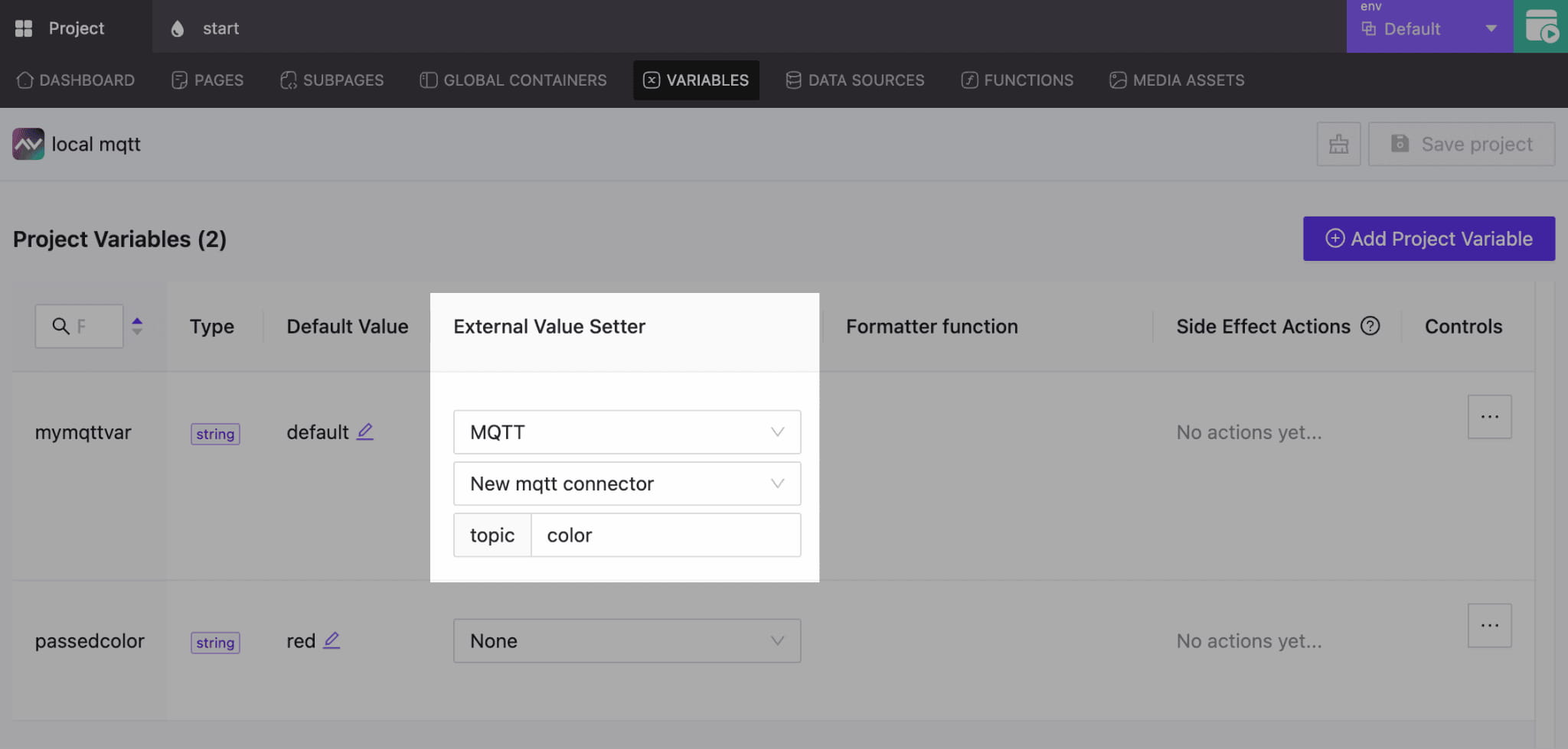
MQTT for Variables and Parameters
We’ve expanded the functionality of variable and parameter updates through MQTT Feedback. By assigning the correct connector and topic, any variable or parameter in your project can receive live updates. This enables precise control of the interface and its elements.
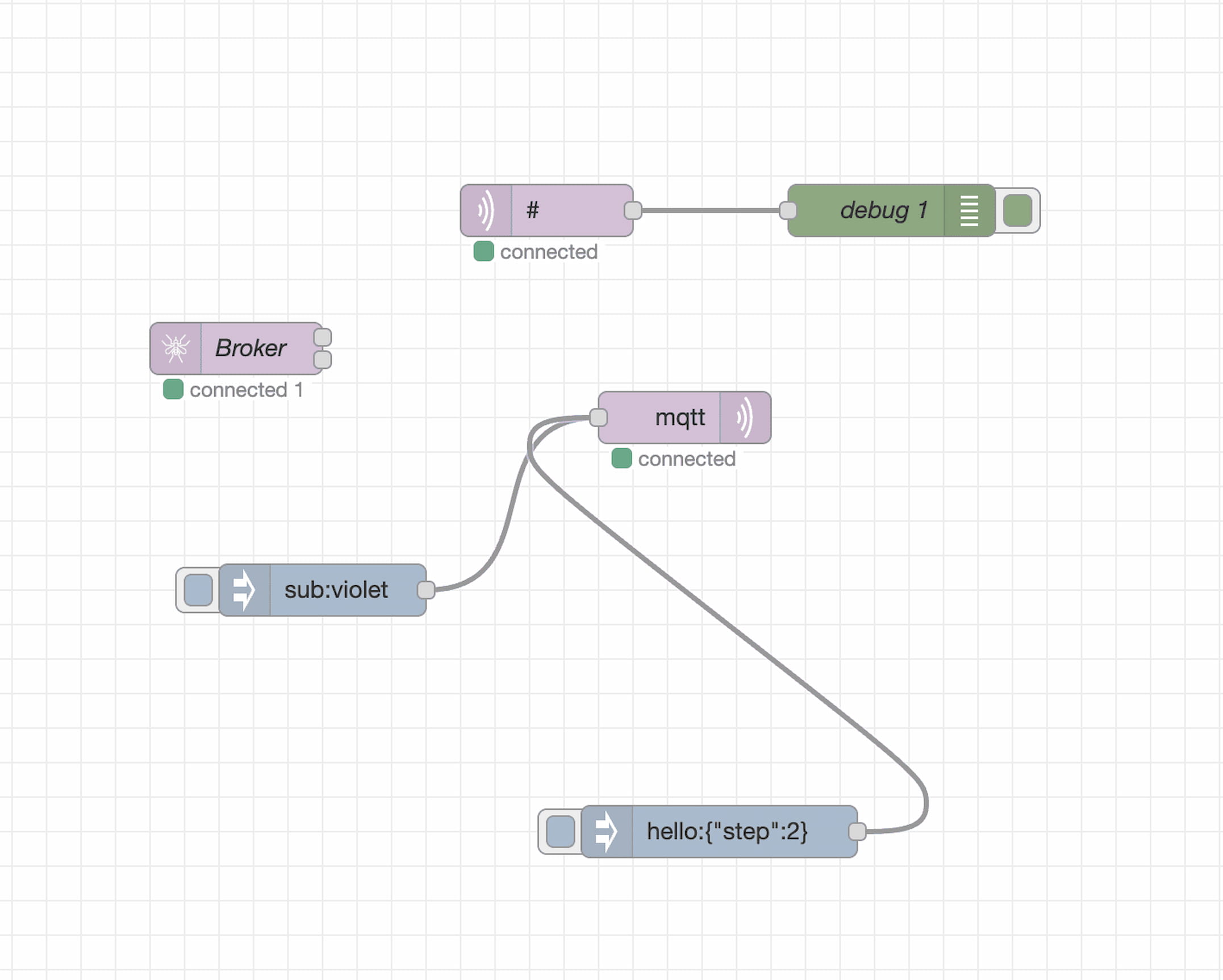
Connect to Node-RED, Home Assistant, and More
AVstudio now connects to Node-RED, Home Assistant, and other systems over the MQTT Protocol. It only takes two clicks to establish a connection, making it easier than ever to exchange data between your interface and an automation or control system. This highly efficient solution enables dynamic management of data flows and end devices.
Bug Fixes and Performance Enhancements
In addition to MQTT support, this update includes several refinements:
Stabilized Mixed DataSources: Fixed issues where local fallbacks for a repair DataSource were not correctly retrieved.
Improved Performance: Element selection, positioning, and property adjustments make AVstudio Editor faster, smoother, and more efficient.
AVstudio Editor Continues To Evolve
Update 3.9.12 reinforces AVstudio Editor’s powerful features through open, flexible connectivity. With MQTT, Node-RED, and real-time data feedback, your projects can be created faster, smarter, and more precise than ever.
Click the link below for a short video showcasing how this update enhances the development process: 👇
We are pleased to introduce our new Round Slider. It features outstanding responsiveness and can seamlessly fit into any environment. It can be adapted both in height and width simultaneously. All content within the slider also automatically adjusts to the element’s size by default, which is highly convenient.
Taking into account your feedback and our previous experience with the earlier version of the slider (Circle Slider One), the internal content is now presented as a standard text field. This allows you to freely arrange the necessary content across any number of lines and format it exactly as you wish.
Extremely responsive slider
A rich set of options allows you to style your slider and achieve completely different results that seamlessly fit into your design concept.
In this example, no custom styles were applied – only the basic element option was used.
A universal approach to defining the list of element options.
Due to the growing number of elements and their settings, it became necessary to standardize all properties in a consistent style across all elements. We carried out extensive work to group the properties in a clear and convenient way. For now, these properties will only be available in this form for the new elements introduced with this update. In the near future, we will gradually update the properties of all existing elements to bring them into full consistency.
Appearance, content, action, and state now standard sections.
Element state management.
For new elements, we’ve made element state storage and usage universal. It can be stored and retrieved from any dynamic source: data sources, parameters, global variables, data received via WebSocket or HTTP requests. The Crestron option remains available. In the future, we’ll upgrade all elements so they can store, retrieve, and send state through any channels, not just Crestron.
New Color Picker Element
It’s time to introduce the new ColorPicker element. It allows you to add any RGB color range.It can store its state with any dynamic data; similar to RoundSlider, it is fully responsive and can adapt to any parent width and height.
Auth improved
We’ve improved the authorization system. Now you can log in not only using the Email and Password combination, but also via the Google platform. In the near future, we’ll add several more convenient authentication methods.
Bug fixes and improvements
Parameter handling has become much more stable. We fixed issues with boolean parameters, as well as some update and dynamic calculation errors.
When creating adata source, errors could occur during test data retrieval, test function applications, etc. All these issues have been fixed.
Color selection in some element layers could be slow. We’ve improved its performance in the following object and will continue working to make this process even more convenient and faster.
AVStudio HTML5 GUI Editor Updates Version 3.4.0 | New features for Crestron Control System GUIs
At AVgator Inc., we are committed to evolving our AVStudio HTML5 GUI Editor to empower system integrators with faster, smarter, and more flexible tools. Our recent updates — versions 3.4.0 through 3.4.2 — bring exciting new features and capabilities that help Crestron HTML5 GUI developers deliver exceptional, customized control system user interfaces.
Premium Widgets for a One-Click Integration
NEW
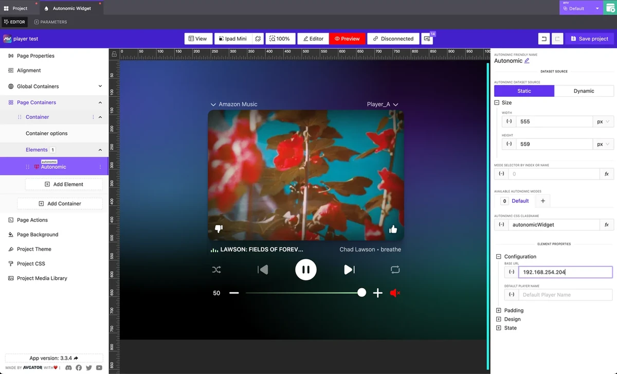
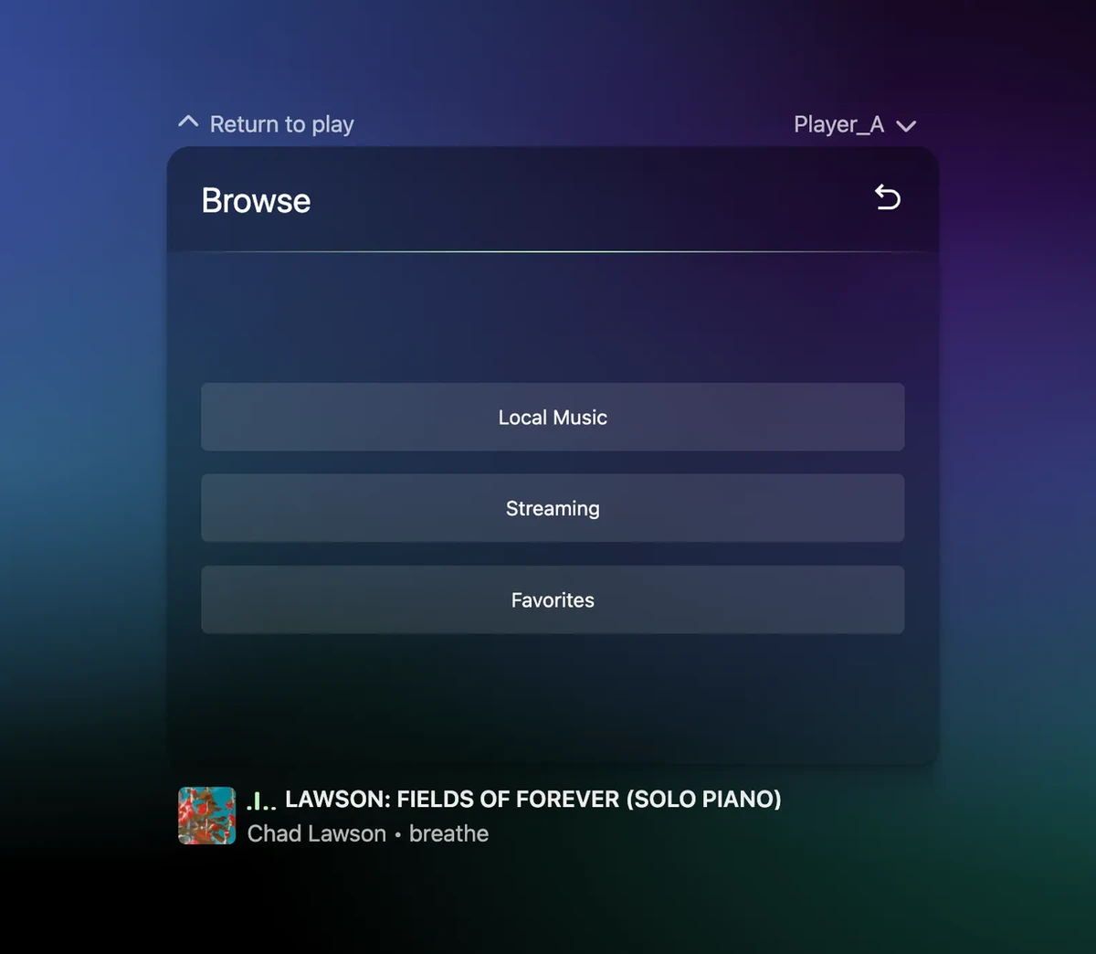
With version 3.4.0, we launched the Autonomic Premium Widget — AVStudio’s first widget designed for one-click integration within your Control System Custom GUI project.
This new AVStudio HTML5 GUI Editor feature is developed to accelerate your Crestron Control System GUI design. Simply drag and drop the widget, enter the IP address, and you instantly get a sleek, fully responsive media player interface ready to use. No complicated setup — just rapid deployment that saves time and impresses clients.
Key features include:
Only the IP field is required to get started
Fully responsive design that fits any space
Comprehensive support for the Autonomic API:
Full transport control (Play, Pause, Skip, etc.)
Real-time metadata display (album art, track info, artist name)
Volume control
Player selection
Seamless integration with Crestron, Global Caché, and other AV control systems
This launch marks the start of our vision to develop a diverse portfolio of premium widgets supporting one-click integration with multiple hardware and software platforms. These widgets will be tailored for residential, corporate, hospitality, and education use cases.
We are committed to making AVStudio the go-to Crestron HTML5 GUI Editor for seamless, drag-and-drop integrations across all environments.
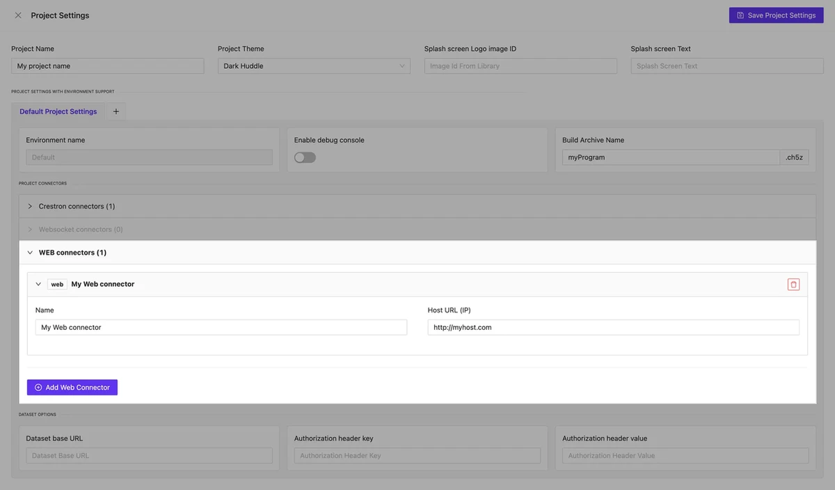
Web Connectors to add IP-controlled devices
NEW
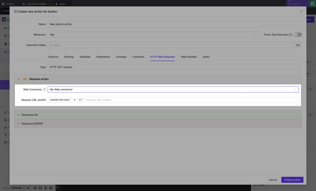
In addition to the existing Crestron Connectors, which enable fast development and testing of Crestron HTML5 GUIs within AVStudio, this new release introduces new Web Connectors. These empower you to integrate and control a wide range of other IP-based devices and control systems within the AVStudio HTML5 GUI Editor.
Managing HTTP resources in your AVStudio GUI projects is now easier with the new Web Connectors feature. Accessible from your project’s global settings, Web Connectors let you centrally store and manage data properties used across your HTTP actions, making edits faster and your Custom GUI Editor projects more consistent.
The New Web Connectors feature extends your GUI project capabilities far beyond standard Crestron hardware and makes AVStudio the go-to GUI Editor for system integrators working across AMX, Control4, Extron, Global Cache, and other various control systems and devices.
WebSocket connectors are currently under development and will soon complement the existing Web Connectors. This new functionality will enhance the handling of real-time data streams and support remote data sources, expanding your options for dynamic and responsive integrations in future AVstudio updates.
Redesigned Manage Actions Layout
NEW
To streamline your workflow, we redesigned the Manage Actions interface in the HTML5 GUI Editor to occupy almost the full screen and group actions thematically. This reorganization helps you quickly find and manage the actions you need, keeping your focus on building powerful GUIs without unnecessary distractions.
Workflow Improvements
BUGFIX
Between updates 3.4.1 and 3.4.2, we delivered key fixes and enhancements to make your control system GUI design experience within AVStudio more stable and smooth:
Fixed issues with attaching dynamic page names in route actions
Improved stability of routing-back operations
Introduced the new Editor Connection Manager for better connection handling inside the editor
Several minor improvements and bug fixes for overall performance
Fixed issues with attaching dynamic page names in route actions
Improved stability of routing-back operations
Introduced the new Editor Connection Manager for better connection handling inside the editor
Several minor improvements and bug fixes for overall performance
Explore these new features and enhancements in the AVstudio HTML5 GUI Editor for your projects completely free and accessible anytime at avstudio.app. Registration is quick and simple, so you can start building without delay.
Interested in early access to new features, direct communication with our developers, and opportunities to influence the future of Control System GUI design? Join our growing community of beta testers! Apply now to become a beta tester or contact us directly to learn more.
We are excited to introduce the latest updates in AVstudio, bringing you new features and improvements that will enhance your design experience. This version includes community templates, new design options like Shadow and Reflect, support for custom fonts, and various usability enhancements such as better hotkeys and the ability to switch between element modes by name. Additionally, performance optimizations and bug fixes ensure a smoother workflow. These updates are designed to provide you with more creative options and streamline your projects.
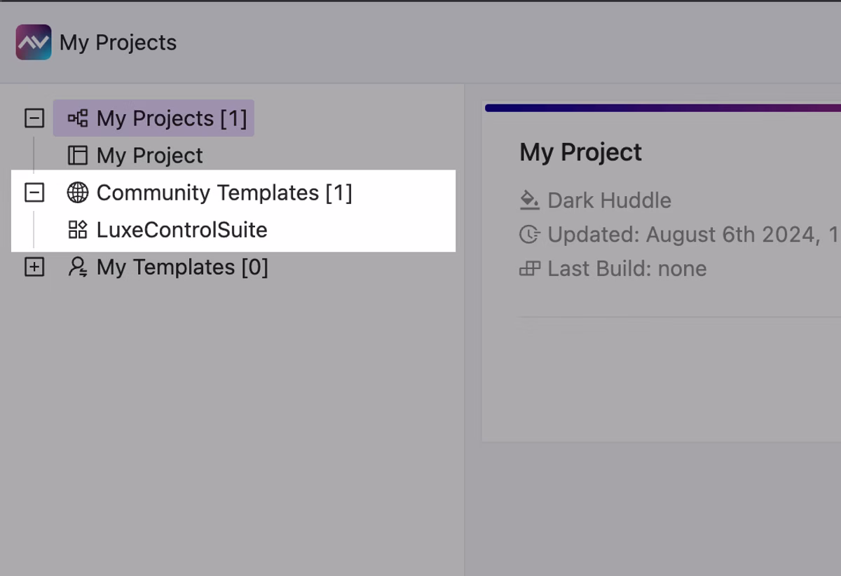
Community templates
NEW
The first free community template is available in AVstudio. Feel free to clone these projects and reuse or modify them any way you want.
We plan to regularly add new templates, so stay in touch to not miss new stunning, free-to-use AV GUI templates!
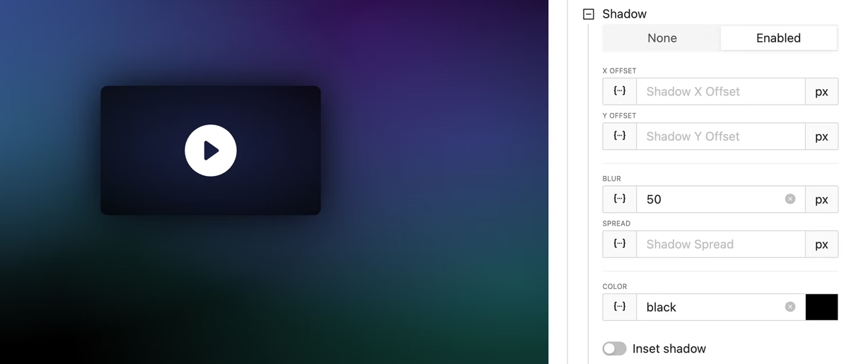
Shadow introduces a subtle, elevated look to your elements, creating a sense of depth. This design option enhances visual hierarchy and can make your elements stand out more effectively.
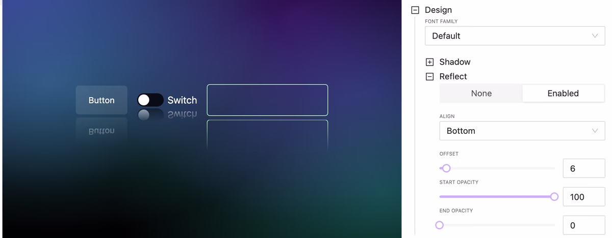
Design option: Reflect
NEW
Reflect allows you to create mirrored versions of your elements with just a few clicks. This can be particularly useful for design symmetry and creating visually balanced layouts.
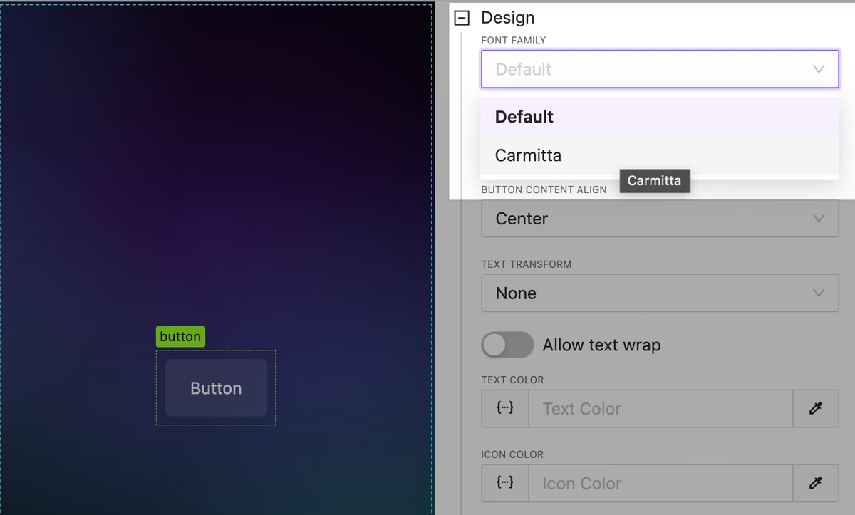
Custom Fonts
NEW
Upload and use beautiful custom fonts everywhere you need to impress your customers!
Fonts can be attached from element settings or by using custom project CSS.
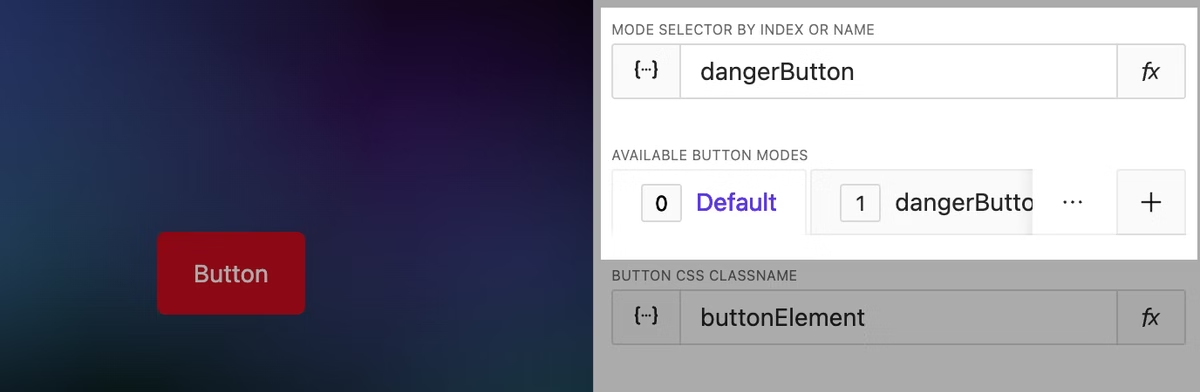
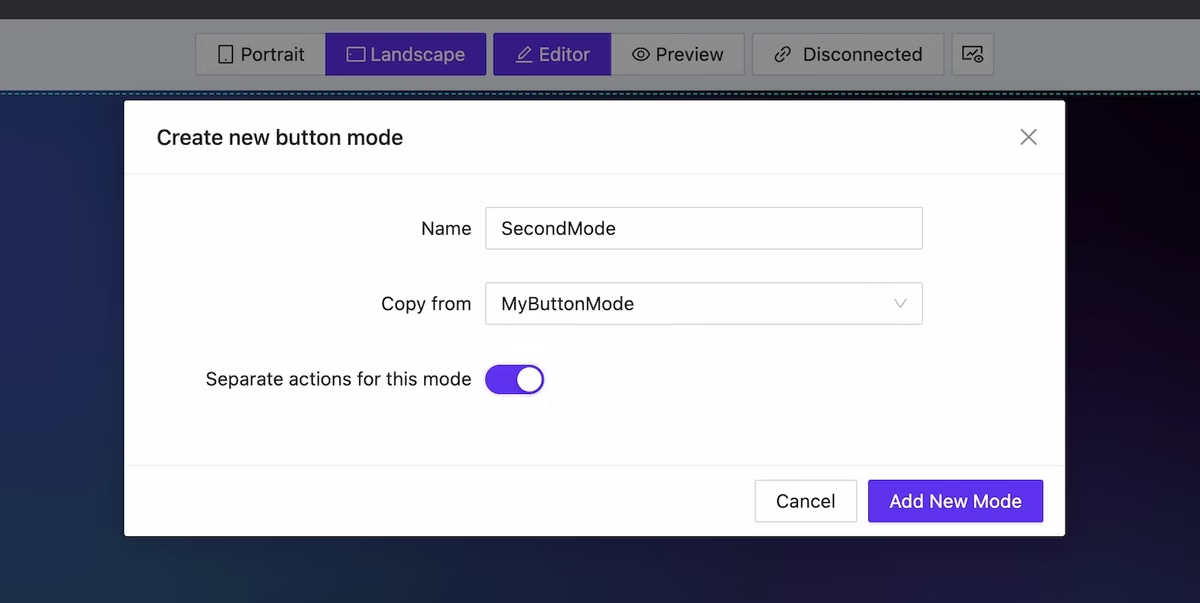
Switch between element mode by name
UPDATE
You can now switch between element modes by using their names directly, making the design process more intuitive and streamlined.
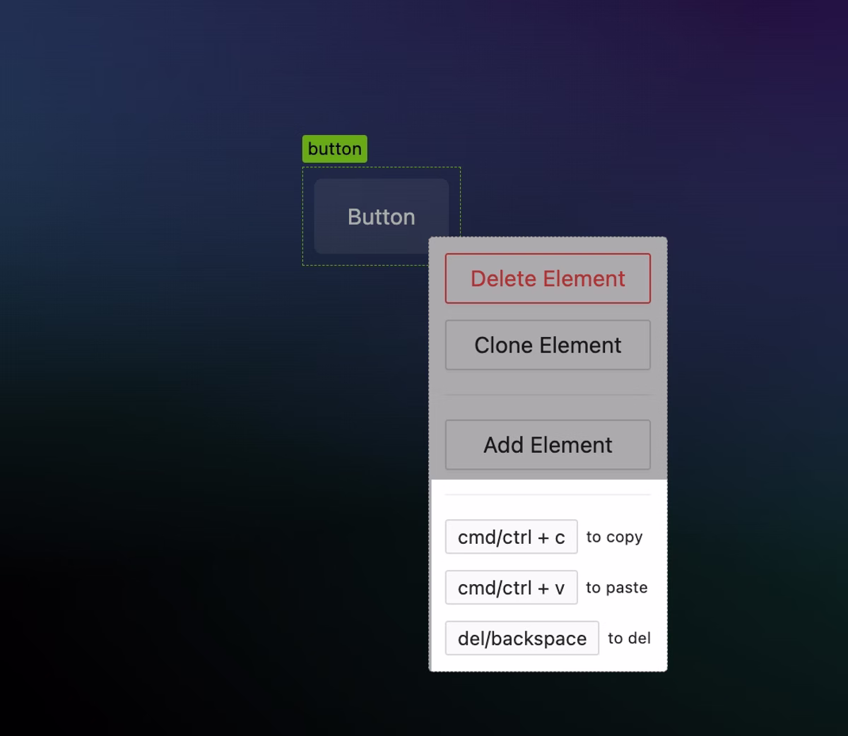
Better Hotkeys
UPDATE
Add hotkeys for quick copy/paste of elements. This works even between projects, but for now, it does not include associated data like datasets, attached functions, nested subpages, etc. Deep copy will be available later.
Current available hotkeys are:
ctrl/cmd + shift + z (redo)
ctrl/cmd + c (copy)
ctrl/cmd + v (paste)
ctrl/cmd + s (save)
ctrl/cmd + z (undo)
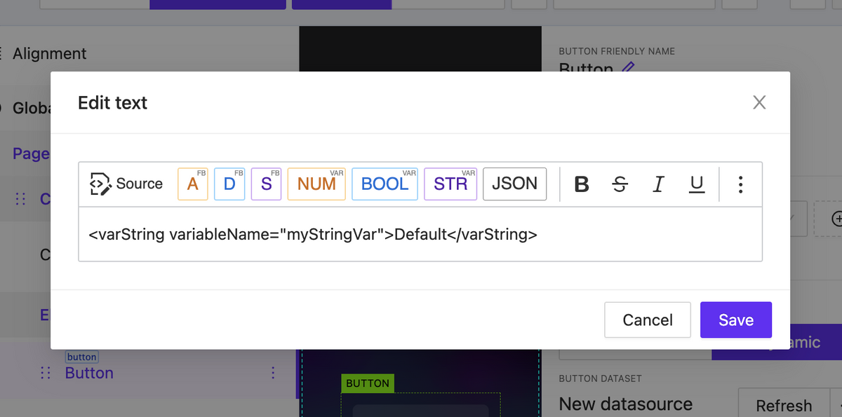
Double click to edit text fast
NEW
You can double-click on text and button elements to open a text editor modal.
Override global project theme vars
NEW
Take control of project variables such as colors, backgrounds, and more. In the near future, the list of available overrides will be expanded.
Functions: AVgator® project methods info
UPDATE
You can now access a variety of built-in functions directly through the Window object. These include methods for data manipulation, element control, sending and listening to events, page flips, and more.
Large list loading optimization
UPDATE
Now you can easily handle a large number of elements on one page without any performance issues.
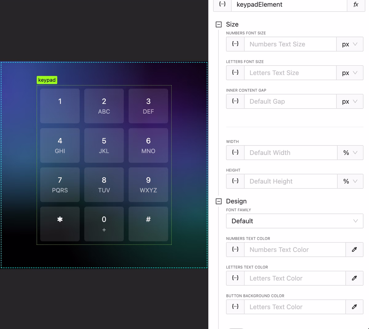
Added keypad design options for colors, backgrounds and gaps
UPDATE
Keypad design options have become more flexible.
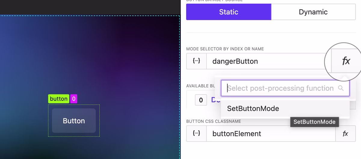
Post-processing functions
NEW
Post-processing functions let you apply effects and modifications to element values to alter the result. For example, based on a signal or string variable’s value, you can calculate and return the proper element’s mode index (or name) using some logic.
Image Sizing
BUGFIX
There were sizing issues with image elements and inside elements where images were used (such as in the shades widget). Sometimes, images were larger than expected and did not fit the container. This issue has been fixed.
We have added the capability to create mods for elements (all of them!). This allows for significant alteration of both the appearance and actions of the element depending on dynamic data. This functionality extends to page lists as well: you can easily modify the structure of the list with just a few clicks.
Mode creation dialog
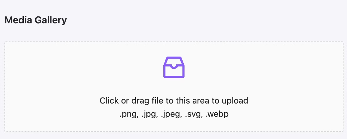
Media upload: support for .svg (color inheritance included) and .webp
NEW
We have implemented the ability to upload images in the webp format. Additionally, you now have the unique opportunity to upload images in the .svg format. It is important to understand that an SVG image containing ‘currentColor’ as a color indication will adopt the element’s color settings—this is particularly convenient for creating unique icons.
Use any .svg image as icon. Animated .svg also supported.
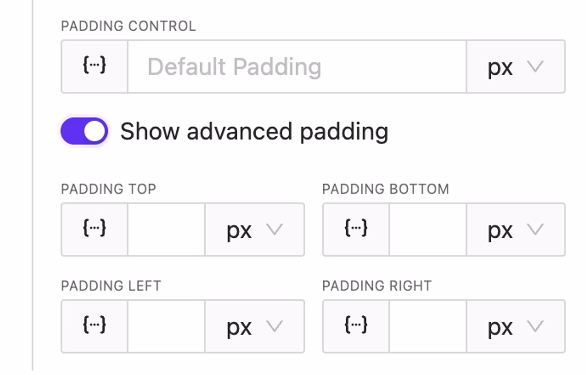
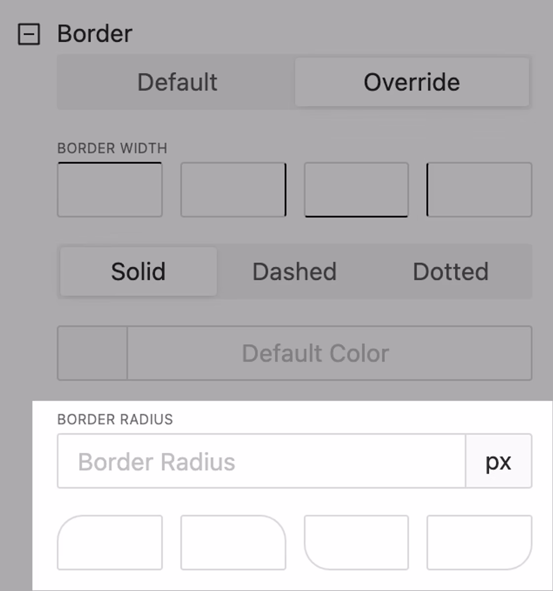
Granural Padding & Border Radius Control
NEW
It has become convenient to set different value for different sides. Feel free to utilize this feature!
Advanced border radius control
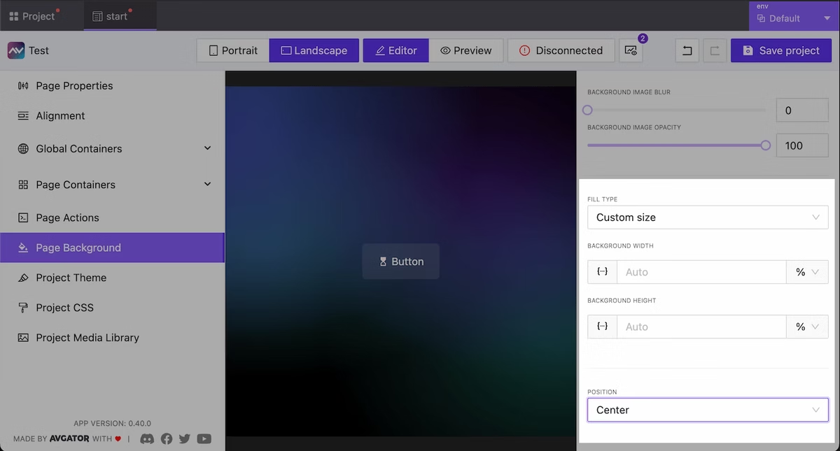
Extended Background Size & Position
NEW
Now you have more control over the background at the page, project, and other supported element. You can now specify sizes and positions as well.
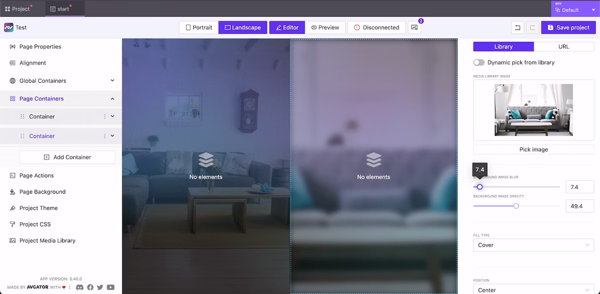
Background Image for Containers
NEW
The ability to specify a background for the container is now available. Control for position, opacity, size, blur included!
Containers with custom background Images
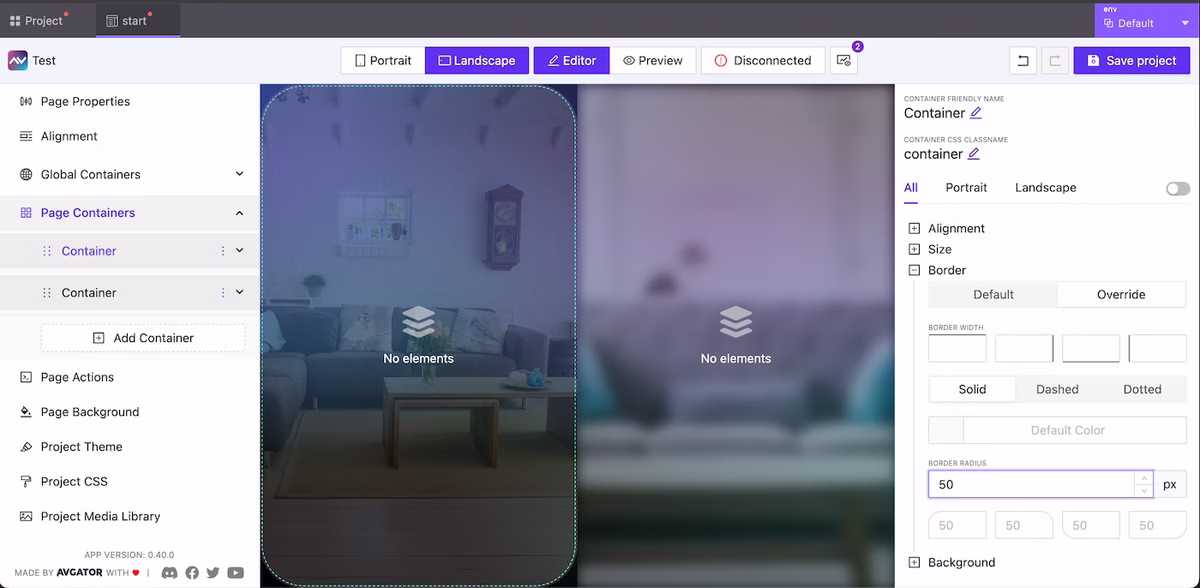
Border Radius for Containers
NEW
Utilize border radius directives for the container to enhance the appearance of your project.
Container border radius
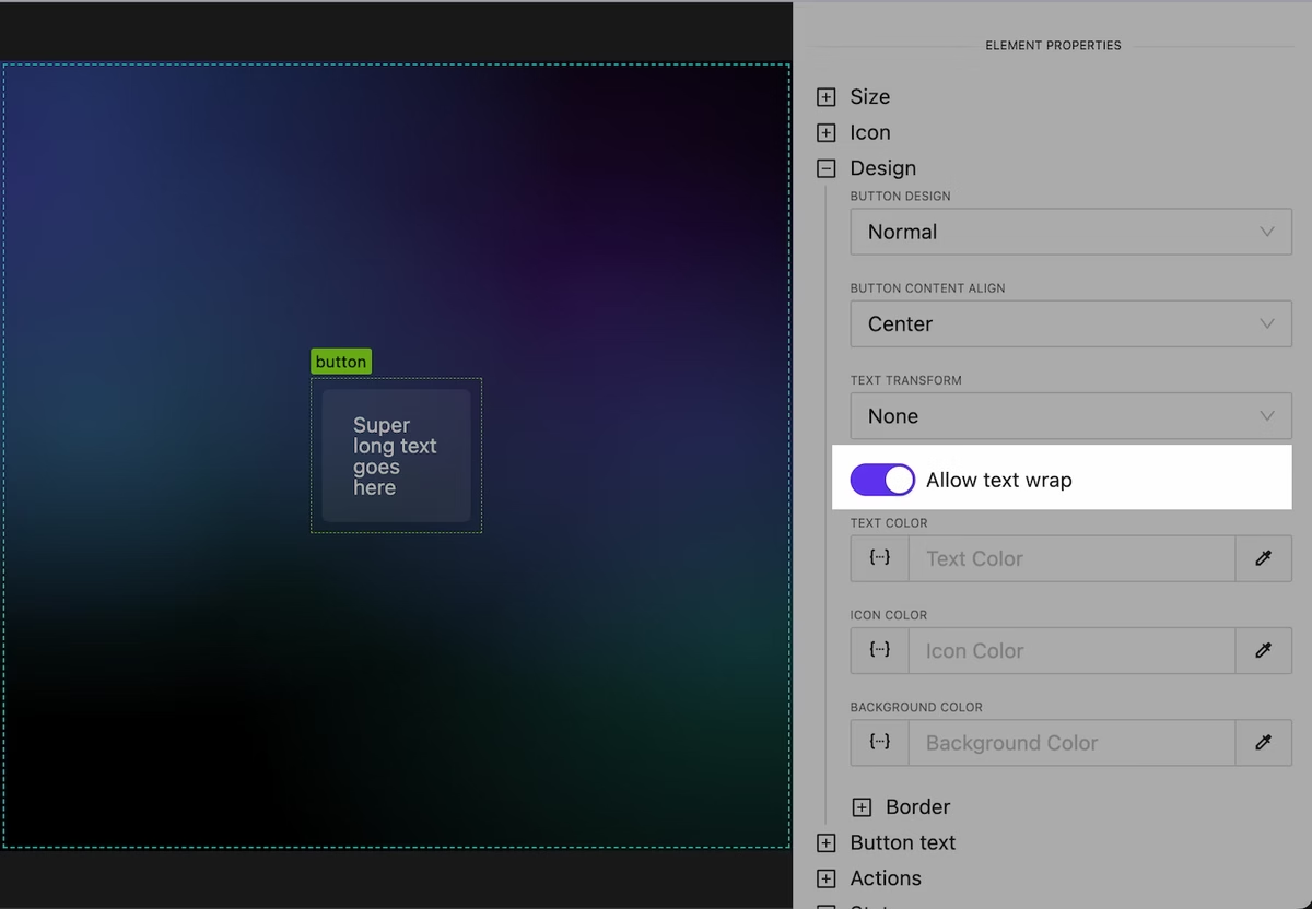
Text Wrap Behavior for Button & Text Elements
NEW
Working with long text has become more convenient. Later we will add convenient tools for automatic truncation of long text.
Control over text wrap
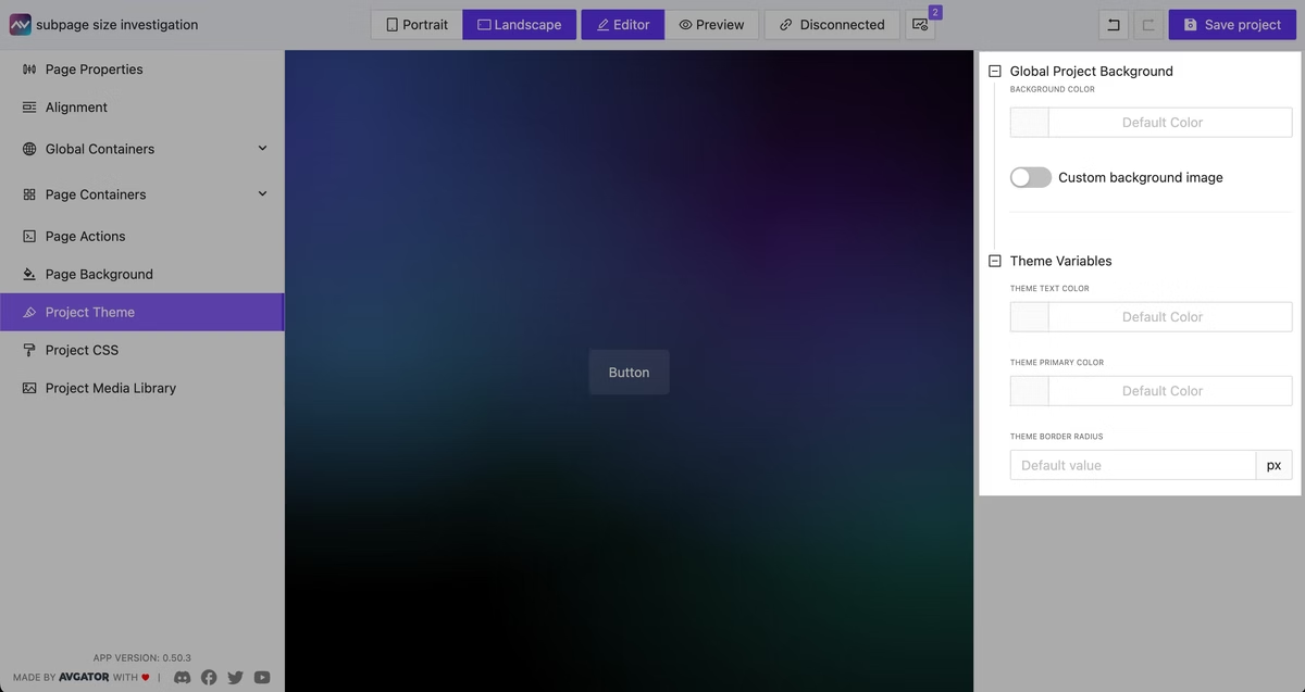
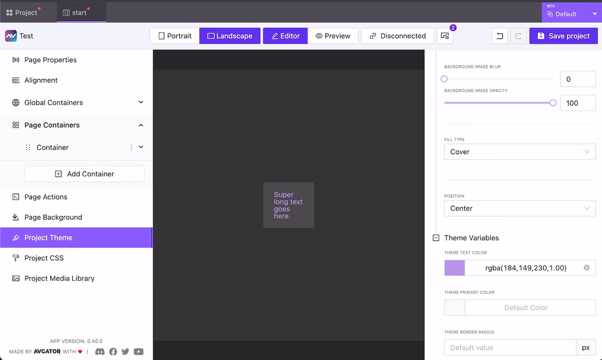
Global Override Theme Design Settings
NEW
We have moved global project background settings into a separate category in the menu. Additionally, in this menu item you now have the option to specify custom settings for the main colors used. In the future we plan to significantly extend control over the appearance at a global level and allow users to create and share their own design/color themes.
Override global theme color/background settings
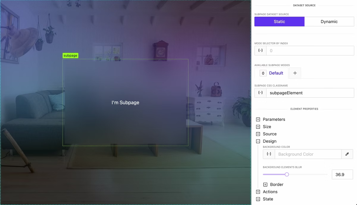
Blur Content behind Subpage or Container
NEW
At the container and subPage level, it is now possible to control the degree of blurring of elements/content beneath them. This is very convenient for highlighting, creating visually appealing effects and improving the readability of your interface.
Background blur effect
Containers are sortable again!
NEW
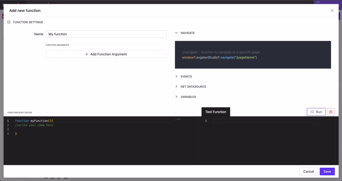
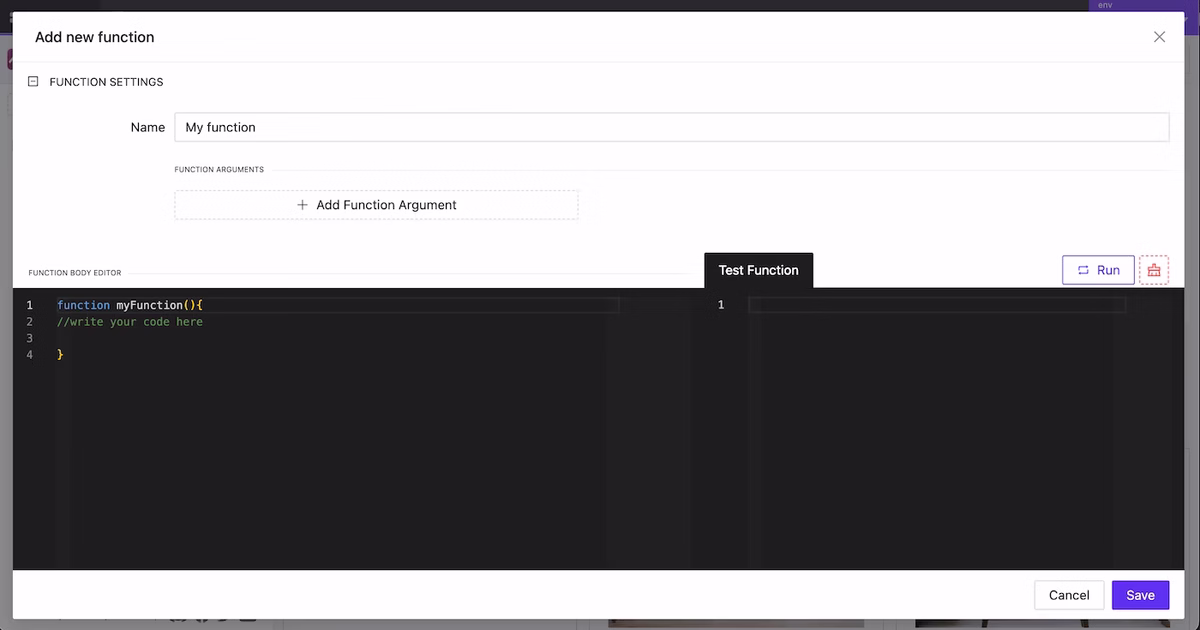
New Function Creation Modal
NEW
A new editor has been designed for creating functions. Writing and testing functions has become much more convenient. Additionally, integrated documentation with all available global data and variables for use will be added to this modal soon.
New Function Creation Modal
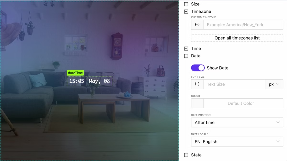
New DateTime Widget
NEW
We have added a DateTime widget for convenient and fast visualization of the current time and date with detailed formatting options and the ability to specify time zones.
DateTime widget
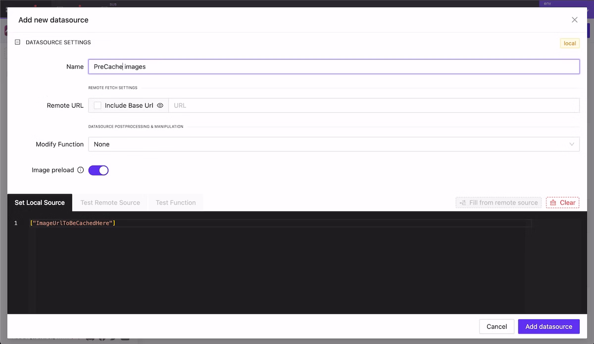
Precache External Images
NEW
If your project extensively uses images from external sources you can now cache them in advance so that users will see them instantly when using your GUI.
Add datasource with urls array should be precached
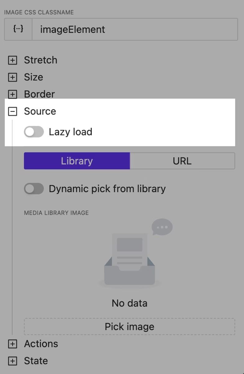
Image Lazy Load Option
NEW
Using this option will allow you to defer the immediate loading of heavy images and improve the user experience.
Image lazy loading
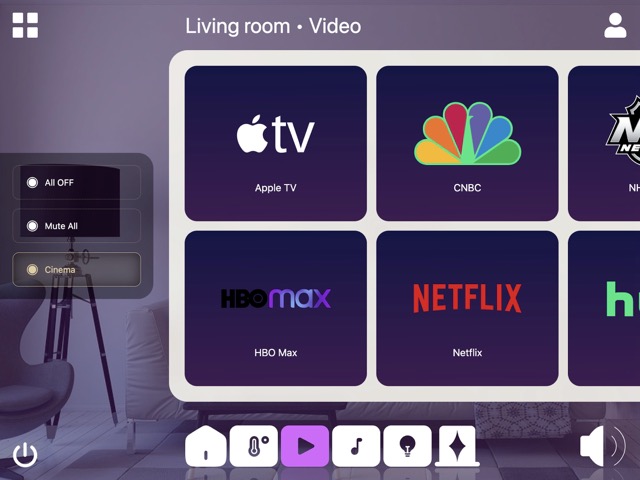
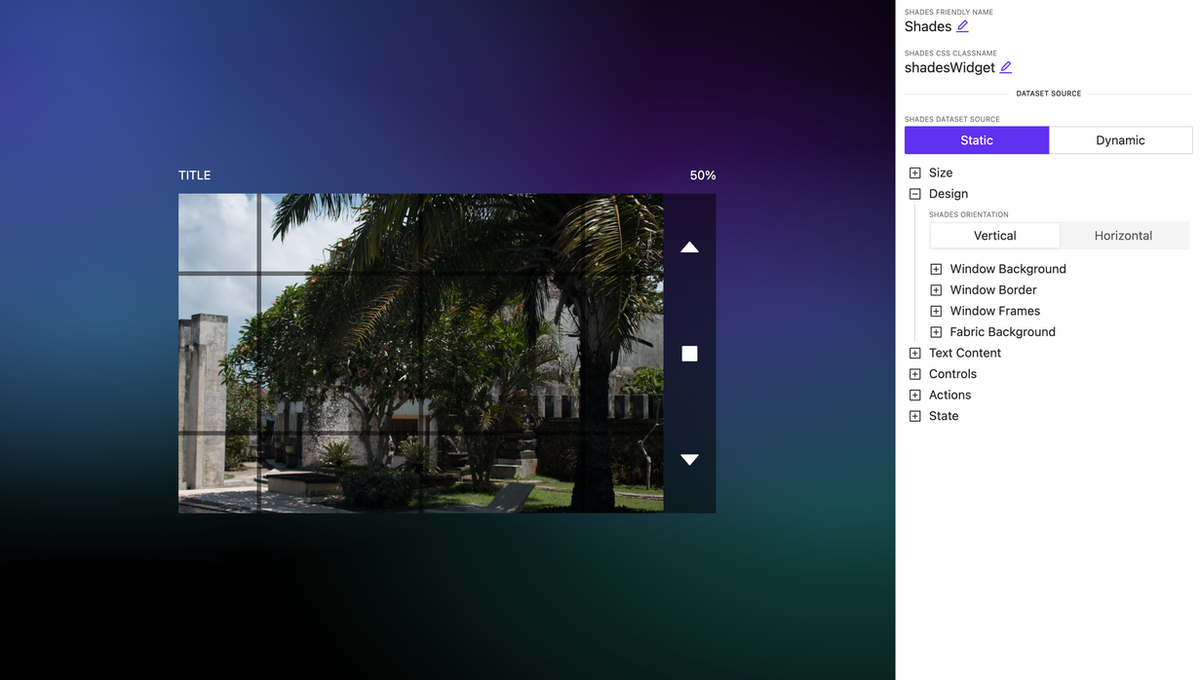
Shades Control Widget Improved
NEW
Advanced settings and bug fixes have been implemented for the shades control widget. You can now configure the curtain style in more detail. Additionally, users can adjust the degree of opening and closing by directly dragging the curtain fabric.
We have added the ability to assign dynamic CSS classes to any element on your page. This allows you to change the appearance of elements using not only built-in settings but also custom CSS styles.
You can assign as many classes as you want separated by a space.
Dynamic CSS classnames for any element
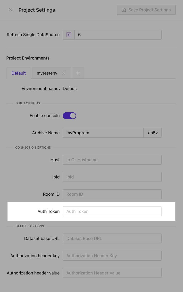
Environments
NEW
We are pleased to introduce our new feature, Environments. Now, each project can have multiple environments, each storing specific settings that can be used in various scenarios. For example, different connection settings to the processor that you can use at your workplace as well as for final testing on the client’s hardware. It’s easy to switch between environments both during interface creation and when selecting them for building. When changing the active environment in the page editor, the live preview instantly applies all the current settings you have selected.
Crestron processor auth token support
NEW
We have implemented support for authorization tokens for connecting to processors. This allows us to avoid redirects during authentication.
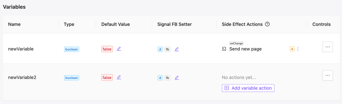
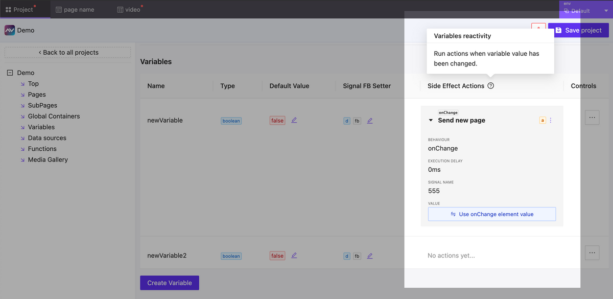
Variables Side Effects
NEW
Now you have the ability to react to changes in variable values. In the event of a variable change, you can create as many actions as needed. This can include actions to send any type of signal, assign a variable, change a page, or anything else necessary to implement your scenario.
Updated variables table
Variables side effects form
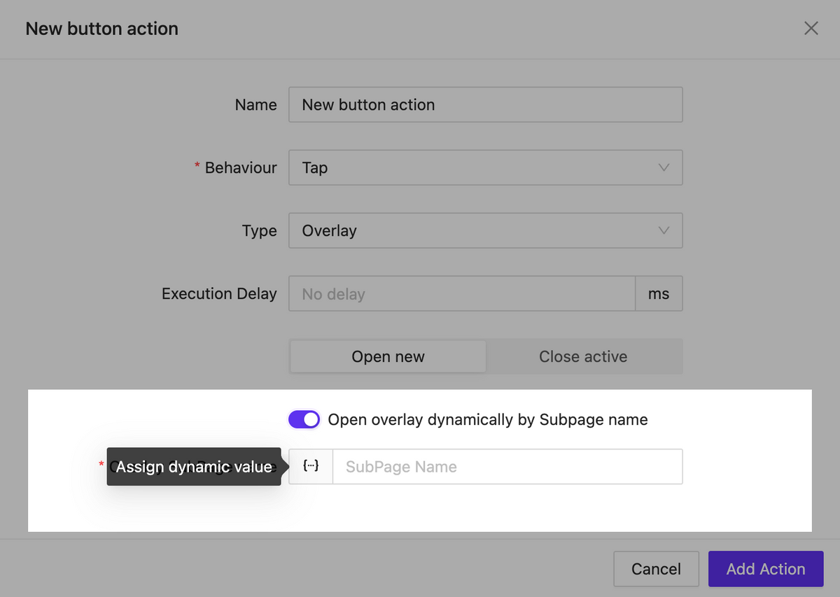
Dynamic subpage inside overlay
NEW
Now, when opening the overlay you can specify the page that should appear in it dynamically. This allows us to implement various interface logic within a single element as part of an action.
Call overlay by subpage name
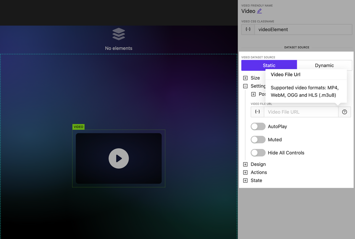
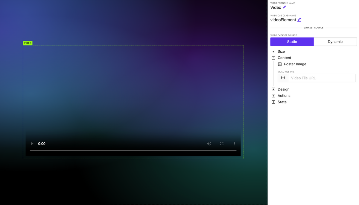
Video element updated: new options and HLS support
NEW
The video element has been significantly enhanced. It now includes extended settings for controlling the display of player interface elements as well as support for the new format: HLS.
Updated video element
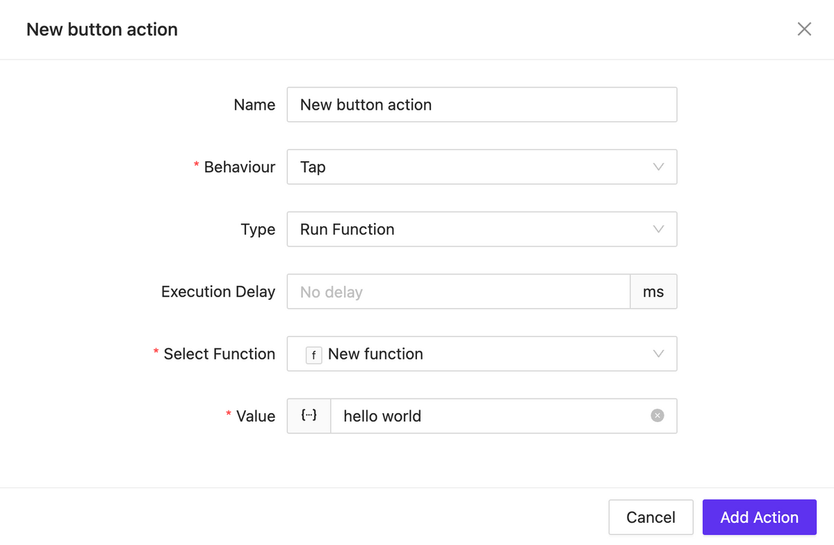
New action type: Run Function
NEW
We have introduced the ability to create an action that allows you to execute any JavaScript function you have previously created. This action can be applied to any element.
Function runner
Bugfix & Small improvements
UPDATE BUGFIX
Better behavior for text input element, slider, circle slider, toggle, checkbox, switch.
Fix Button element pressed state styles
Update fullscreen editors (html block, css)
Back routing doesn’t trigger action if actually no back page exist
Click on image allow open overlay
Better webxpanel initialization method, webxpanel updated to latest version
Fix bugs on touch click events
Fix bugs when sometimes overlay cannot be closed
Stop execute actions from list elements while it scrolling
Edit action form bug with representing wrong initial data
Click event may triggered twice on iOS – fixed
Fix project clone process
Improve page/subpage search
Improve subpage search whet setting up a route action
Live session isolation: one per login instance
Fixed unresponsive field while editing assigned dataset
Fixed: Color field doesn’t show current color value (text element for example)
Fixed: Dpad keep working when disabled
Fixed: Circle slider send wrong value when ends with zero and using fraction
A new widget for controlling shades with rich appearance and display settings.
Shades control
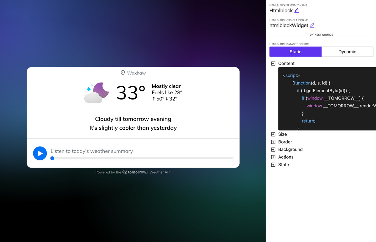
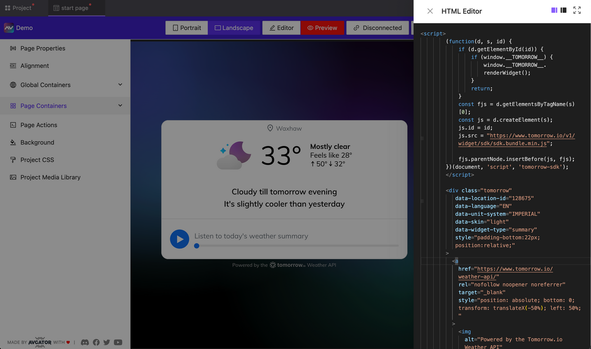
HTML block element
NEW
A new element has been introduced allowing you to embed HTML code, including tags, styles, and scripts. For example, in about 30 seconds, you can insert a fully functional web widget for weather, and it will work seamlessly and display on your page.
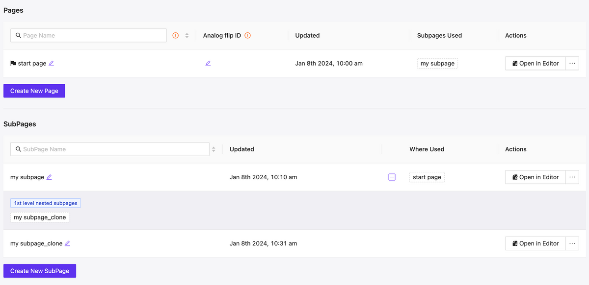
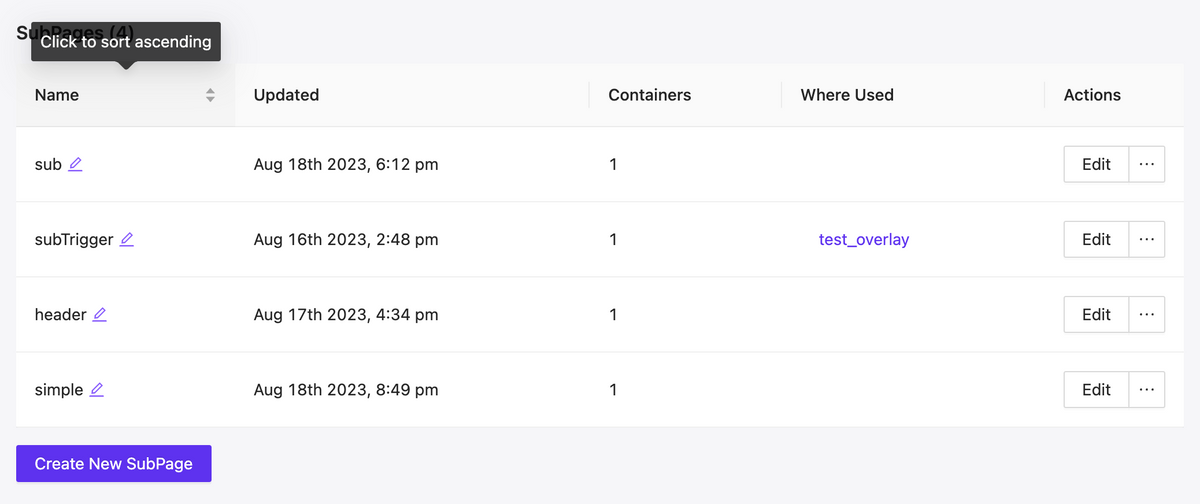
More control over the management of pages and subpages
NEW
Fast filtering as well as mutual mapping of utilized pages and subpages, allows for quick orientation and navigating to edit relevant components, understanding their hierarchy.
Pages & Subpages interface updated
Extend dynamic support
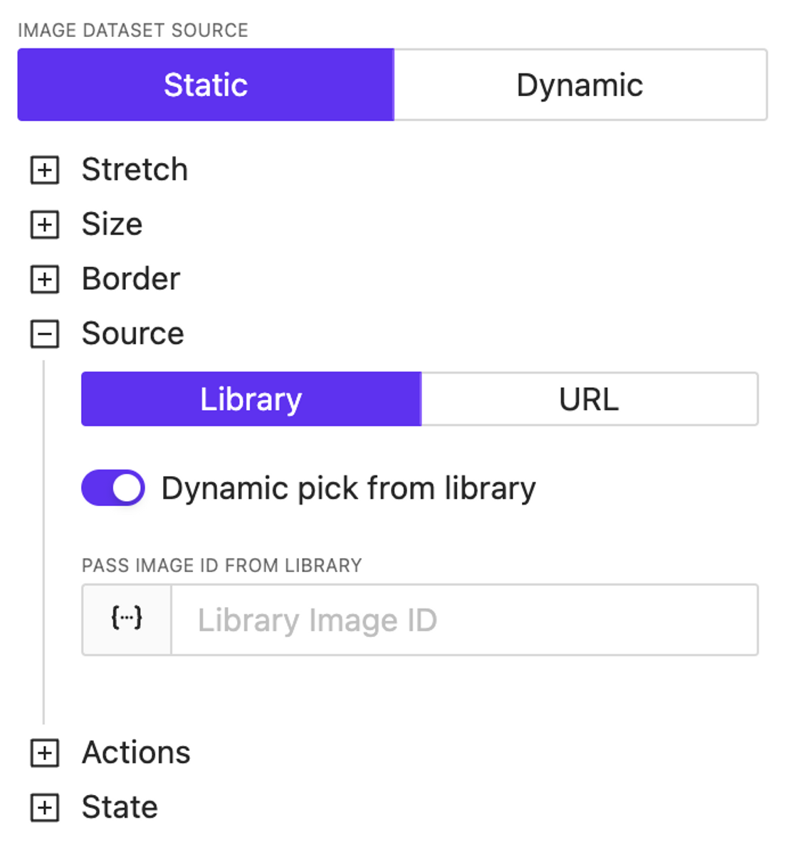
NEW
We’ve introduced dynamic support for color settings across almost all elements. Additionally, the image source specification is now entirely dynamic—you can use both URLs and dynamically reference images previously loaded into the library, including the use of variables and/or a datasource.
Video element
NEW
A video element has been added. Currently, it’s the most basic implementation; later, we’ll update the list of supported properties and display settings for this element.
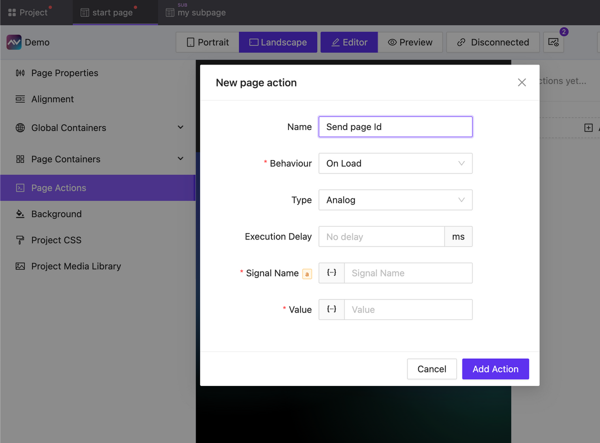
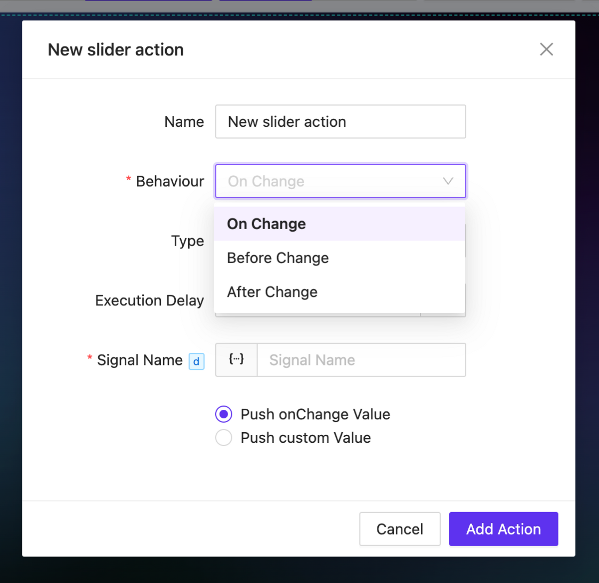
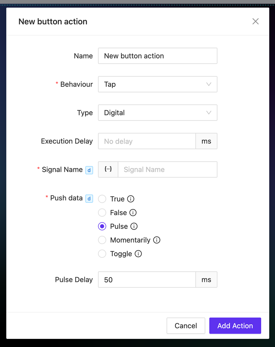
Actions updates: OnChange, Page Actions, new properties
NEW
Actions for pages (and subpages) have been added, which can be triggered upon the loading or unloading of a page (subpage).
For all types of events, you can now set a delay in the action execution.
For elements that imply a change in the value of something (such as sliders, checkboxes, inputs, etc.), onChange actions are available. These actions allow you to trigger any events before or after the value changes, as well as directly manipulate the changing value.
For the digital type action, numerous new options have been added for working with the sent value: momentaries and toggles are now available. Additionally, for the Pulse value type you can configure the delay for value transitions.
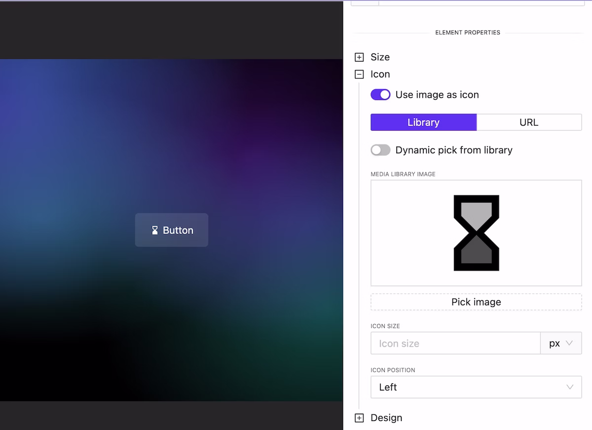
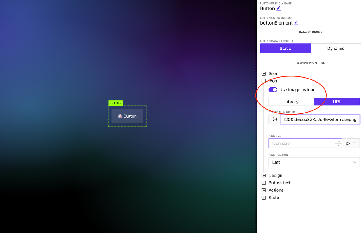
Image as Icon
NEW
In all elements where there is an icon specification (for example, a button), you can attach not only an icon available in one of the preinstalled libraries but also use any image. Moreover, this image can be loaded either from the library or dynamically.
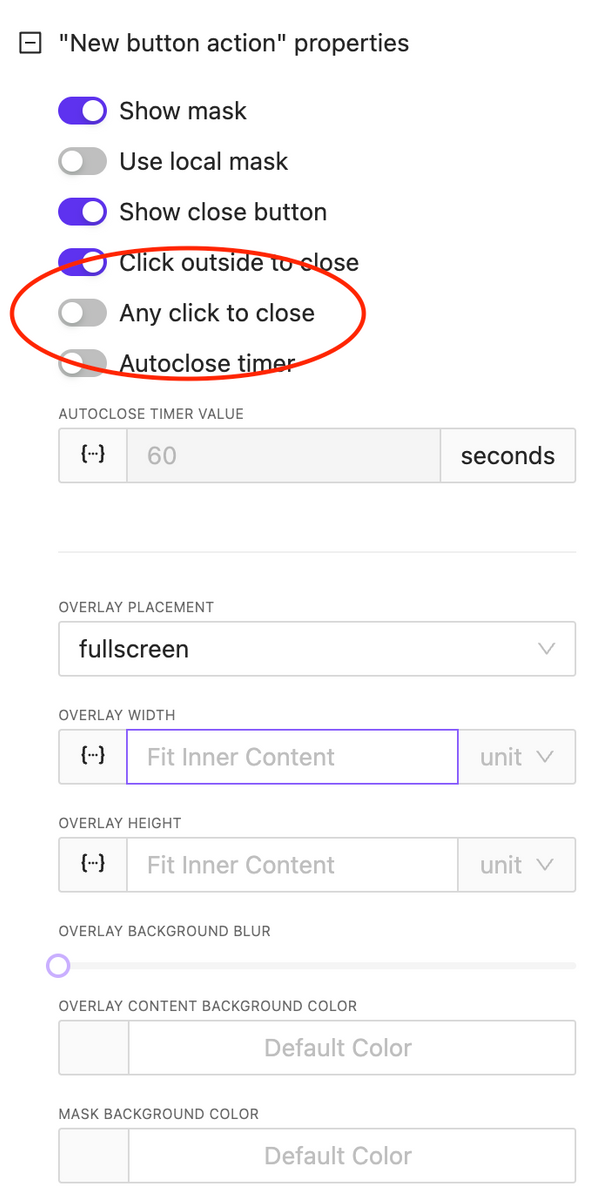
Overlay: Any Click to Close
NEW
An important option has been added for overlay control: the ability to close the overlay by clicking anywhere on the screen. This is useful for implementing informational pop-ups that do not require user interaction.
CSS & Code Editors updates
NEW
We have reformatted the appearance and display settings for code editors used for writing CSS and HTML block code. You can relocate the code edit and also expand it to full screen.
Bugfix & Small improvements
UPDATE BUGFIX
Fix touch actions in Crestron One
Added border support to many element
Fix bugs with value in multiply circle sliders on the page
More stable functions
Fix deep nested parameters values
Fix action info in sidebar, add ability to edit actions without need to recreate them
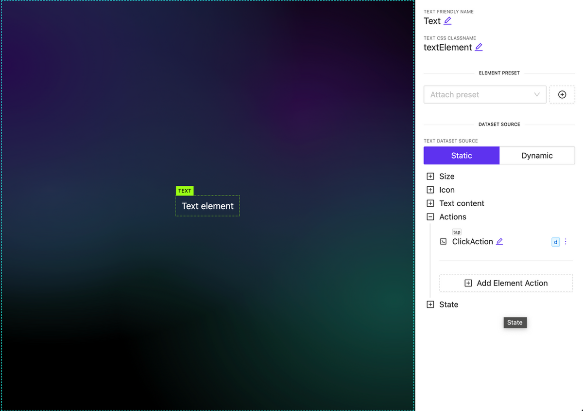
Ability to attach actions to Text, Image and Subpage elements
NEW
You can now associate various types of actions with new elements, such as subpages, images, and text. It’s important to note that any actions used within a subpage are executed independently.
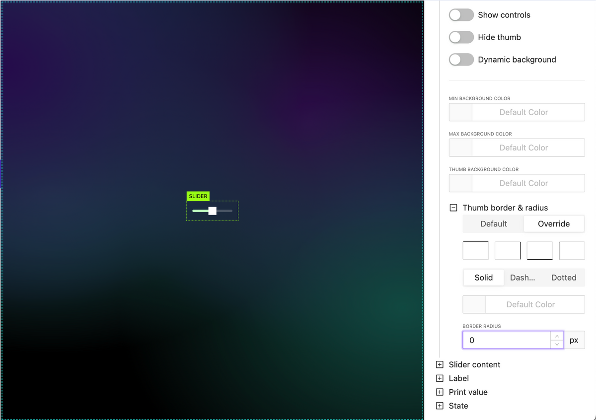
New slider handle style options
NEW
Hand border options including border radius
Hand background color
Pages & Subpages sorting
NEW
Allow set signal value in action as dynamic value (json, variables, etc)
NEW
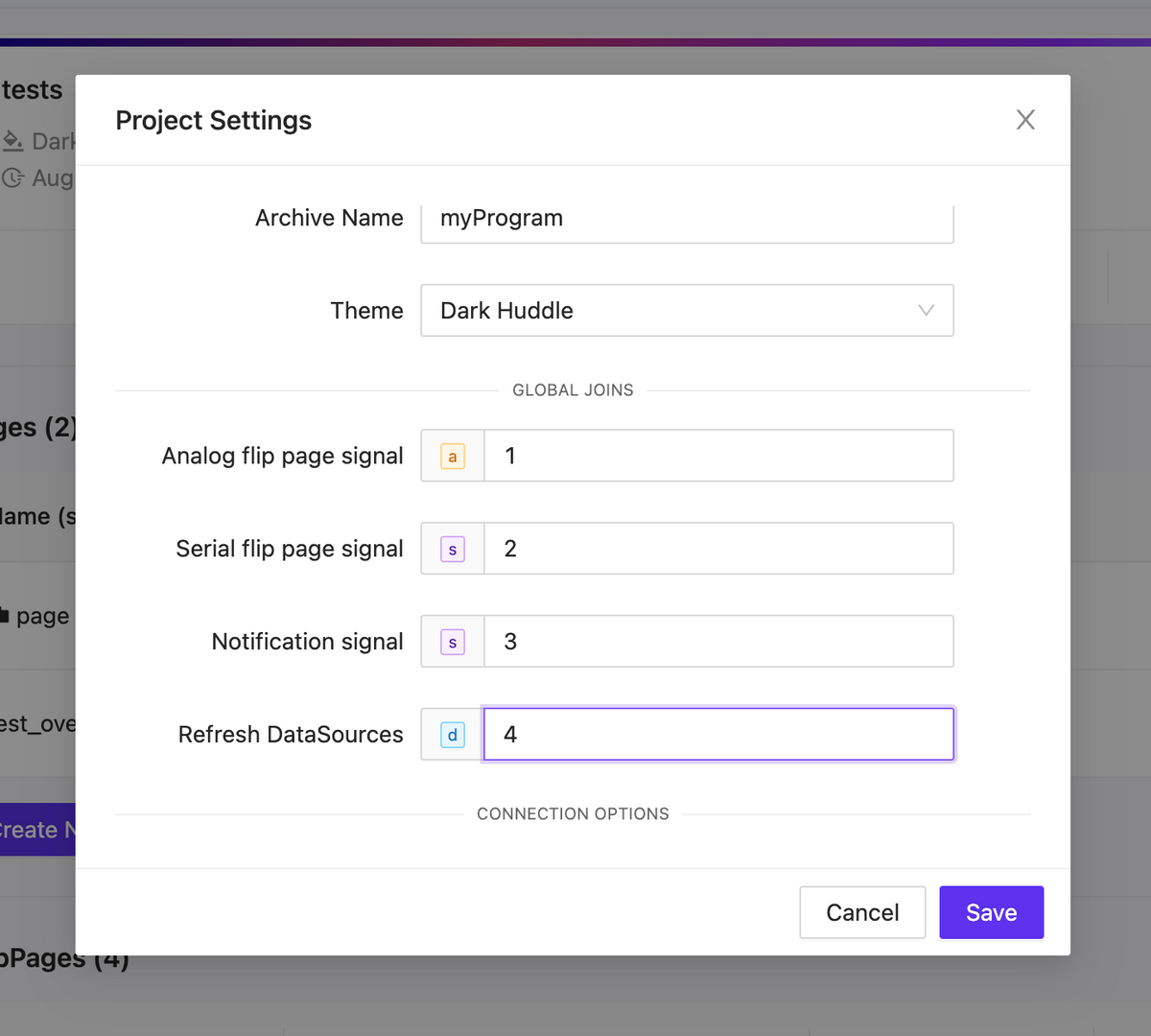
Project global joins
NEW
Analog flip page signal
Initiate a page flip from the processor using analog feedback. Remember to manually set the page flip ID for this operation.
Serial flip page signal
Trigger a page flip using the page name as a reference.
Notification signal
Inside your project settings, you have the option to define a serial signal name. When feedback is received from the processor, the text will be displayed as a notification using the specified signal name.
Refresh DataSources
Activate a datasources update by using signal feedback.
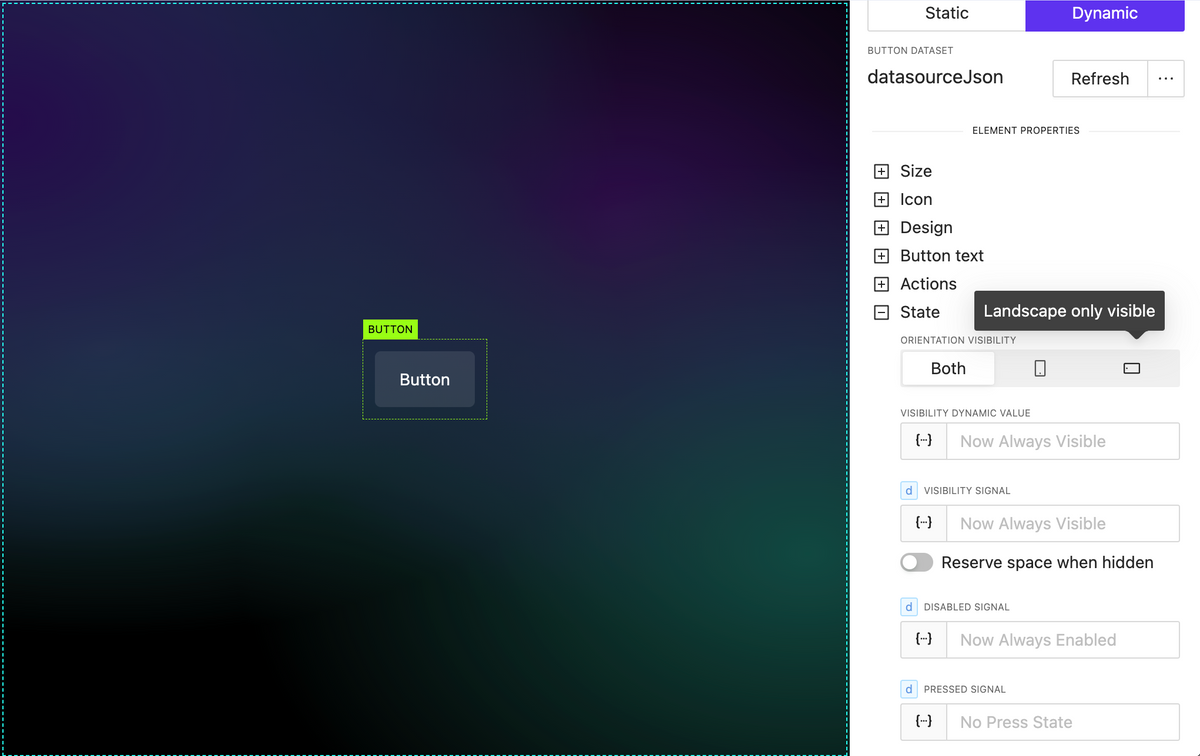
Element extended visibility
NEW
By orientation
Element orientation visibility refers to the position of an element, such as text, an image, or any other component, and whether it’s currently visible within the current orientation.
By dynamic value (variable, parameter, json datasource)
By utilizing dynamic values within your project, you can dynamically update whether elements are visible or not, all without the need for external processor interactions.
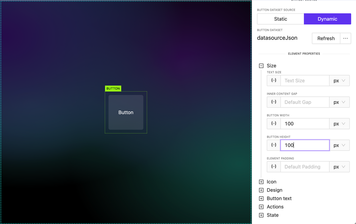
Added button height property
NEW
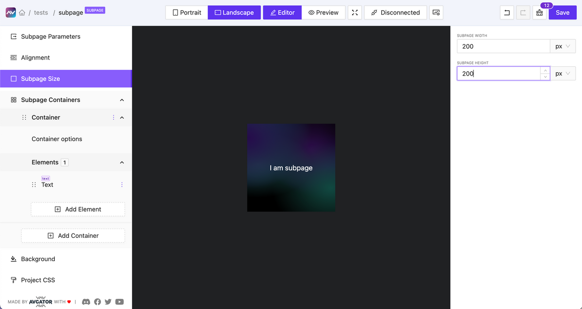
Subpage optional default fixed size
NEW
You can enable the option to set a fixed width and height for a subpage.
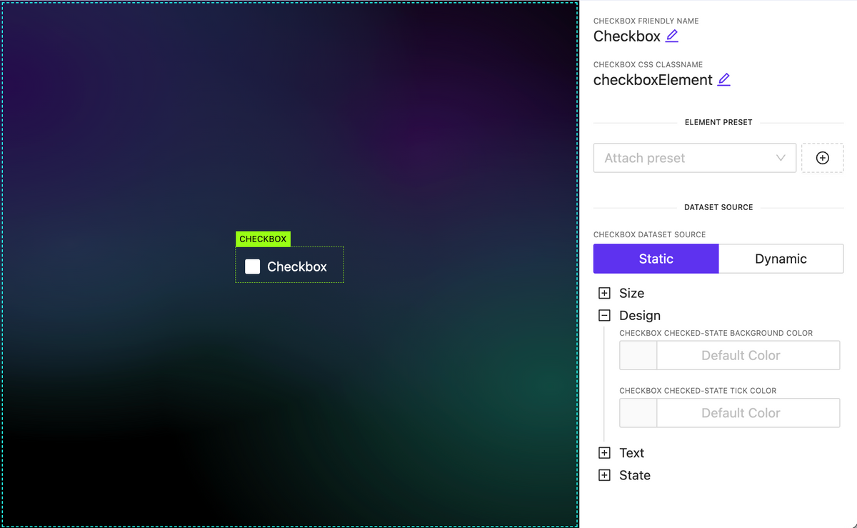
Added Checkbox element
NEW
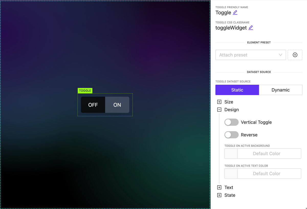
Added Toggle Switch widget
NEW
Added Circle Slider widget
NEW
A highly customizable circular slider widget that can be employed for various purposes, including climate and sound controls, among others. It allows dynamic content configuration for all elements inside.
Subpage parameters
NEW
Pass data from the parent element down to a nested subpage as input parameters and utilize this data within the subpage.
Overlays
NEW
A new action type has been introduced, functioning as a trigger to display an overlay. The overlay can be any type of subpage containing various data, appearing on top of the page content. Numerous customization options are available, including:
Adjustable overlay placement on the page.
Customizable overlay mask styles and local mask design.
Automatic closure by timeout or clicking outside the overlay.
Set icon dynamically
NEW
You can now set the icon name as a string, even when it’s sourced dynamically. To discover the full range of available icons, you can utilize the Icon Explorer feature, providing greater flexibility in choosing and displaying icons within your project.
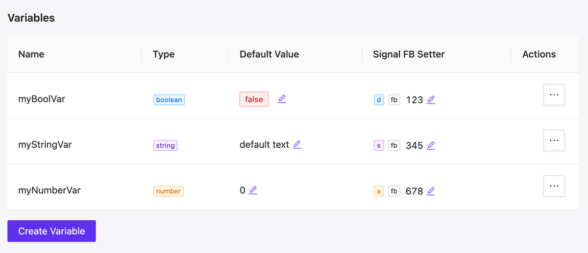
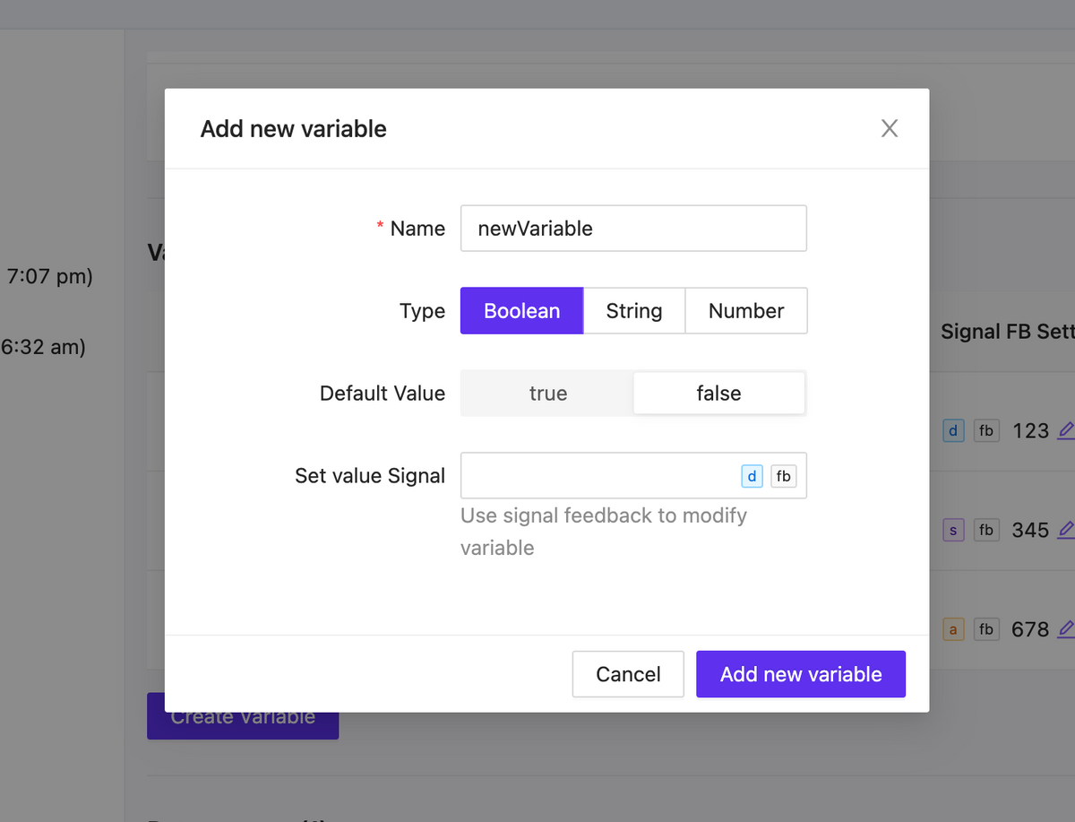
We have added local variables that can be used in your project. There are three types of variables: string, number, and boolean. The variables have default values and can be modified within the UI interaction, either without the involvement of the central processor or with its involvement taking on the value of signal feedback.
As a result you can implement a significant part of internal logic without involving the processor.
Variable list
Variable form
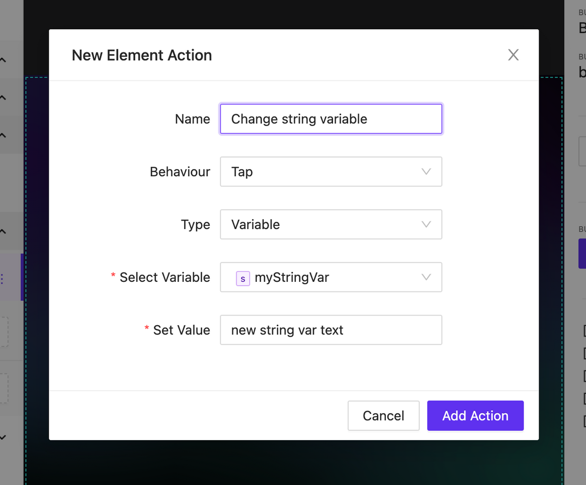
Action to change variable
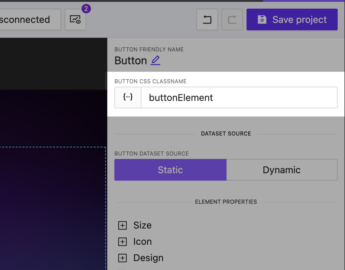
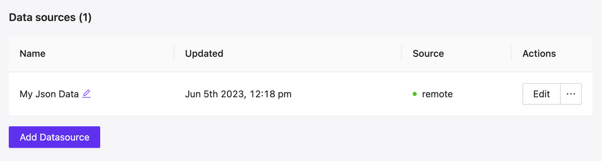
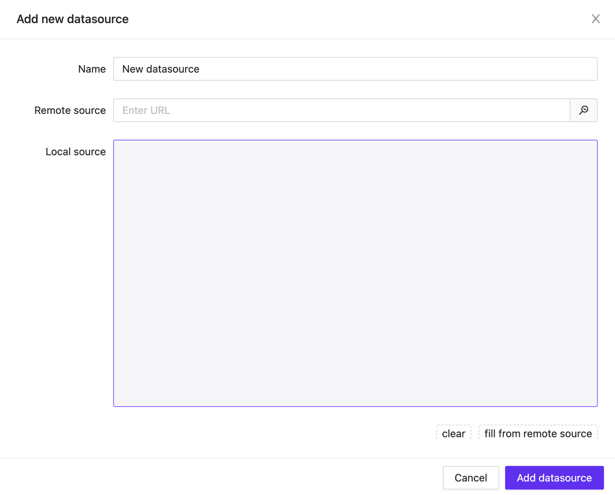
Project Datasources
NEW
A new feature has been added that allows you to connect JSON data to the project, either through a remote link or locally. These data can be used in any way you prefer: as text labels, numeric values for styling elements, data for building lists of items and much more.
Currently, after building, some of the logic with data sources may not work properly. However, in the upcoming updates, full support for data sources will be provided.
Datasource list
Datasource Modal
Rich text datasource & Variables support
NEW
Rich text content can now contain more than just plain text and print output signals feedback. It also supports working with connected data sources and local variables.
New Element: Button List
NEW
We have started adding a new type of element – lists. The first one released is called ButtonList, which is a set of buttons that can be generated based on static data or using a data source attached to the element.
Lists have a wide range of display settings for their child elements. These settings include specifying the scroll axis, the number of rows and columns, positioning within the container, and much more.
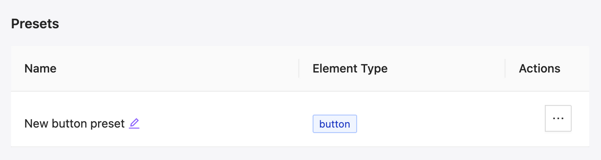
Presets for elements
NEW
We have added presets for elements, which allow you to save the appearance and settings of an element and efficiently reuse it. Additionally, you can easily change the appearance of all buttons in the project that are linked to a preset with just a few clicks.